

Button
Buttons on the web are there to perform an action. A well-designed, good-looking button is always crucial in any web design. Buttons hold the key to page redirection, interaction, and data flow on web pages. In SP Page Builder button addon is nicely developed for adding nice buttons to your web pages quickly. You just have to add and customize some of the button design properties and this awesome page builder will do the rest.
How to Add a Button Addon?
You can add the Button addon to your page from the SP Page Builder sidebar. Simply drag the addon from the Addons panel and drop it on the section of the page where you want to add a button.
Button Settings
The addon inline editor will open up when you click on the Button addon. You can access the addon settings and customize the button to fit your needs.
Button
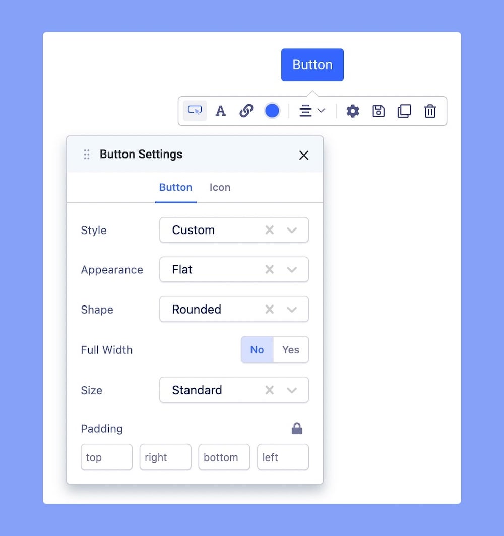
Button Text: The button text is the text that will be displayed on top of the button. It’s quick text on what that button is going to do. Click on the button to edit the button text.
Button Style: You can choose a desired button style from the given list.
Button Appearance: You can choose a suitable button appearance from the list.
Button Shape: Choose your button shape from the list using this option.
Full-Width Button: Set this option to ‘Yes’ if you want a full-width button. Leave that to ‘No’ if you don't.
Button Size: There are numerous options you can choose from to define your button size.
Padding: Use this field to set the padding of the button.
Button Icon
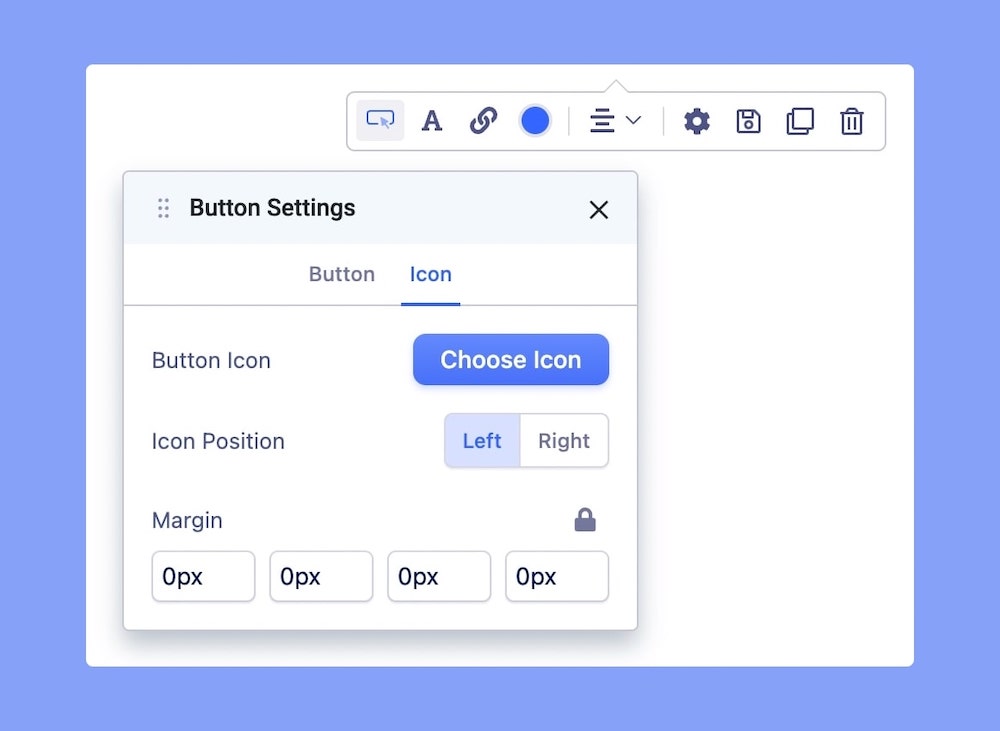
Button Icon: You can add a button icon using this option. Select the button icon from the list.
Button Icon Position: Where do you want the icon left or right? Select your desired position.
Margin: Set the margin of the button icon.
Button Link Settings
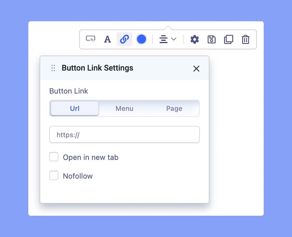
Button Link: You can set the button link to be an URL, a Menu, or a Page.
URL: Insert the URL you want to link to the button.
Menu: Select the menu from the drop-down list to link to the button.
Page: Select the page from the drop-down list to link to the button
Open in a new tab: Tick on this box if you want to open the URL in a new tab.
Nofollow: A no follow link is a link that does not count as a point in the page's favor, does not boost PageRank, and doesn't help a page's placement in the SERPs. Tick on this box if you want the button link to be a no follow.
Button Color Settings
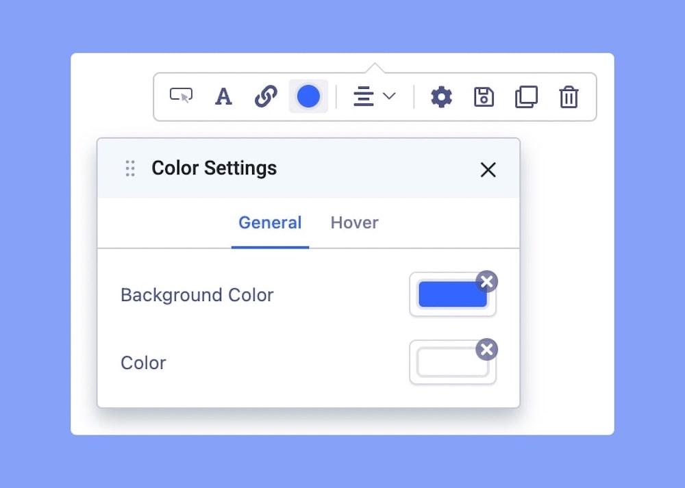
Here you can set the button’s color and background color for its general state and hover state.