

Image Content
Image Content addon lets you display an image along with a text field to add texts relevant to the image. The SP Page Builder Pro Image Content will allow you to display your Content along with your preferred images for maximum exposure.
How to Add an Image Content Addon
You can add an Image Content addon to your page from the SP Page Builder sidebar. Simply drag the addon from the Addons panel and drop it on the section of the page where you want to add an Image Content addon.
Image Content Settings
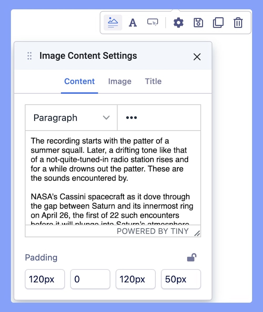
Gain access to the most basic settings of the Image Content addon through Image Content Settings. The Image Contents settings come with 3 different settings tabs:
- Content
- Image
- Title
Content
Use this field to enter the content you want to display in the Image Content addon. Use the text editor to bring necessary customization to your content.
Padding
Define paddings for top, right, bottom, and left areas. Padding is the space between the content of the element and its border.
Image
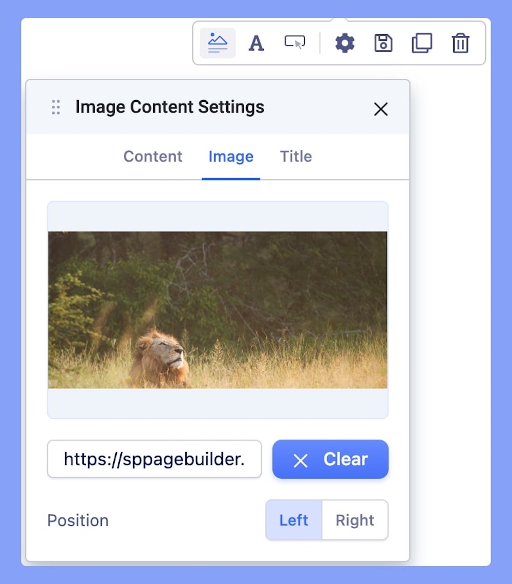
Use Image Settings in the Image Content Settings option to use SP Page Builder's well-developed media manager to upload the image.
Position
Choose whether you want to set your uploaded image position to the left side or right side of your content.
Title
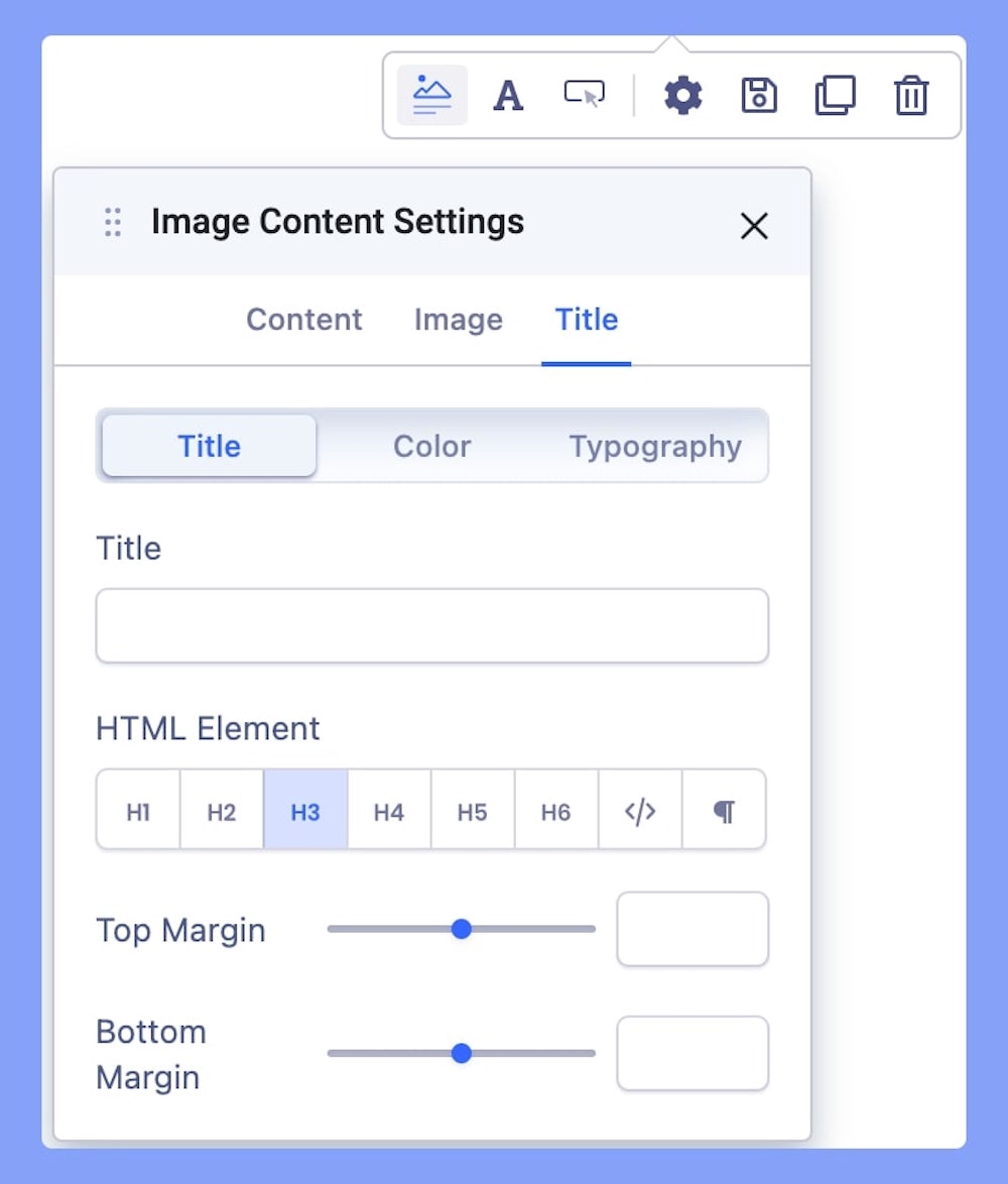
Use this tab to add a title to the section you just added with the addon.
- Title: Add a title on top of your Content texts. Also, edit your HTML element, and set the Margin
- Color: Set your preferred color of the added title. Learn more about color settings here.
- Typography: Edit your title Font, Size, etc in this tab. Learn more about settings here.
Typography Settings
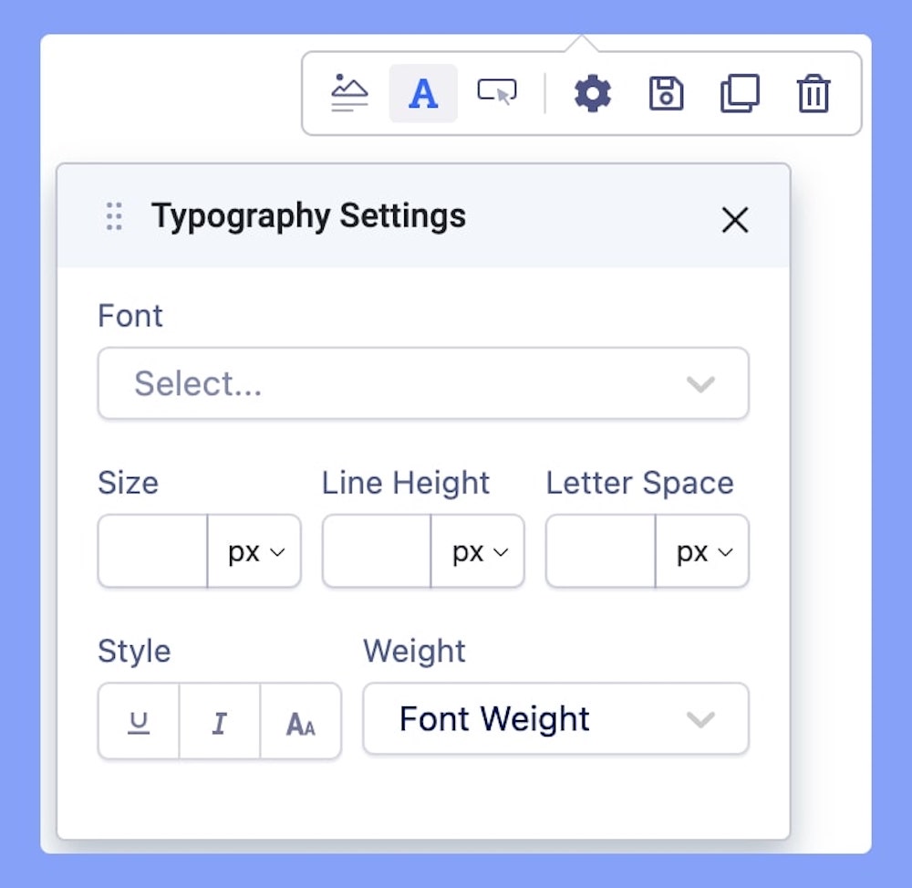
The Typography settings let you edit the Content texts. Adjust your font types, Size, Line Height, Letter Space, Style, and Weight for your Person Addon texts. Learn more about Typography Here.
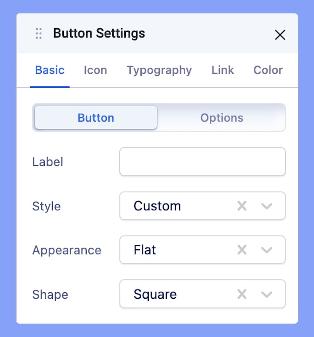
Button Settings
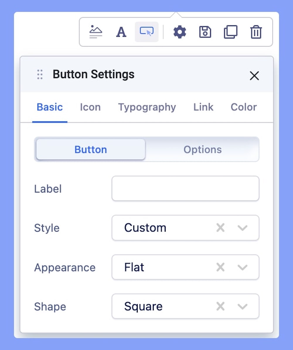
Use this setting in case you want to set a button inside your Image Icon Settings. The Button Settings comes with all the options necessary to create a fully customized button.
The basic settings let you create a button and apply a basic style to it.
- Label: Enter the button text here. Leave it blank if you don’t want any button.
- Style: You can choose a desired button style from the given list.
- Appearance: You can choose a suitable button appearance from the list.
- Shape: Choose your button shape from the list using this option.
- Size: There are numerous options you can choose from to define your button size.
- Full Width: Set this option to ‘Yes’ if you want a full-width button. Leave that to ‘No’ if you don’t.
- Margin: Set an optimum distance around your button.
- Button Icon: Choose your desired icon from a list of available icons in the Icon Library.
- Icon Position: Choose whether you want to set the icon position to the left or right of your button text.
Link

Add a link to your added button using the Link tab options.
- For URL, simply paste the web address you want to link to into the first field.
- For Menu, select the option you want to link to from the dropdown list. Note that the options on this list are all Menu Items that exist on your website.
- For Pages, select the option you want to from the dropdown list. Like Menu, these options are all existing Pages available on this website.
Lastly, you can enable the option Open in New Tab to open this link in a new tab and No Follow to tell search engines to ignore this link.
Color
Use the Color tab settings to edit the color of your added button
- Normal: This tab lets you change the color of your button’s background and the color of the text inside your button.
- Hover: This tab lets you change the color of your button’s background and the color of the text inside your button upon hovering.