

Howdy SP Page Builder users! As you all know, with the release of SP Page Builder version 4.0.5, the Column Responsive option was got ridden off for clarity and convenience. Since then, a lot of you have had questions regarding how to adjust your column sizes as you can no longer specify the class for the columns of your tablet and mobile layouts.
At JoomShaper, we’re always working to shape our products to become the best of their kind while also keeping our beloved users at our heart. Hence, even if the old Column Responsive Options have been removed, it will not limit you from adjusting your column sizes in any way compared to the convenience you have had in the previous versions.
So we are here today to walk you through some simple steps on how you can have your column responsive fixed without the column responsive options. Without any further ado, let's delve in!
Step 1: Create a Section with Multiple Columns
First things first, from the SP Page Builder Pro frontend editor create a section with 3 or more columns. For this demonstration, we are taking 3+3+3+3 columns for convenience.
Also, note that you can add a total of 8 Columns within a single Row.

Step 2: Add Your Addons and Make Necessary Changes
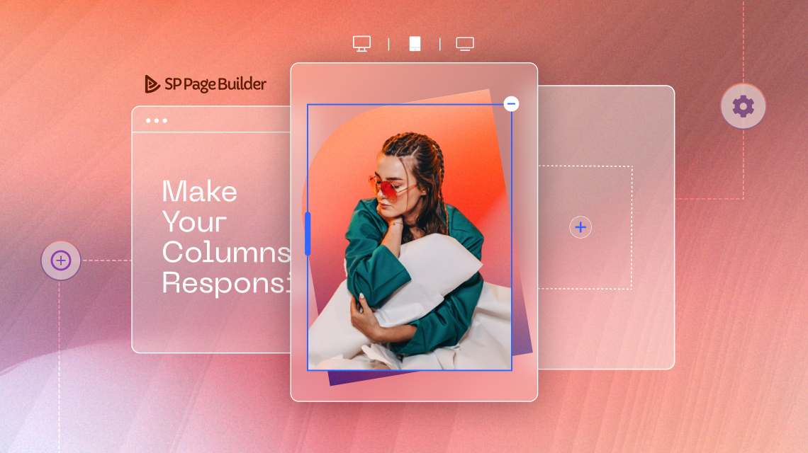
Time to add the addons. Here, we are taking two image addons and two text block addons. Adjust the images and texts of the addons to fit your need.

Step 3: Check the Column Responsive for the Tablet Mode

When you are happy with your addons, switch to Tablet Portrait mode from the 6 viewport panel on the top of your page in case you want to change the column responsive for your tablet layout. Now, navigate to the Row settings from the Row Editor. From the Style tab, you should be able to find the Fill Columns option at the top and disable it.
After disabling the Fill Column option, you should now be able to adjust the column width by simply clicking and dragging the Column boundary.
Another way to adjust the column size is by specifying the width of your columns from the input field that appears on the top of each of your columns when you click on the boundary. Simply enter the percentage of the columns that you wish to resize according to your preference.

Please note that the procedure to adjust the column size for your Mobile responsive layout is exactly the same as the tablet layout.
Step 4: Set Gap Between Columns In the Responsive View
When you have set your columns according to your need you might want to add some more gaps between each of your columns for further clarity or decoration. There is also a simple trick to let you get that gap just right! Simply go to the Column Option and choose the Style tab. From the Spacing option, choose and set the Margin values to fit your need.

Ending Thoughts
We hope this simple yet effective tutorial answers a lot of your questions. With our constant effort to make SP Page Builder the best Joomla web-building tool, the changes that come along are only to make your web-developing experience easier and more comfortable. Let us know if you have tried out this new trick to resize your columns in the comments!
Happy developing!

Maybe your developer team would like to have a look at how a really professional front-end editor can look like. Just a suggestion.
https://express.adobe.com/de-DE/sp/onboarding
You can certainly learn a lot here
regards