Menu Settings & Colors
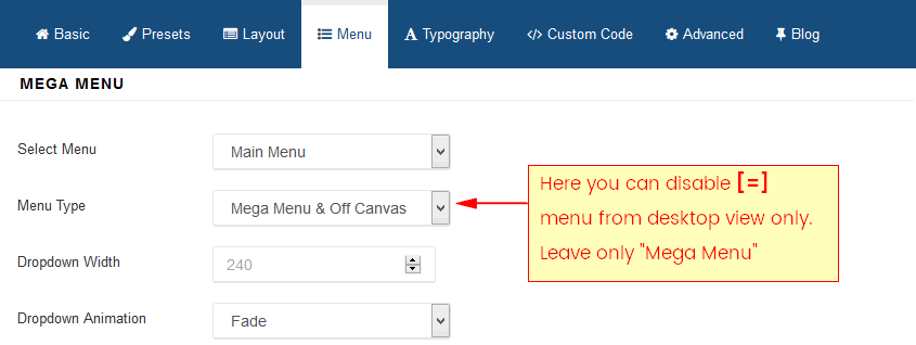
In Aspasia template in Main Menu section we used one top classic menu, and mobile [=] menu and search icon. Of course you doesn't have to have all those elements.

For example pretty easily you can disable [=] menu from desktop view only.
Color of menu items you can control by Preset settings (template) or by using custom css code inside custom.css file (more info here). If you chosen second method here is example CSS code which can help you during customization tasks.
Menu items color (level 1)
.sp-menu-item > a, .sp-megamenu-parent > li > a {
    color: green;
}
.sp-megamenu-parent > li.active > a,
.sp-megamenu-parent > li:hover > a {
    color: blue;
}
Submenu items color
.sp-megamenu-parent .sp-dropdown li.sp-menu-item > a {color: red;}
.sp-megamenu-parent .sp-dropdown li.sp-menu-item > a:hover {color: yellow;}
Please add above CSS inside custom.css file.
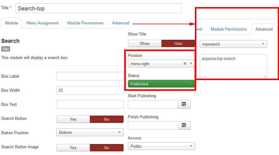
About Search icon and whole feature - it's default search module which extra styles, this view was overriden by template.