

How to make a website perfectly responsive with SP Page Builder


What SP Page Builder is, needs no explanation. What you can do with it, needs no description either. The only thing you need to know today is how simple it is to make your Joomla website 100% responsive with SP Page Builder. According to the tenets of responsive design, websites should adapt to different resolutions, supporting devices ranging from smartphones, tablets to desktops. All the addons of SP Page Builder come with device-specific responsive options. We’ll take a look at few of them.
In this article, we will demonstrate how you can adjust your site's responsiveness with SP Page Builder to make it load perfectly on any device (desktop, tablet, mobile). Here we will see some adjustments made to different website sections.
Adjusting the Hero section
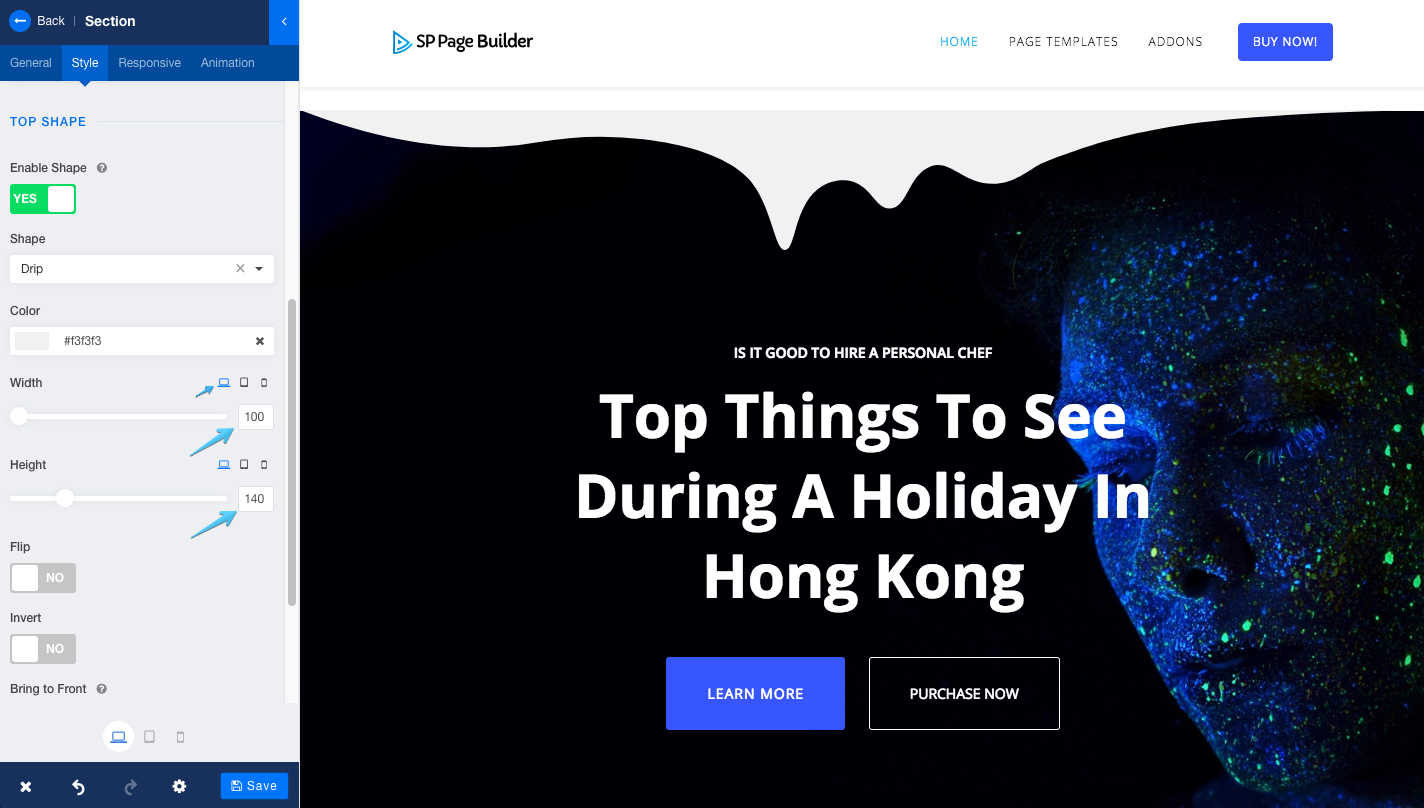
Every row made with SP Page Builder has the functionality to apply different shapes to them. To do so, you need to go to Row Options > Style > Enable Shape > Set it to “Yes” and you’ll find 10+ different shapes in the dropdown list. We’ll select “Drip” for our little experiment. Now select your desired color, height, and width for Desktop.
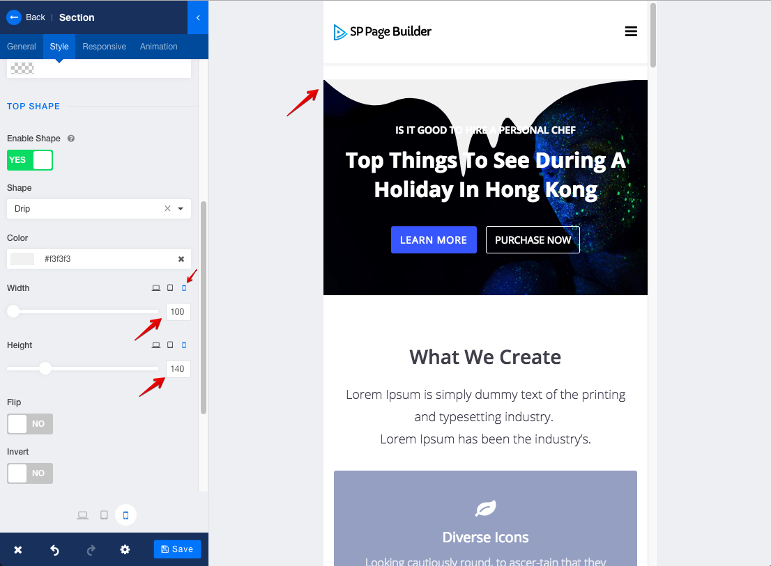
Let’s select the Mobile view. If you put the same value as Desktop, you’ll see that the shape seems to be "broken".
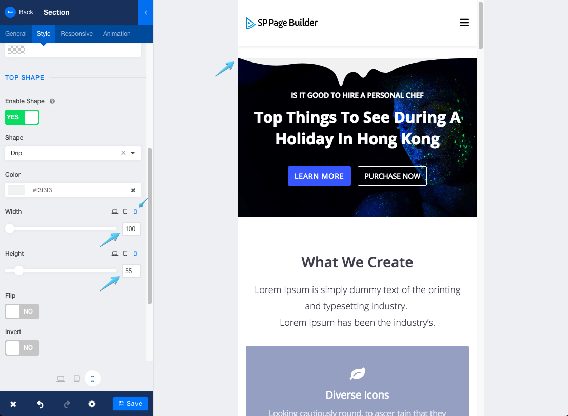
To fix this issue, we need to adjust the value for mobile view - click mobile icon at the bottom. As you can see in the image below I decreased the height for mobile view. Now the shape looks perfect on all mobile devices.
Let's see how this setting looks on Tab view.
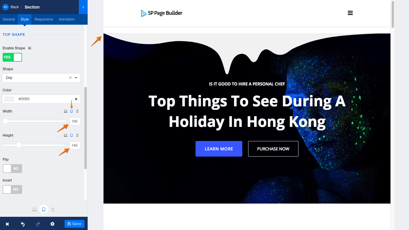
It looks just fine. So we will leave it as it is. But if you feel like the shape is broken, adjust the values as necessary.
Adjusting the Heading: Title or text
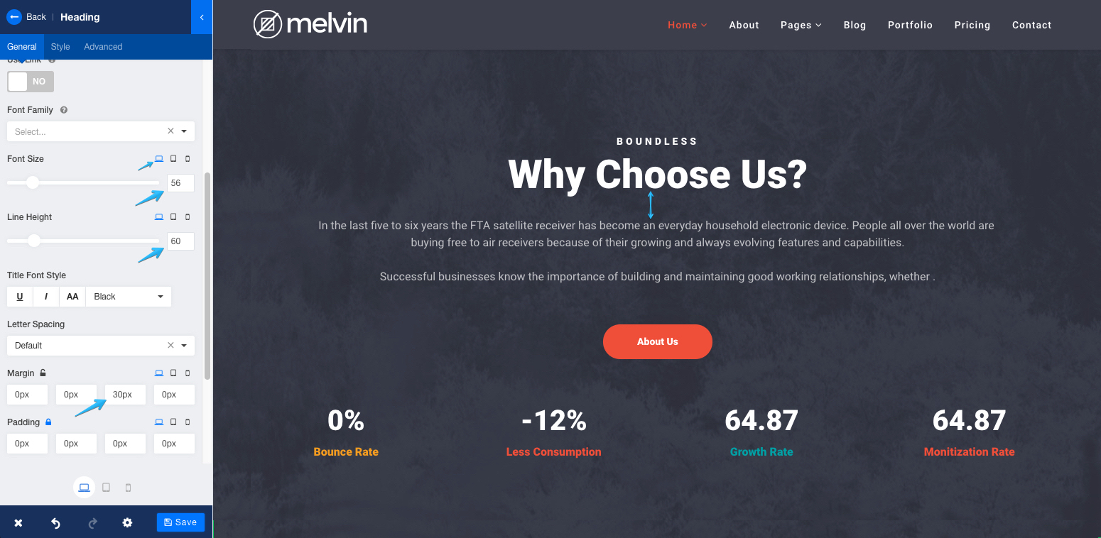
The same thing you can do with all the text contents of SP Page Builder. Let's take Heading addon for an example, and set our font size to 56, line height to 60 and margin-bottom to 30. You see how it looks on a desktop? Perfectly fine right?
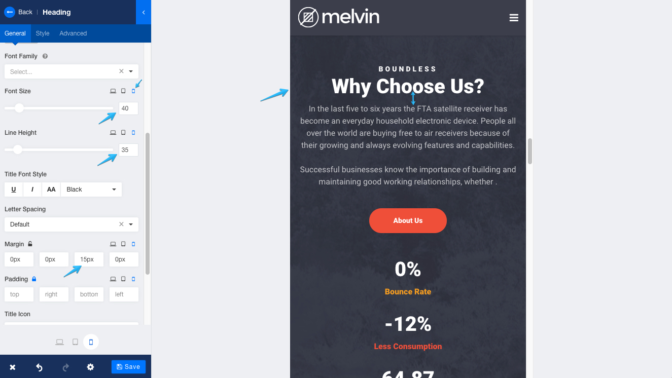
But now take a look at the mobile view with the same values. Not so good!

We can solve this issue by adjusting the values. I set the values for font size, line height and bottom margin as 40, 35 and 15. Now see the mobile view in the image below. The combination of all the elements is perfect, right?
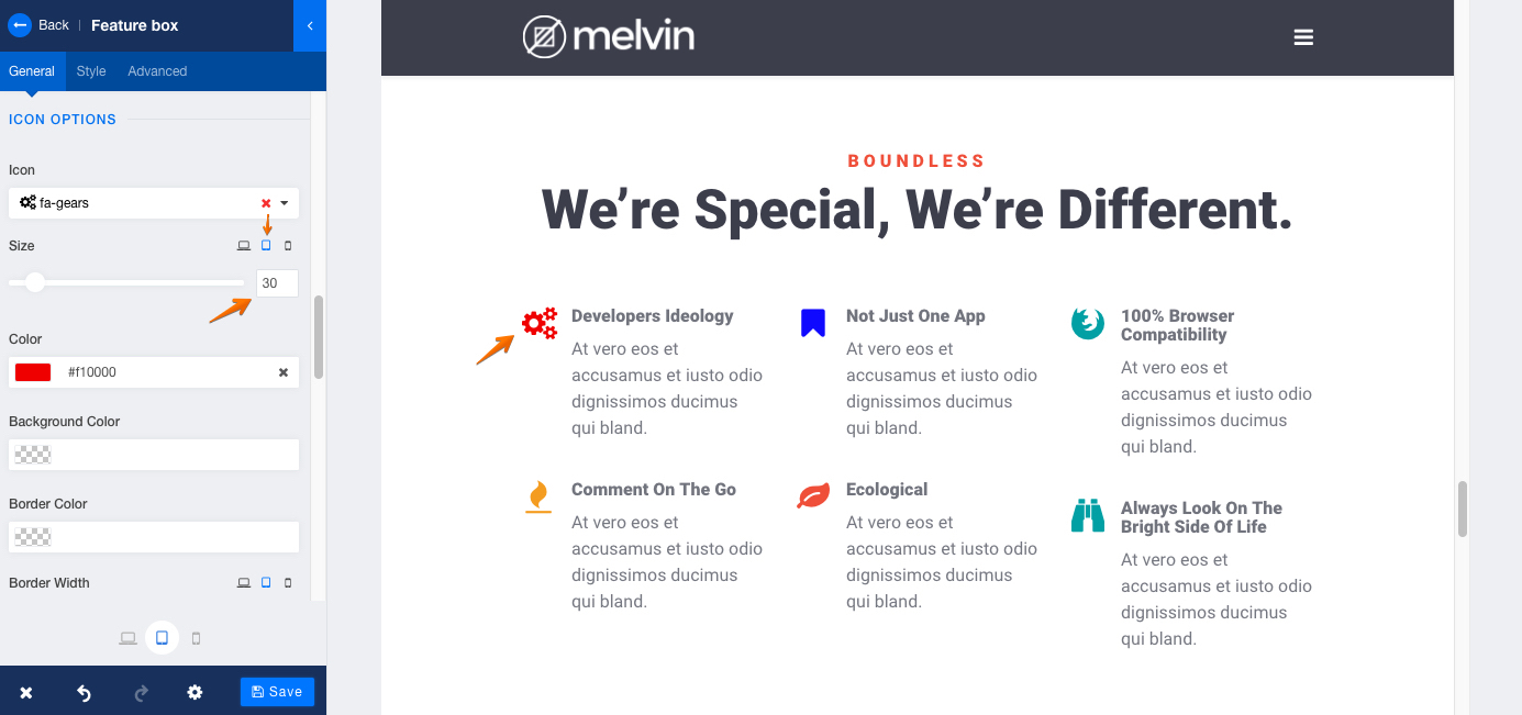
Adjusting a featured section
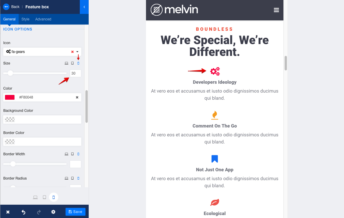
The Feature Box addon gives us the freedom to adjust responsiveness on many functionalities including title line font size and height, title margin top and bottom, icon size and line height, border margin and padding, content font and size. We’ll make the icon responsive for different devices today. Our primary size of the icon is 30 for desktops.

If you keep the size at 30, it looks too tiny on the mobile devices.
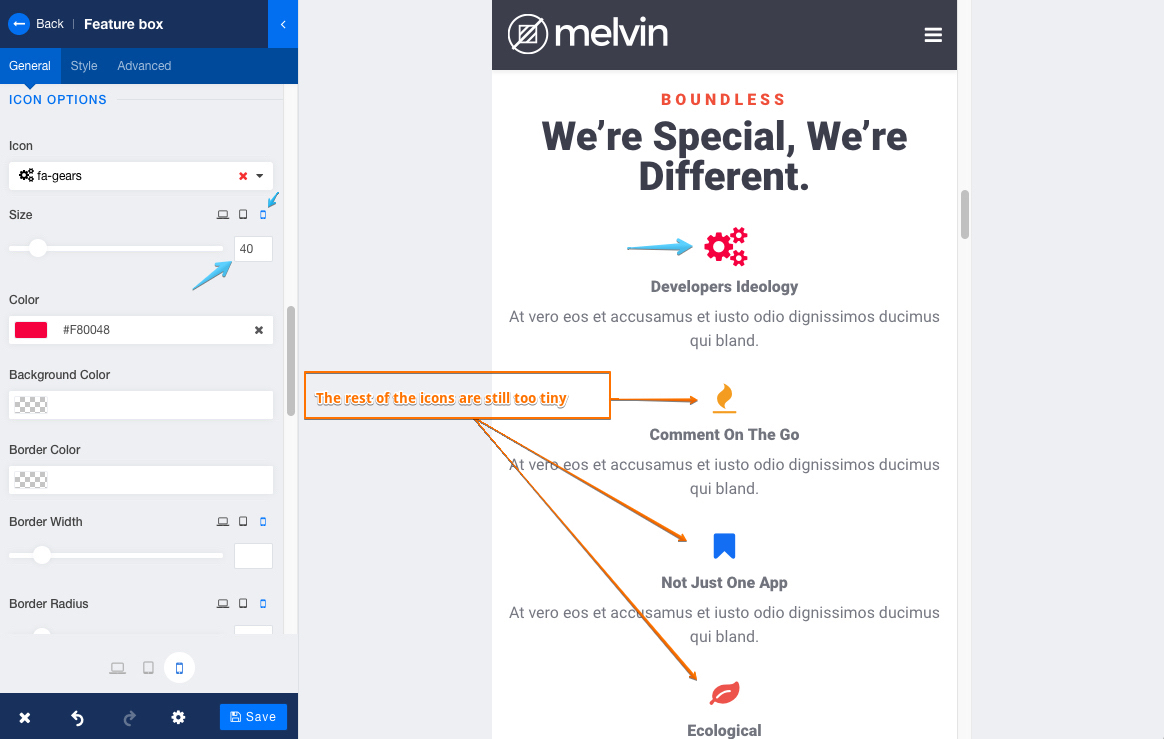
We want our users to focus on the icon so we will increase the size to 40. It will make the icon more visible to the users. If you want you can do the same thing to all other icons.
Now, if we take a look at the Tab view, we'll see the icons are comparatively larger. Which meets our requirement. So, we'll leave it as it is.
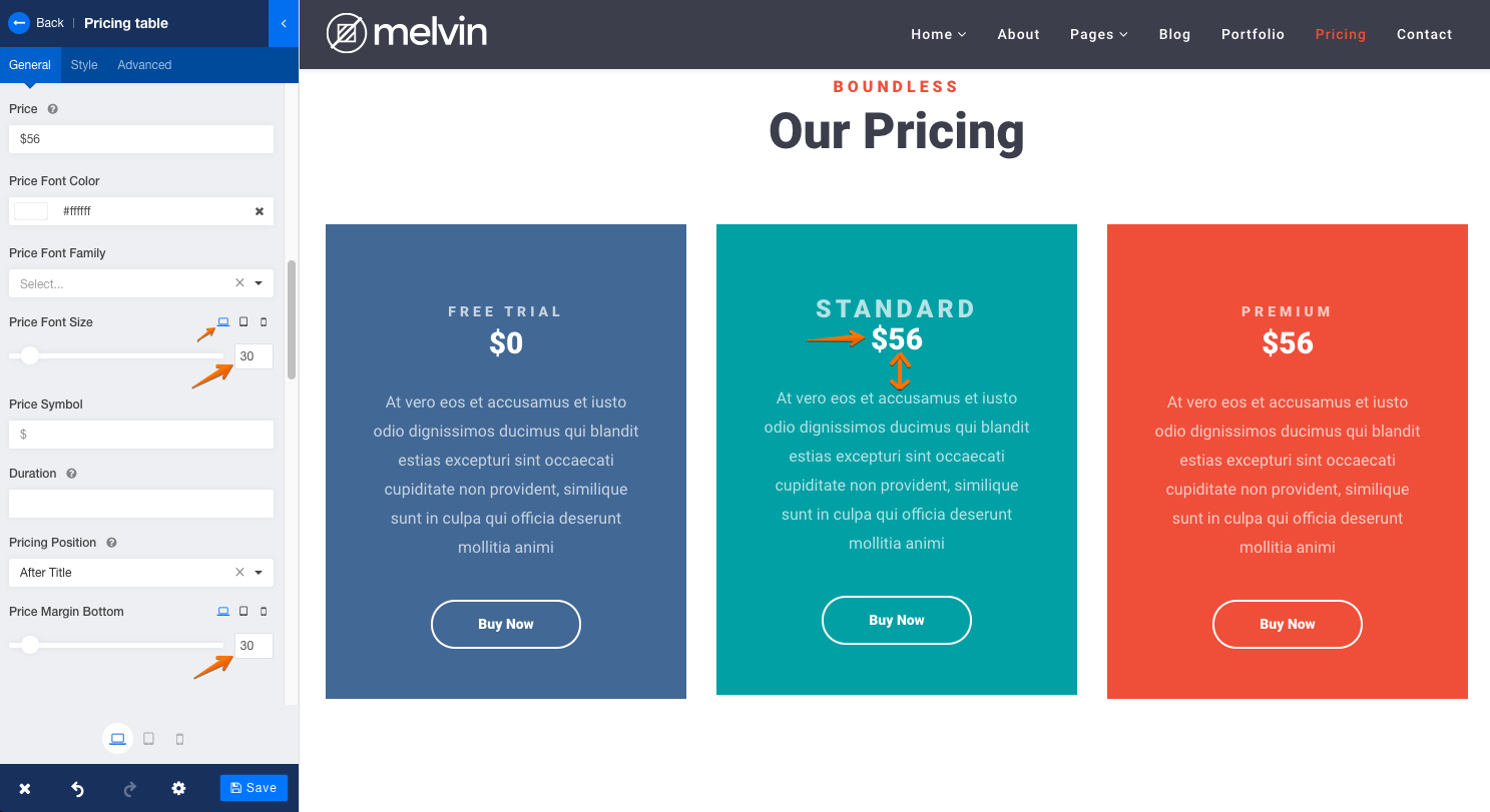
Making a pricing table more visible on mobile devices
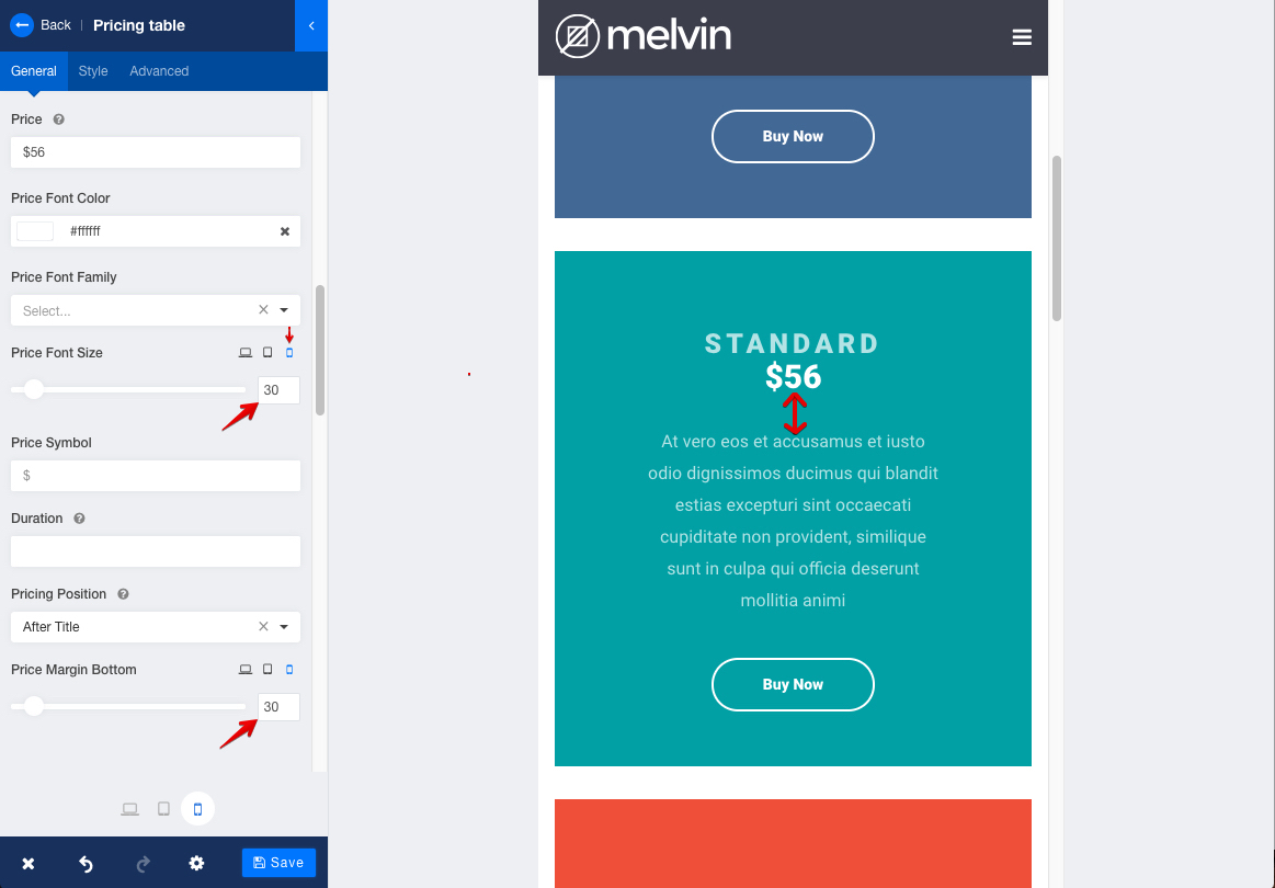
The process is almost the same and that makes SP Page Builder user-friendly. You learn to do one thing, then you know rest of the things automatically. Let’s make the pricing more visible to users by adjusting some values in the Pricing Table addon. For that purpose, we’ll set ‘Price Font Size’ at 30 and ‘Price Margin Bottom’ at 30, so that the space between content and price are friendly to the eye.
But we cannot stick to this setting for all the devices. See what happens in the image below if we do so. The gapping is too much, the font is too big for small devices. So, we need to adjust them for different devices.
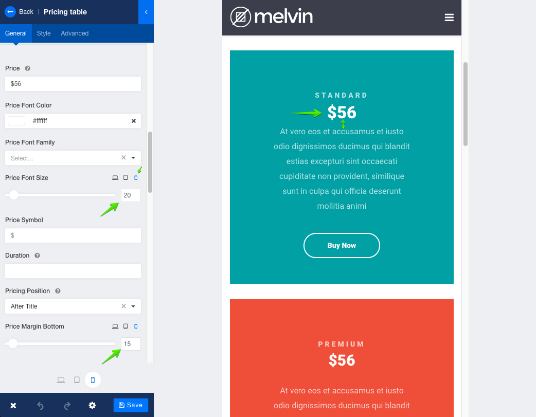
Let’s decrease the font size to 20 and ‘Price Margin Bottom’ to 15. Now it looks more decent, don’t you agree?
Responsiveness options at a glance
You'll find some very useful responsive design options for mobile, tablet, and desktop from the followings:
- Row Options > Responsive > Hidden on Mobile/Tablet/Desktop
- Row Options > Style > Padding and Margin
- Column Options > General > Padding and Margin
- Column Options > Advanced > Tablet and Mobile Layout and Visibility Options
- Addons (several different options described above)
Don't hesitate to play around with some Joomla templates that offer the same options.
Conclusion
I hope you've got the clear picture of available responsive web design options from this guide. What we are trying to say is that SP Page Builder is an amazing page building tool that lets you make your website responsive in a very easy and simple manner. Presenting contents beautifully and functionally on every device is very easy when you have SP Page Builder in your hand. Take a few moments to be familiar with the responsiveness settings of SP Page Builder and you'll thank yourself in the future. Stay connected with us and we will keep you amazed with more and more helpful stuff like this. Thanks for being with JoomShaper.
It is an essential feature now to look at mobile first, and having this option there to tweak the same website feature for differing screen types is such a powerful tool! The number of times now that something looks great on mobile but not desktop, and vice versa, being able to adjust it so quickly makes things much easier, possibly one of the best features of PageBuilder 3.x :)
Our developers would feel very proud seeing your comment. You know, you are the ones who encourage them to make SP Page Builder the best of its kind. I'll convey your message to them. Thanks for the appreciation :)
- [url="http://impossiblegame.co/"]impossible game[/url]
You may have a hard time understanding this, but once you try it yourself it will be crystal clear.
-Thanks for your cooperation :)
-Thanks
Hosting account: The storage of your website’s files.
Setting up Joomla: For a functional website.
LMS extension: We will use SP LMS here.
Regards