

Brand New Image Carousel Addon Arrives in SP Page Builder Pro v3.6.4


“A tool is as good as the hand wilding it” - a quote from Kevin Sands. Rather, we believe, a person is as powerful as the tool allows it. Therefore, we are on a mission to provide you with the best page building tool that you deserve. To empower you to create mind-blowing web pages. SP Page Builder Pro comes with yet another update that presents the brand new Image Carousel addon. We’ll see what you can do with this amazing addon in a later section. But first, let’s have a brief look at the improvements that are coming with today’s update.
Full changelog of SP Page Builder 3.6.4 Pro
- New: Introduced the Image Carousel addon
- New: Added 4 new carousel blocks to block collection
- Fix: Frontend edit 404 issue with sh404SEF
- Fix: reCAPTCHA issue on Form Builder & Contact Form addons
- Fix: Page fluctuation issue at interaction first-load
- Fix: Context menu positioning issue
All New Image Carousel Addon for a Neat Showcasing
Carousels are a tricky thing, it’s very likely to confuse them with sliders. Some people refer to the relation between them as “tomayto, tomahto”, others just don’t care. However, there’s a slight fundamental difference. Although it can’t be defined with words, the difference is visible to the eyes. They both display a collection of images but the difference lies in the versatility of content. Sliders let you animate a wide variety of content altogether which results in cluttering the display. It’s like bringing a gun to a knife-fight.
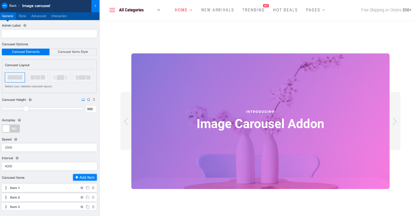
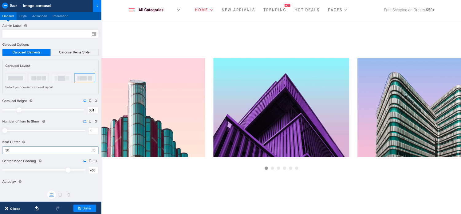
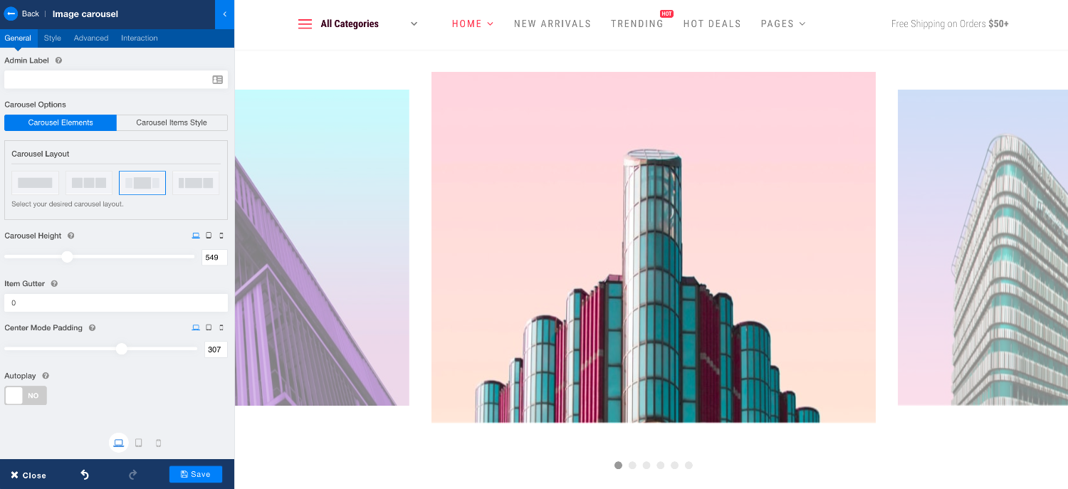
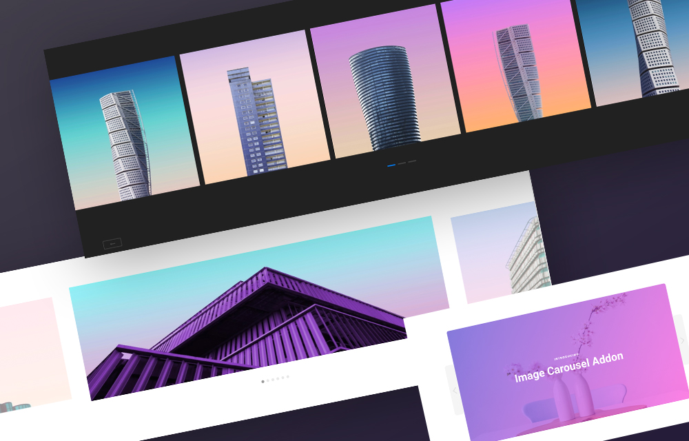
You get 4 layouts in the Image Carousel addon
The Image Carousel addon came to birth from this idea. To empower you what you need for creating a stylish image carousel, we have introduced the Image Carousel addon. It lets you showcase a clean, neat and aesthetic presentation of your products/features sections/portfolio showcasing. Image Carousel is the sharpest tool to highlight a collection of images.
These are the amazing features you get in Image Carousel
Single Item: Focusing on one particular element grabs the users’ attention to that item. Therefore, to highlight one thing at a time, single item showcasing is the best way to do it. This puts the spotlight on the particular item that is currently showing.
Multiple Items: Use this when you want to make your visitors hooked on certain products that you have put on display. Three layouts of the addon out of four, lets you showcase multiple items.
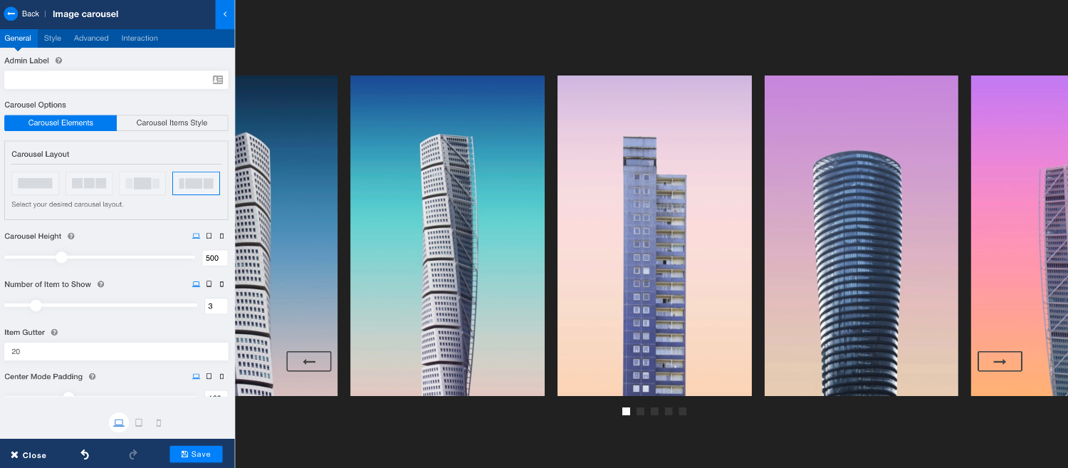
Height Adjustment: We know the viewport varies for different screen/device types forcing the element sizes to shrink according to screens. Thus, we have introduced the freedom to control the height of any element regardless of the device type.
Gutter Control: To keep the screen clutter-free, it is important to put a gap in between the images. The “Item Gutter” function lets you control the empty space between images as you seem fit.
Responsive Display: The Image Carousel addon gives you full control over the items you want to show. You can define the number of items to be displayed on different device types. Firstly, choose the device type, then define the “Number of Items to Show”.
Center Mode: The Center Mode option is available in two layouts of the Image Carousel addon to highlight the center image. The Center Mode Padding function lets you define the adjacent padding area.
Swipe Enabled: The carousel items in the Image Carousel addon supports desktop mouse dragging. Also, in touch screens, users can swipe through images.
Autoplay and Animation Control: Since the whole point of carousels is to showcase images. We found it essential that you have complete control over display animations. You should have control over whether you want to autopay the images and how fast or slow you want to showcase them. You can also define the interval time.
Controller Styling: You get two navigation controllers with the Image Carousel addon. Both Arrow Controller and Image Controller come with rich styling options. You can customize the styling in normal and hover states for the Arrow controller. And the Bullet controller lets you change the styling for the normal and active states.
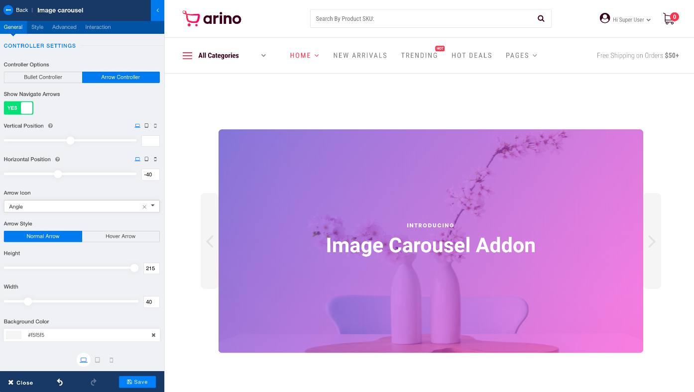
Controller Positioning: The addon not only lets you style the controllers in your own way, but also you can change the positioning of the controllers to the area you seem fit. Both Arrow and Bullet controllers give you this freedom.

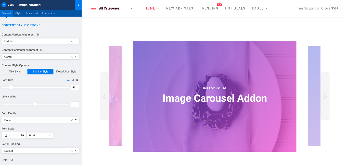
Text Content: Sometimes it’s crucial to add text content to images so that you can convey your message related to those contents. The Image Carousel addon not only presents you with the ability to add text content to images, you can also apply the styling the way you want to.
Gradient Overlay: Your amazing skills are not limited to the options stated above. You can take them a step further with the Overlay styling option. You can apply gradient overlay to the images used in the carousel.
4 More Blocks Added to the Collection
To boost your development speed and get you the rhythm that makes a great designer, we have added 4 brand new blocks to the block collection. With this addition, the total number of blocks available on SP Page Builder goes up to 160. These 4 new blocks show the use cases of the Image Carousel addon, and can be found under the Image Carousel category. Browse to Blocks and choose Image Carousel category to access these ready-made sections.
More Improvements
Today’s update also brings a few notable fixes. One of them addresses the bug for the users of sh404SERF. The extension resulted in a broken URL while editing in frontend mode. This has been fixed. The reCAPTCHA issue with the Form Builder & Contact Form addons has been taken care of as well. Most importantly, the issue that caused fluctuation at first loading of an interaction-applied page has been addressed.
SP Page Builder v3.6.4 is not just a regular update. We have put in a tremendous amount of work as always in improving the tool to make it even better than what it was yesterday. We will constantly keep on working and will keep introducing amazing addons like “Image Carousel” that will make you a better developer, even a better designer. Let’s grow together.
Also, don’t forget to share your thoughts with us down in the comments below.
Try SP Page Builder for FREE! Get SP Page Builder Pro Rate on JED


Off to look :)
There's a template provider who also has downloadable addons for PageBuilder...let's just say that one of those addons allows exactly this, as I've just tried it. I'd rather stay 100% native with your solutions though :)
What would be amazing if you can allow for the image to popup a larger image in a lightbox when clicked. Kind of like the Image Gallery addon, but in this carousel format. I find myself constantly needing that functionality, but unable to do it in pagebuilder.
Images should clickable in the next update.
The carousel image does not retain its original aspect ratio in tablet and mobile views, which leads to distortions; For example:
.sppb-carousel-extended-item img {
width: 100%;
object-fit: fill;
height: auto;
}
In addition to the clickability problem, perhaps the color adjustment of the text to be displayed would be important!
How about the still unsolved media path?
Thanks for your reply.
I have spend most of the afternoon trying the different slider add-ons to achieve the effect without success. I got close with the team carousel and had the effect I wanted, but there was no option to make the image or the text a link.