

Helix3 v1.4 - improvements and new features

4 min read
It's been less than two months from when we published Helix3 v1.3 (template framework) - now the time has come for the next version. In the last couple of weeks we collected great feedback from our users, they asked about different improvements, we tried to add in this version most of them.
Today the developers of the JoomShaper team have released a new version of the great template framework named Helix3 v1.4.
Improvements and new features inside Helix3 v1.4
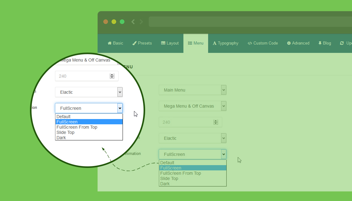
Menu changes
We added new animation types for Dropdown MegaMenu (Elastic, Drop In, Slide down and Twist) and Animation for Off Canvas Menu.
Preloader more animation effects
Now Helix3 offer 7 animation effects (Circle, Double Loop, Wave, Clock, Static logo) in preloader. Once the content of the page is loaded, the preloading screen will show small animation object. Compatible with all major browsers. You can also choose the color of the animated object and the background color under the animation.

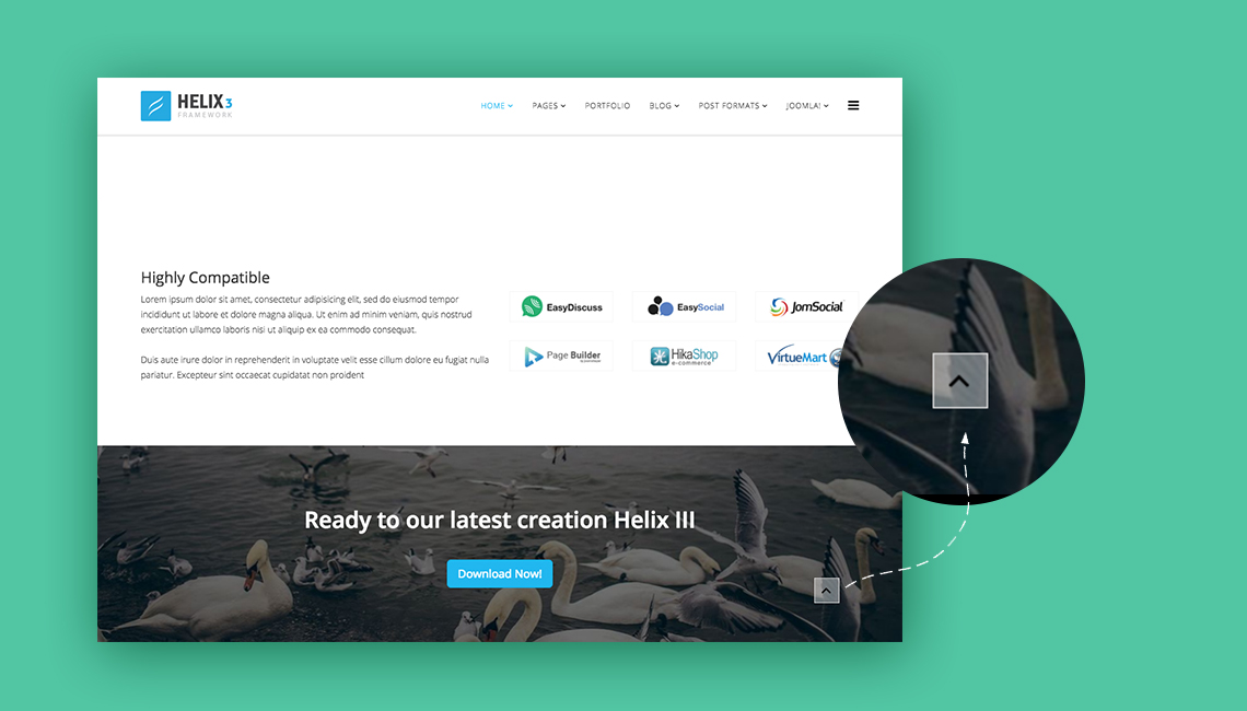
Go to top arrow
To improve UX on website built with Joomla! and Helix3 we added a new icon button (arrow) "Go to up". It that allows visitors to scroll smoothly to the top of the page. It's a little detail which enhances navigation experience on website with long pages. This gives your website better navigation and also adds a more professional look to your current layout.
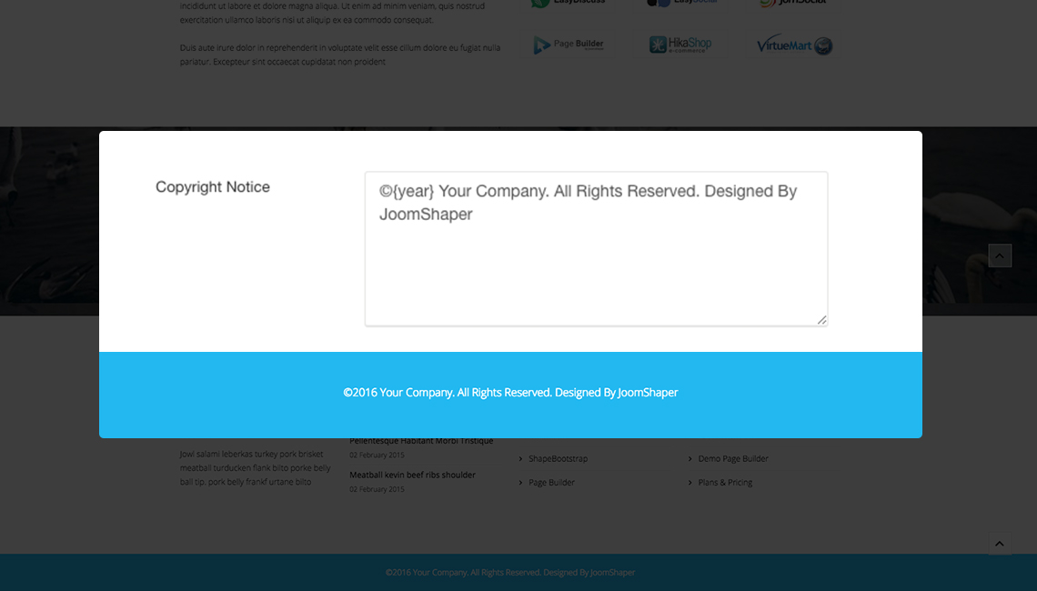
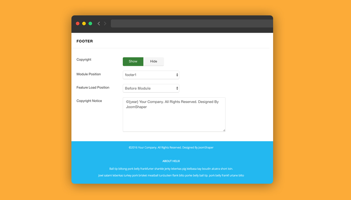
Auto update date in Copyright Notice
We thought that auto update year in copyright section would be a useful feature so we added it.
All you have to do is use {year} tag there.
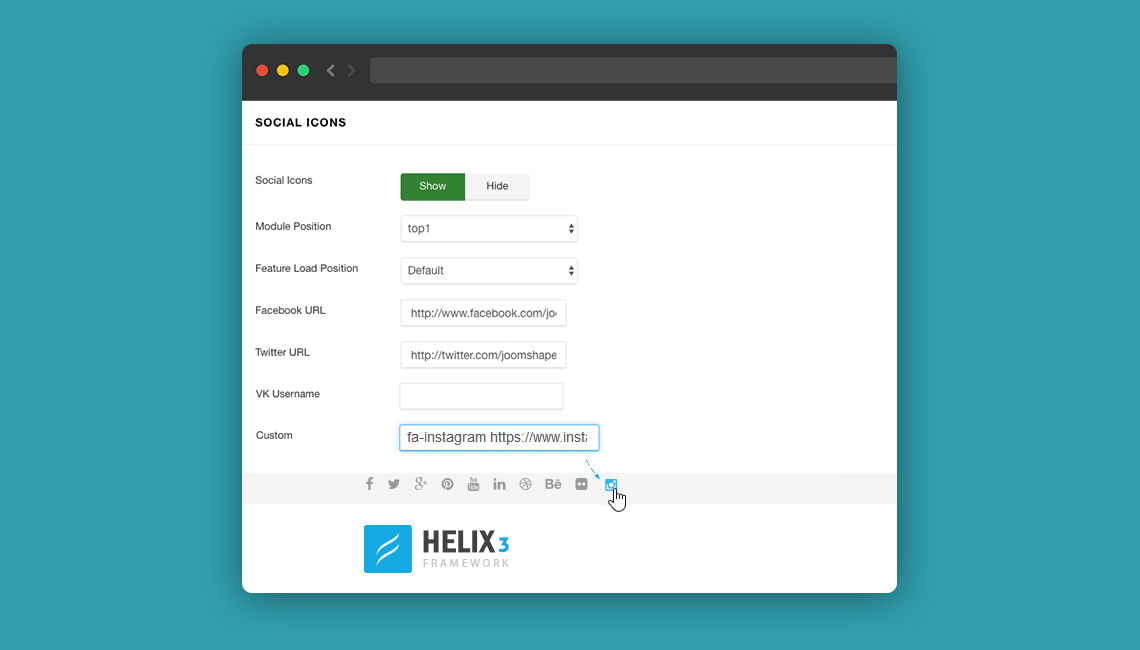
Custom Social icon
Long list of ready social icons (11 items) is sometimes too short, so we decided to add one more, but this time with custom field.
So You're able to add any FontAwesome icon class with custom URL there, for example Instagram.
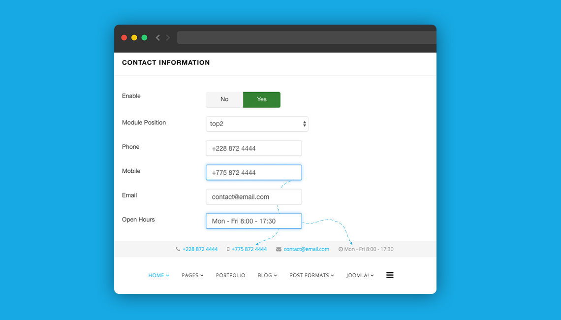
Mobile Phone and Open Hours
We added two new fields in Contact Section: Mobile Phone and Open Hours.
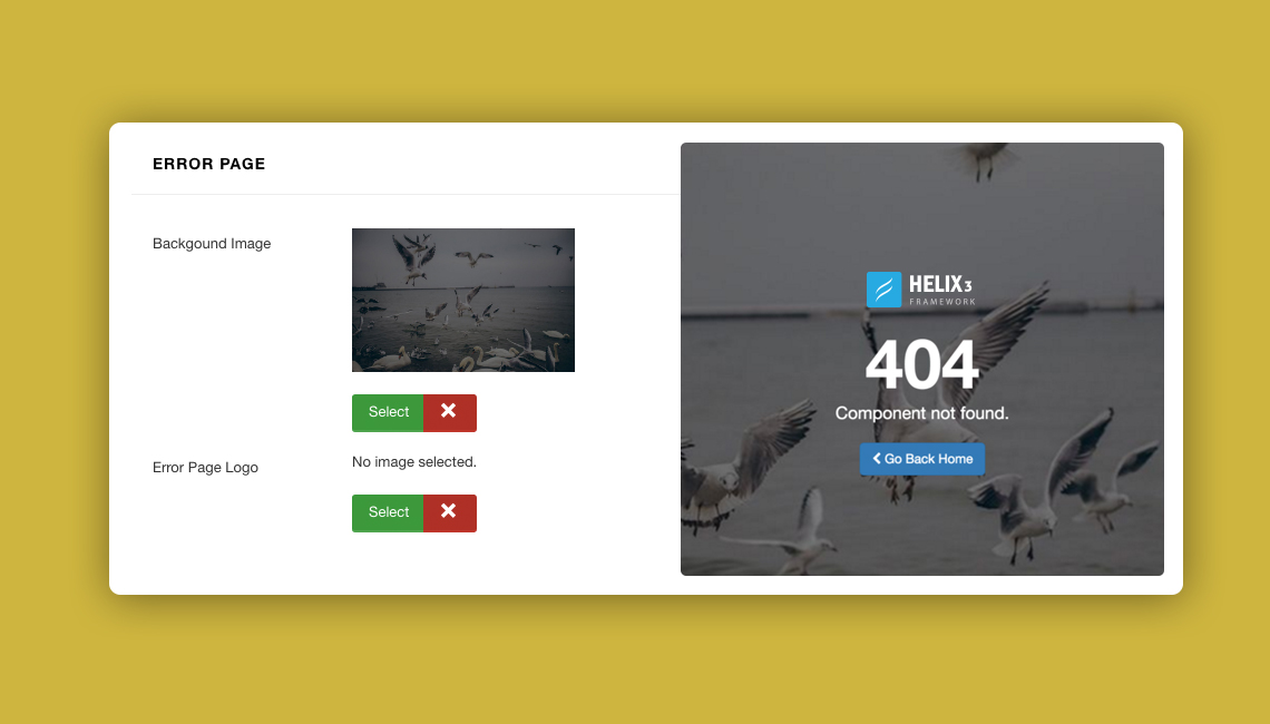
Customization of Error Page
From today you can not only add any module in error page like it was before, but also upload & use a unique logo and background image for whole Joomla! Error Page.
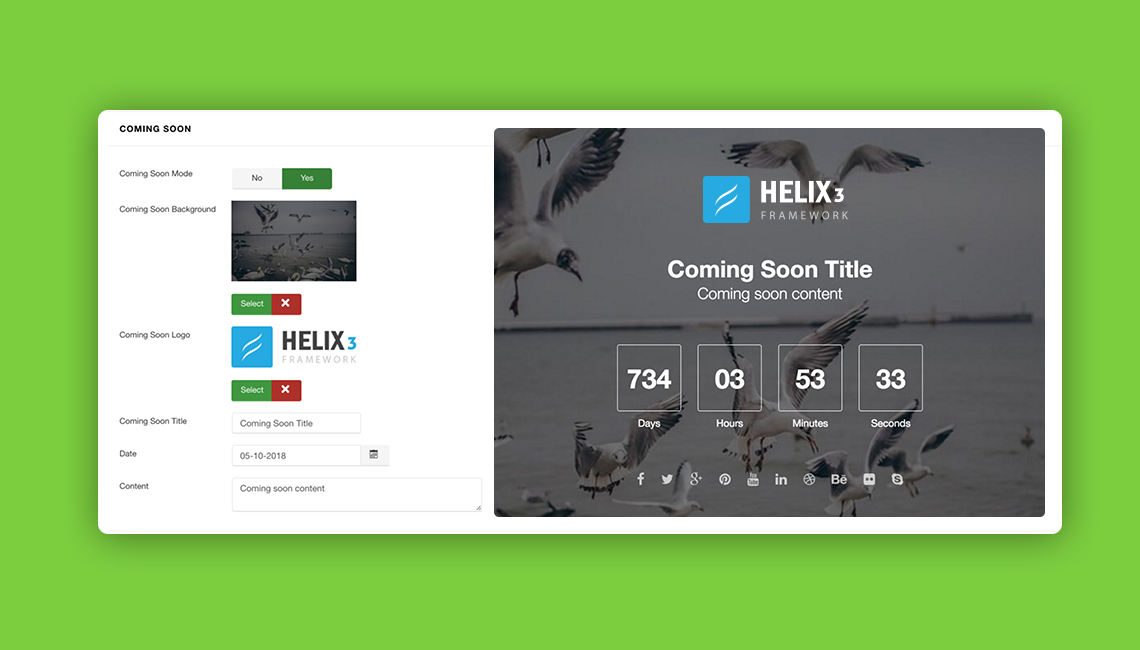
Customization of Coming Soon Page
On Coming Soon page you can upload & use a unique logo and background image without creating a custom CSS code.
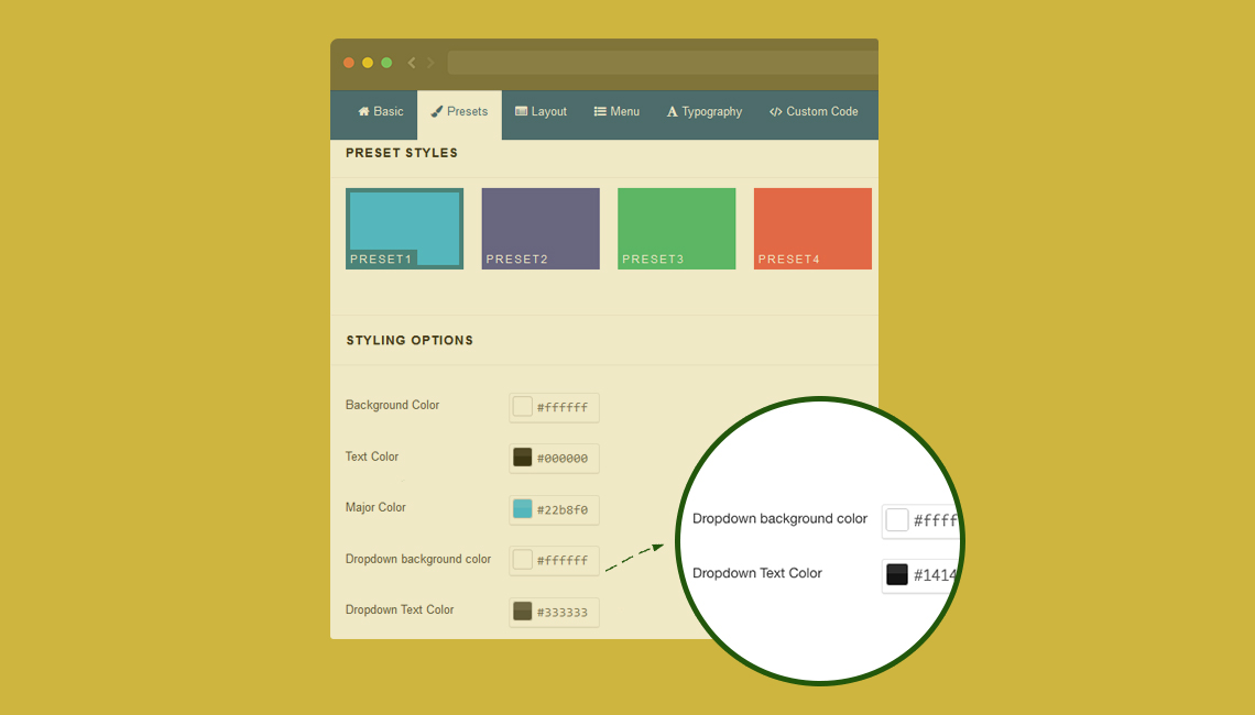
Preset Styles
Also Preset section got two new options: Dropdown background color and Dropdown Text Color - which should help you with template customization without using a custom CSS file.
Custom CSS file
Custom.css file where you can add all custom CSS class'es and IDs (to override our styles or add new ones) is used in both Error page and Coming Soon page. It means more customization capabilities for Joomla! web designers.
Template feature after or before module
From template settings you can choose the order of used template features (Footer and Social icons) - they can be loaded before or after Joomla! module.
Layout Override
Helix3 Frontend Generate overwrites option by layout (file should be in templates/YOUR_TEMPLATE/html/layouts/helix3/frontend).
Documentation link
As a new menu item in template settings, we added links to the Documentation section, we hope that will help understand how you can use a template.
ChangeLog Helix v1.4
- Front-end Generate overwrite option by layout (path should be ( templates/YOUR_TEMPLATE/html/layouts/helix3/frontend).
- Load feature before module and after module.
- Off-Canvas Menu variations & improved offcanvas functionalities.
- Mega menu animation.
- Dropdown Menu text color and background color changing option.
- Load custom.css in error & coming soon page.
- Preloader with 7 animation.
- Go to top button (arrow).
- Coming Soon Logo & Background Image.
- Error Page Logo & Background Image.
- footer copy right {year} (year replace current year).
- insert mobile number in contact feature.
- Documentation Tab in back-end.
- Article Social share improved & added LinkedIn share.
- Custom icon and url option in social feature.
- 1,11,12 column use facilities in layout builder column.
- SEO friendly frontend.
- Box Layout header width problem fixed.
- Responsive and CSS issues fixed.
We hope you will enjoy new changes in Helix3 template. If you have any questions, comments or suggestion please add them below.
But it seems your updates do not use the Joomla Update Manager...
Can you make templates & framework compatible ?
Txs !
PS : Also, how can I download only Helix 3 *Framework*, without its template ? Because I use paid JoomShaper templates on many sites, but I should also update the underlying framework... Txs
- all my websites running Helix3 Template *did* get a notification in the native Joomla Update Manager. Great !
- but all the sites running the (paid) Templates running on the Helix3 *framework* do not get notification in Joomla Update Manager (and they are running various Framework versions, mainly 1.2, according to when I installed the corresponding paid Template)
So the question is : how to update the underlying Helix3 *Framework* for all the paid templates ? (without installing Helix3 *Template*, which is nonsense as I only want an up-to-date Framework, not a new template)
Txs !
Unfortunately I had no free time to finalize and send you my suggestions and wishlist. I hope to get my hands on new Helix3 and PB2 ALPHA as soon as possible!
Oh, one thing I have noticed on a first quick look: Bootstrap (CSS) and FontAwesome are not up-to-date. Probably it won't change too much, but I wondered why it is older. Maybe an optional parameter to load the latest from a CDN would be useful.
Right now your site looks normal. Next time make a backup and do not panic you are big boy :).
http://www.amaredesign.fi/
http://www.amaredesign.fi/palvelut/sisustussuunnittelu
@media (max-width: 640px){
#sp-logo {width: auto;}
}
it will fix [=] menu problem on smartphones
#sp-logo {width: auto;}
}
it will fix [=] menu problem on smartphones
There is one thing though that either I don't know how to configure or it is a complete change of functionality compared to Helix-II: if I place a menu with sub-menus in the Off Canvas position (the [=] menu on mobile devices), either i see only the top menus or all the menus and sub-menus (setting "Show Sub-menu Items" to YES). In Helix-II there were ">" signs on the right side of the menus indicating that there are sub-menus available, and the user could tap on the ">" to get to the sub-menus. Now, if I set "Show Sub-menu Items" to NO the user has to guess that there are sub-menus available and to tap on the parent-menu in order to see the below menus.
Is this the way Helix3 is supposed to work or I just don't know how to configure it?
Thanks,
Catalin
Please look at my site: http://www.fmb-maschinen.de
Bevore updating to 1.4 the header works fine like it should, but now theres an mistake, the header is in front of the module position wich should be under the header.
Another point:
I had styled the sticky header so that it was smaller height an with the mobile logo, now it is the same header wich looks good, but has no more the functionality like bevore with the smaller mobile logo.
Only the effect like it come from top is graeter than bevore.
Third point was talked above: The social icons can´t shut off.
I hope you can fix the issues nearly, and wish you a great day.
Best regards, Wolfgang
and to fix social share :
div.helix-social-share-icon {display:none;}
Because this issue isn´t corrected :(
Another issue since 1.4 / 1.5:
With the new template.css the page does not fit in the viewport of the iPhone. 6, tested with http://seorch.de/#mobile_seo.
Temporary I used the template.css of the 1.3 Version and this point is OK. Dou you know this issue?
In my custom.css I have this code:
[code type="xml"].is-sticky #sp-header {
height: 70px;
background: #fff;
z-index: 10;
}
.is-sticky #sp-header .logo {
max-height: 70px;
float: right;
max-width: auto;
}[/code]
Bevore updating this was fine, but now this dosn´t effect :(
What can I do to reach this function now back?
Thanks for your answer,
Best regards Wolfgang
I have upgraded the template and the framework but I don't find new features in the option settings.
Thanks a lot for your great and hard work guys. :)
But i have some problems as below, i would be highly appreciated if you would help me with them.
1- Desktop View: If Contact Information enabled on position TOP2; the page title background(OFF backend for menu items) can be slightly seen under main menu on desktop view.
2- Mobile View: When i go to Mobile View, Contact Info on position TOP2 can't be seen at all and Social Icons is seen in the middle on top1. They were all right before.
3- Mobile View: Also the page title background can be seen even a lot more sizes on mobile. (The pages are disabled page title so.)
I hope that you would help me out with these. The site link is as follows if you want to check: http://onlinelig.net/forum
Thank you.
That would be fine, but what is with the header now?
The function that the header scrolls from top back again ist away...?
And the other problems like viewport (see above posting)?
And the possibility to shrink the header and the Logo (see above posting)?
Is there a possibility to download and re-install the version 1.3?
In the .zip is only one file: shaper_helix3_v13_final.sql
I can´t install it.
In all other cases every change like in the custom.css works immediately, so i think that is not a problem of compression.
The complete functionality of the header is gone, in 1.3 I changed the custo.css so that the sticky header shrinks from 90px to 70 px inclusive the logo. That works fine.
In 1.4 & 1.5 from yesterday you brought a new function that the header smoothly scrolls from top in the screen, that was fine, althought my shrink header no longer works.
And now in the newest 1.5 the header does only sticky, without any effect :(
In the moment it looks like you only patched the mistake that the header overlayed the slider position above, therefore are other problems like I postet...
Perhaps you need mor time to test all the changes bevore you bring an update with other mistakes ;)
Please: http://www.filedropper.com/helix3templatej3
Now I have testet again:
With 1.3 the viewport is OK, and my changes in the custom.css are OK too. Now the header changes his height when is sticky.
After that installed 1.5 viewport is not OK, and the header is only sticky without any animation...
Even when I delete the custom.css complete, no changes...
Am I the only one with these issues?
So thank you for sorting this. I was getting a little worried, admittedly... deadlines and all that.
I do still have some issues that don't seem to have been covered in the update (probably because they hadn't been flagged as issues):
[list=1]
In the [b]Main Body[/b] row ([i]Template>Layout[/i]), ticking the [b]Hide on Tablet[/b] option in the Left (or Right) column setting does nothing; the column is still visible on my tablet.
[/list]
[list=2]
In SP Page Builder, setting the [i]background-attachment[/i] property to [i]fixed[/i] doesnt seem to work on mobile devices... at least, not on my iPad. It does nothing in [i]Template>Layout[/i] either.
[/list]
I'll fill you in on anything else I find. In the meantime, keep up the great work!
Simon @ QLS
---
About Tablet -- there are several types of tablets (from 6" to 10"), and our tool is based on bootstrap 3 which have it's own static grid/layout values. Please check on project site.
[code type="xml"]
@media (max-width: 991px) {
.sppb-col-sm-3 {
display: none;
}
.sppb-col-sm-9 {
width: 100%;
}
}
[/code]
While this doesn't hide the left (or right) column in landscape mode on my tablet (which is fine by me), it does so in portrait mode.
[code type="xml"]
@media (max-width: 991px) {
.sppb-col-sm-3 {
display: none;
}
.sppb-col-sm-9 {
width: 100%;
}
}
[/code]
While this doesn't hide the left (or right) column in landscape mode on my tablet (which is fine by me), it does so in portrait mode.
when I use navigation font in typography from admin panel here is an option to change font size, but in template.css .sp-megamenu-parent >li >a font size is default 12 px and here is no way to add important feature in admin panel to show font size.
---
Also you can download SP Page Builder Lite for free too.