

How to create a responsive image grid with SP Page Builder 3


Responsive image grids are sometimes very handy to display your contents more stylishly. Also, responsive image grids showcase contents perfectly in any device. With SP Page Builder 3 you can easily create amazing portfolio grid, blog grid, gallery grid including other types of image grids.
Today we are going to see how you can easily create a responsive image grid with custom column structure and SP Page Builder 3 Image addon. Gradually we will demonstrate portfolio grid, blog grid, and gallery grid in our further blog posts.
We are going to create the following image grid layout in our blog post today. This layout is a basic one, you can create more complex stuff as well.

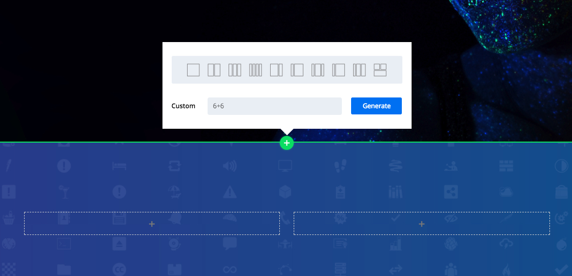
To create the image grid, first we are going to create a column structure with two columns. In that case we have to input 6+6 and generate a two-column layout.
Now add the addon to the columns. In this case, we have added the SP Page Builder Image addon to the columns. (You will see a placeholder image in the addon every time you add it to a row/column.)
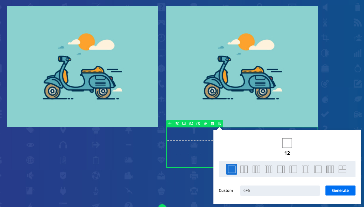
Now we have to add another row inside the second column. Click on the column setting icon. Now select "Add Inner Row" option from the drop down menu.

This generates 6+6 column structure in the newly added row to get the full structure.
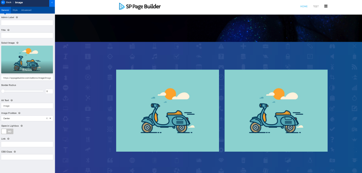
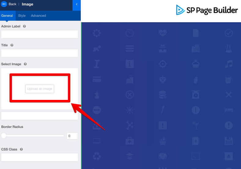
Now add the Image addon to the newly added columns. Then we need to add the images using the addon. Click on the edit addon icon to get access to the editing panel of SP Page Builder 3.
In the General tab, go to the option "Select Image". Click the button "Upload an image". Use the media manager of SP Page Builder 3 to upload and insert your images. You have to follow the same procedure for all the added Image addons.
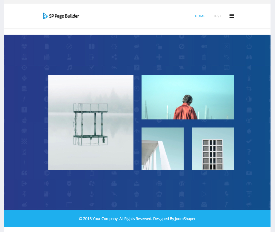
This is how it finally looks after adding all the images.

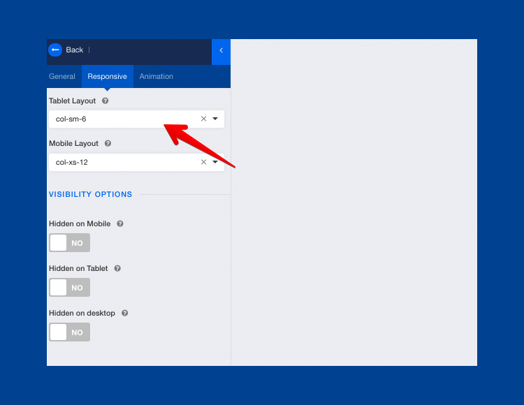
Now we have to make it responsive for tablet and mobile devices. For tablets, we have adjusted the tablet layout of every image. To do that, click on the addon settings icon. Select Column Options from the drop down menu.

Now click on the Responsive tab and enter the tablet layout grid. For the first image, we have selected col-sm-6. For the second image, we have selected col-sm-12 and for third and fourth image we have selected col-sm-6.
After all these adjustments this is what the tablet layout looks like.
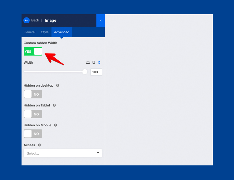
For the mobile version, we have selected the mobile layout to col-xs-12 for all the images. Also, in the Advanced tab of edit column setting, we have adjusted the custom column width.
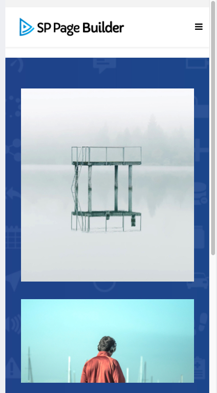
And this is what the mobile version looks like.
So, this is how you can create amazing fully responsive image grids with SP Page Builder 3. Please note you might have to choose images very carefully and resize them accordingly to make them fit for the grid layout. Meantime, if you feel glitches we are here to help you. We will add more amazing tips and tricks to our coming posts. If you have any suggestions regarding our products please feel free to use the comment section below. We feel double time inspired seeing you connected with us.


sp pagebuilder travel system https://www.meisturizm.com.tr ;)
Thanks :)