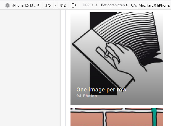
Hello dear developers, the title in the sp easy image gallery is displayed too large in the mobile view of a website. as a result, when several galleries are displayed simultaneously on a mobile phone, the titles overlay the icons so that they can no longer be selected.
My gallery test page is called 2dgrafik.de and instead of title names I used dots as a title to work around the problem. lowercase title names would be better for me than points. do you have a css-script with which you can change the size of the title font of a gallery?
Staff replied
Extensions
sp easy image galerie
2 replies

Paul Frankowski Senior Staff
3 years ago
· edited
Hi Wolfram,
Indeed everything can be improved and fixed. Don't worry.
Let's start with that custom CSS:
 @media screen and (max-width: 680px) {
 .speasyimagegallery-col-xs-3 {width: 50%;}
 .speasyimagegallery-album-info {padding: 20px 10px;}
 .speasyimagegallery-album-title {font-size: 14px; letter-spacing: 0;
 color: white; font-weight: normal; text-shadow: 0 0 2px #555;}
    }
It will allows you to use album titles that should be visible (2-3-4 words) and 2 images per row.
Use it inside template options > custom code > custom CSS or inside file custom.css , as we informed in Helix documenation.
Paul Frankowski Senior Staff
3 years ago
· edited
if you don't want 2 images side by side on mobile view, but just one, in my code change value from 50% to 100%
Okay :)
Log in to reply.