
Hello there,
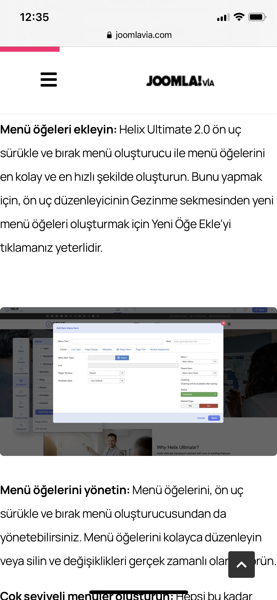
The article articles appear wide on the screen on the mobile device. As seen in the picture below
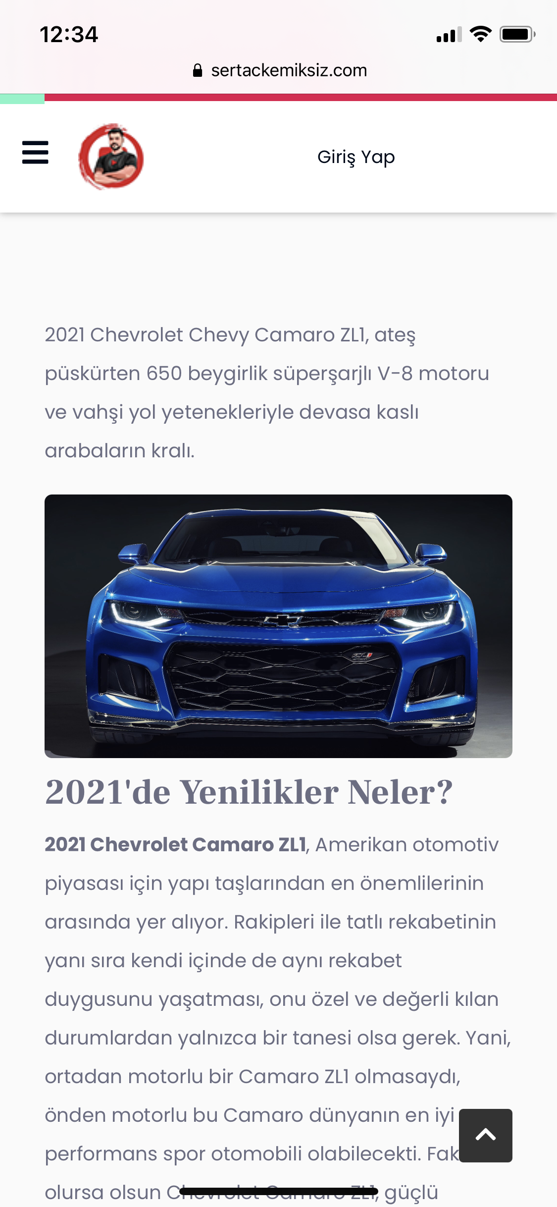
The picture below is an example from another site. Article articles and images look good on the screen
Hello there,
The article articles appear wide on the screen on the mobile device. As seen in the picture below
The picture below is an example from another site. Article articles and images look good on the screen
This code is the cause. By default, there must be 15px. Perhaps you changed it. If not, correctly, as you need and place in the custom.css file.
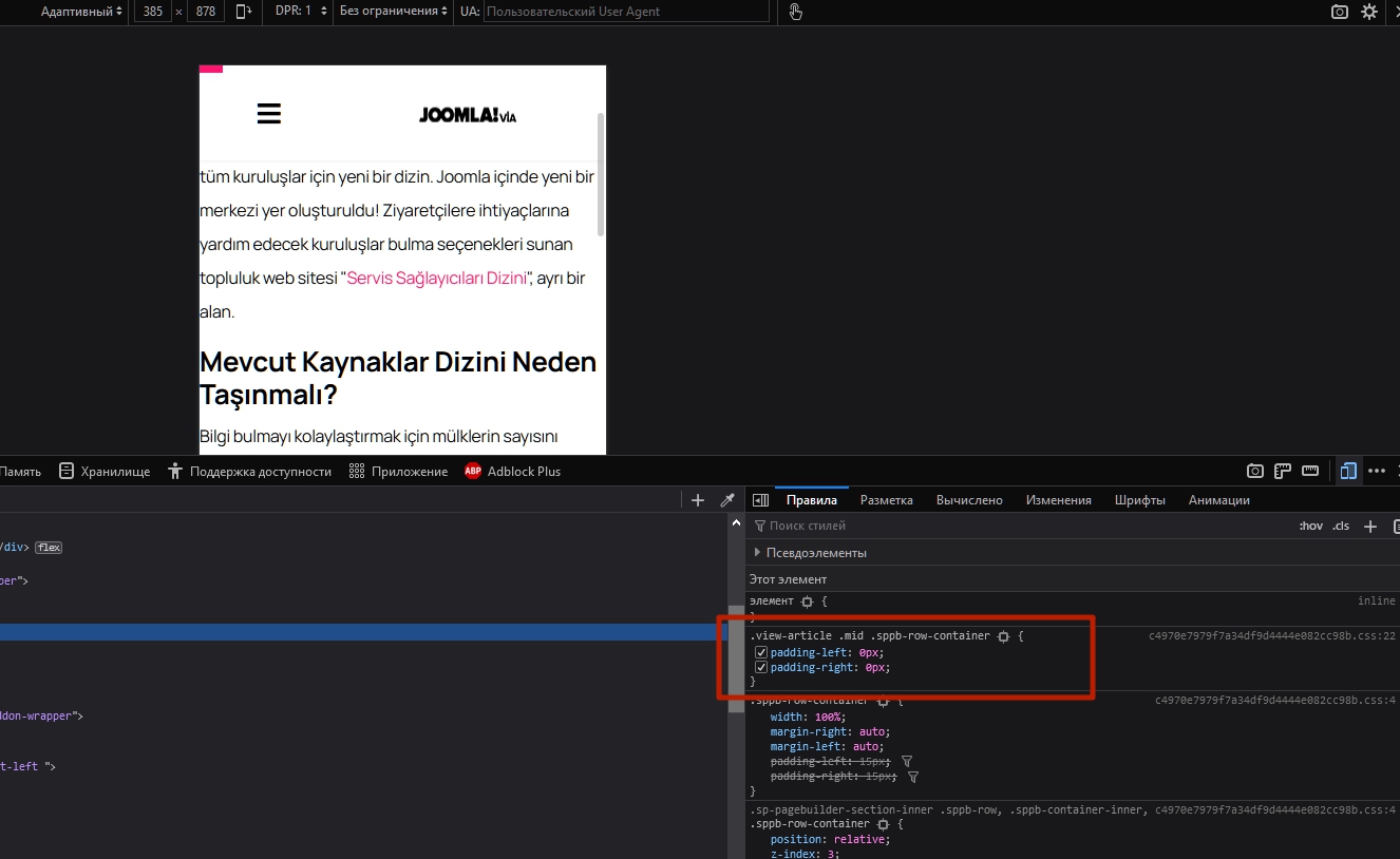
.view-article .mid .sppb-row-container {
    padding-left: 15px;
    padding-right: 15px;
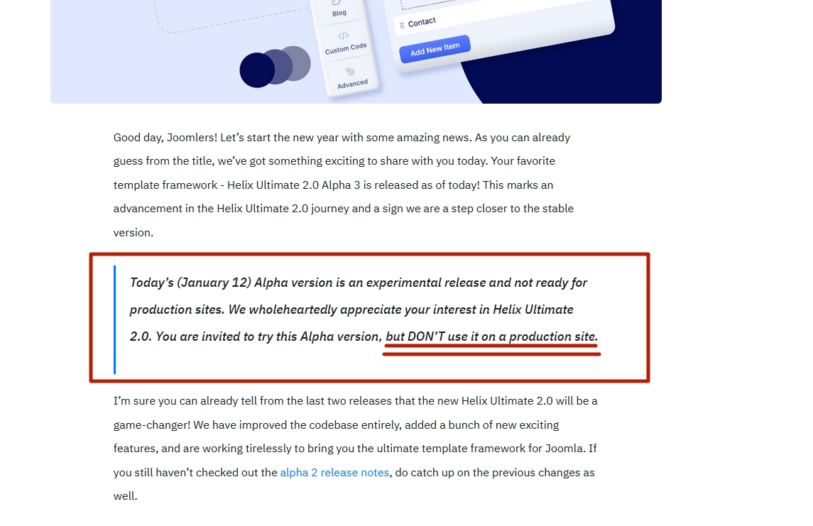
}Hi. Have you seen this warning?
Hello Pavel
Yes I know the warning. I am not using Helix Ultimate 2.0 Alpha 3. I am using the theme here Wimble
Thank you for helping
You are wellcome
Thank very much "Pavel". You are awesome. Loved the support.
It seems that your issue is resolved. Thank you, Pavel for your contribution to the user community. Have a nice day, guys!
Best regards