

Pitech Questions Safari Hamburger - Icon Problem And Arrow Scroll Up No Show In Block
Puntje
i have some problems. see questions belows
1 Sometimes the burger icon does not show https://www.youtube.com/watch?v=C3Ib_9ALoSY
2 Also the arrow is gone on the index and blog pages of scroll up button - see below for link youtube https://www.youtube.com/watch?v=rrwGPyS6SpE

Toufiq
Accepted AnswerHi there,
Thanks for contacting us. Sorry for the inconvenience. Will you please provide me the FTP access to check the issue? I will check & get back to you soon.
-Thanks
Puntje
Accepted AnswerHi toufiq thanks het hamburger icon is showing.
i saw one problem on mobile and desktop that the cross in off canvas is not showing https://prnt.sc/nTWQZA-5oFWj
Puntje
Accepted Answeri will do. some are great - others the hamburger is not showing on check in browser
https://prnt.sc/Kv-LdsnBsurU https://prnt.sc/qr6TKJw_DFlw https://prnt.sc/ckTVRS7LVrdA
Also logo on top is not always correct ligned out. see above. The cross is showing on mine mobile
Puntje
Accepted Answerthanks the icon hamburger is showing. Only the header menu and logo desktop is not below see screen movie
Toufiq
Accepted AnswerPuntje
Accepted AnswerI did. i work on mac os monterey on safari and chrome. i think a problem in apple mac os with safari and chrome. i do not know why it is. a bug
this mine video with safari and chrome
Puntje
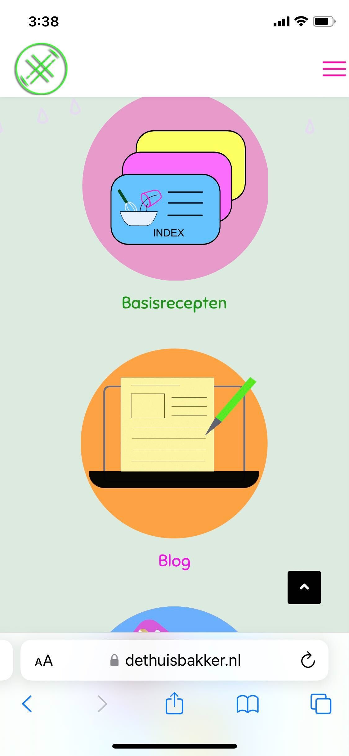
Accepted Answeri did. Some logo problem and one time the hamburg icon not on the wright place see movie. Also the arrow in the blog and in the receptenindex scroll up is not showing. The other pages what are not blog indexen - there the arrow is showing safari and chrome. Both are in the movie
Puntje
Accepted AnswerIt also not good on computer.
for link see below - how the logo must be
something is change it the other website i made - backup it and put it back on the wright domain
Also the blog pages the scroll up - Go to top has now ^ in it!
.sp-scroll-up {
display: none;
position: fixed;
bottom: 30px;
right: 30px;
width: 36px;
height: 36px;
line-height: 36px;
text-align: center;
font-size: 16px;
color: #fff;
background: #000;
border-radius: 3px;
z-index: 1000;
}
i think this must change - but i will not work - when i put this in custom
.logo-image {
height: 120px;
margin-top: 80px;
}
.logo-image-phone {
height: 120px;
margin-top: 80px;
}iphone se hamburger-icon. https://prnt.sc/HZPS9Nm-dxRk
Puntje
Accepted Answeri did - still the same in safari browser witj logo
but the scroll up is good in the browser of te blog pages. how did you change that
Toufiq
Accepted AnswerPlease watch the video.
Puntje
Accepted AnswerScroll menu works i mean the logo is not working with below code - see images how it must be - it does not work - when i put the code in
.logo-image {
height: 120px;
margin-top: 80px;
}
.logo-image-phone {
height: 120px;
margin-top: 80px;
}
Puntje
Accepted AnswerThe logo must be - margin-top: 80px; - lower. It also must be like this.
This code does not work in custom in template https://prnt.sc/rwEedwSHcWDJ
.logo-image {
height: 120px;
margin-top: 80px;
}


.logo-image-phone {
height: 120px;
margin-top: 80px;
}Puntje
Accepted Answerwhere must i remove it in template.css.
https://prnt.sc/etVr1Dd9Kzlg there are no line numbers in template.css. only 2. I tried to delete the 120 but then there is no logo
In custom css in will not work: margin-top: 80px;
/* logo*/
@media screen and (max-width: 900px) and (min-width: 320px) {
    #sp-logo {
        flex: 0 0 80%;
        width: 80%;
    }

.logo-image {
margin-top: 80px;
}

@media screen and (max-width: 900px) and (min-width: 320px)
.logo-image-phone {
margin-top: 80px;
}

    #sp-menu {
        flex: 0 0 20%;
        width: 20%;
    }

#sp-header {
    height: 60px;
    display: inline-flex;
    margin: 0;
    align-items: flex-end;
}
}


.offcanvas-menu .logo {
 display: none !important;
}

/*off canvas*/
body.ltr.offcanvs-position-right.offcanvas-active .offcanvas-menu {
right: 0;
background: #CCD6FF;
}

.offcanvas-menu .offcanvas-inner .sp-module ul > li a, .offcanvas-menu .offcanvas-inner .sp-module ul > li span >li:nth-child(3n) > a {
color: #000000;
}

.offcanvas-menu .offcanvas-inner ul.menu>li {
font-weight: 200;
}

.offcanvas-menu .offcanvas-inner .sp-module ul > li a:hover, .offcanvas-menu .offcanvas-inner .sp-module ul > li span:hover, .offcanvas-menu .offcanvas-inner .sp-module ul > li a:focus, .offcanvas-menu .offcanvas-inner .sp-module ul > li span:focus {
color: #E597E5;
}

/*header*/

.sp-megamenu-parent>li.active>a {
font-weight: 400;
}

.view-article #sp-header {
background-color: #ffffff;
}

#sp-header {
    background: #ffffff;
}

.sp-megamenu-parent>li>a, .sp-megamenu-parent>li>span {
display: inline-block;
padding: 0 15px;
line-height: 100px;
font-size: 22px;
margin: 0;
letter-spacing: 1.6px;
  font-family: 'Sniglet';
}

#sp-menu.menu-center .sp-megamenu-wrapper {
justify-content: right;
}

#sp-header.header-sticky {
position: fixed;
z-index: 9999;
top: 0;
left: 0;
width: 100%;
animation: spFadeInDown 0.5s;
background-color: #ffffff;
}

/*bottom*/
#sp-bottom {
margin-top: -20px;
}

#sp-bottom {
padding-left: 40px;
padding-right:20px;
}

#sp-bottom .sp-module .sp-module-title {
color: #21a616;
font-size:24px;
}

#sp-bottom .sp-module ul>li>a {
color:  #fff;
font-size:16px;
}

#sp-bottom .sp-module ul>li>a:hover {
color: #f7f606;
}

#sp-bottom3:after {
background: none;
}

/* titel*/
.sp-page-title:before {
background: #eb953f;
}

.sp-page-title {
background-color: #eb953f;
}

.sp-page-title .sp-page-title-heading {
font-weight: normal;
font-size: 56px;
line-height: 75px;
font-feature-settings: "case" on;
color: #252525;
width: 85%;
}

.sp-page-title {
padding: 200px 0px 5px 0px;
background-position: 50% 50%;
background-size: cover;
background-repeat: no-repeat;
position: relative;
}

/* blog */
.article-intro-image.float-left img{
 border-top-right-radius: 15px; border-top-left-radius: 15px;
border:1px solid #000;
}

#sp-main-body {
padding: 80px 0;
background: #fff9f7;
}

.blog-list-title-wrap {
display:none;
}
.com-content.view-category .article .article-body {
flex-direction: column;
background: #dadada;
border:solid 1px #000;
border-radius: 15px;
padding-top: 40px;
margin-top: -85px;
}

.article-list .article .article-header h1 a, .article-list .article .article-header h2 a {
color: #252525;
}

.article-list .article .article-header h2 a:hover {
color: #d929c7;
}

.com-content.view-category .article .article-header h2 {
margin: 0px 0px 24px 0px;
font-weight: normal;
font-size: 20px;
line-height: 30px;
padding-top: 70px;
padding-left:17px;
padding-bottom:10px;

}

.com-content.view-category .article {
padding-left: 10%;
padding-right: 10%;
}

/*footer*/
#sp-footer {
padding-left: 30px;
}

#sp-footer1 .sp-copyright {
color:rgb(222, 113, 211);
}

#sp-footer1 .sp-copyright {
font-size: 15px;
}

#sp-footer .container-inner {
padding: 0px 0;
border-top: none;
}


/* burger-icon - off canvas */
.burger-icon>span {
background-color: #ff00a6;
}

.fab, .far {
display: none;
}

.offcanvas-active .burger-icon>span, #modal-menu-toggler.active .burger-icon>span {
background-color: #eb1e9d;
}

body.ltr.offcanvs-position-right.offcanvas-active .offcanvas-menu {
right: 0;
background: : rgb(204, 214, 255);
}

/*body*/
.article-social-share .social-share-icon ul {
display: none;
}


@media only screen and (min-width:990px) and (max-width:1290px){
.sp-megamenu-parent{
 position:relative !important;
 bottom:100px;
}
}

#sp-bottom .sp-module .sp-module-title {
margin: 0 0 15px;
}

.com-content.view-category .article {
margin-bottom: 40px;
}Puntje
Accepted AnswerMobile is good. where did you change it. so i can mobile more height. Also on tablet and computer it must have a margin - so i hope to learn where you changed this.
Thank you
Puntje
Accepted Answerin template.css or other css. i cannot find in the template.css in site template settings
Toufiq
Accepted AnswerPuntje
Accepted Answeri did but i do not see the change you made in custom.css
Mine code does not work in custom.css of the template
.logo-image {
height: 120px;
margin-top: 110px;
}Puntje
Accepted Answerfor the normal pages it works! But the blog the menu in the header is not on the wright place - see image lightshot
Puntje
Accepted Answerthanks - the menu is in the header
the title must have a higher margin or padding for mobile and tablet - see images below.
Puntje
Accepted AnswerIt must be the same. now there is a little mistake in it see below a gap
Logo not on the right place and there is a white gap that between header and image https://prnt.sc/hEs4F2i9OAcf https://prnt.sc/ik6zqx2xdbcR
white gap that between header and image https://prnt.sc/JsXtrm2p5eTZ https://prnt.sc/dbVQTWvTCzG5
it must be like this - but is different because of the mobile ipad device of little screen https://prnt.sc/699JPTgm3aSh
Puntje
Accepted AnswerThanks
On one place a white gap between header and image -> https://prnt.sc/6p0_bO3iIjz0
On mine samsung A52 Happy
On the computer - switch to Macbook adaptive design mode - this gives an error - i work Mac Os Monterey 12.4 https://prnt.sc/6IsMVErJsW1T https://prnt.sc/TwU7fHlmotDk https://prnt.sc/WN6JqX5yyvlG
Puntje
Accepted AnswerHi i must ask mine friends with an ipad and iphone. I have android phone. But i must do it quitly, because one client is on mine facebook and he will get angry - because he is afraid his website get the same problems with logo and menu
On mine macbook it on this. The logo is not well placed. see images below
Puntje
Accepted AnswerHi thanks
Logo must be more like this https://prnt.sc/kLJUEgYsDVJM
More beautiful is above - Hopefully more the same same as above https://prnt.sc/ShFKWPhD6_3F https://prnt.sc/0wllwOLjTq6H
Puntje
Accepted AnswerLogo must be bigger on som parts- like this size - see below https://prnt.sc/CgAqSbSO97rq
or this -
https://prnt.sc/sObUY3PGJfNl if he goes from big to small
in the movie you see he becomes smaller the logo