

Center Logo Helix Ultimate2.0.0-alpha.5
T
Tomasz Michałowski
http://j1.cdx.pl/
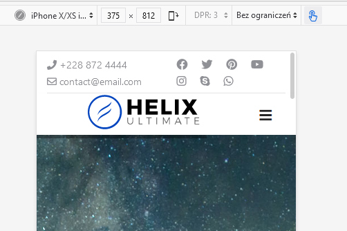
mobil version - does not center
How to do it ?
 code css not work ;-( #sp-logo, .sp-column, .logo, .logo-image { text-align:center !important;}
Website
https://j1.cdx.pl
4 Answers
Order by
Oldest

Paul Frankowski
Accepted AnswerHi,
- Change column width in mobile view, now logo has "6" like icon =. It means it's not possible to center.
- Set column size "10" for logo - for mobile view and "2" for logo column
- Use this custom CSS for mobile view only
@media (max-width: 580px) {
#sp-logo {margin: 0 auto;}
}
Efekt po
T
Tomasz Michałowski
Accepted Answerand where to set the point 1,2 . I added the code but it doesn't work
Paul Frankowski
Accepted AnswerTip for beginners:
- You have to use/create a custom header - not predefined. Exactly as it was it previous version of Helix. Predefined header you can disable in "Basic" - "Header" - "Predefined Header" : Off. Then you have full control over grid settings for all views (mobile/tablet/desktop).
But remember that it's still Alpha version (!) So maybe instead of point 0) - right now more advanced custom CSS is needed. For example:
 @media (max-width: 580px) {
 #sp-logo {
    margin: 0 auto;
    width: 80%;
    text-align: center;}
        }