

Carousel Pro Height For Each Screen Size

Vladimir
Hi! I'm using Joomla 4.2.3 and SP Page Builder Pro 3.8.8. Link: https://test.orthodonticscientist.org/
On homepage I'm using Carousel Pro addon and my images has size 1920px 1080px. I want to see my images with correct size for each screen size. For example, if I'll write Carousel height 1080px, on my laptop with width 1440px I see iamges with bad dimensions and size of images is 1440 1080 - it's not correct.
Of course, I can CSS media for images, I'll trying it. But my titles and bullets left at the bottom of the carousel.
How I can fix this issue? Thanks!
2 Answers
Order by
Oldest

Pavel
Accepted AnswerHi Vladimir.
First thing. The code located below overrides the code located above. Thus in your code is an error. You need to change this in places.
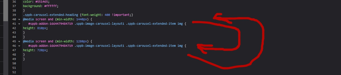
The order of the media queries should be like that
/* Breackpoints */

/* Desktop First Approach */
@media (max-width: 1399px) {}
@media (max-width: 1199px) {}
@media (max-width: 991px) {}
@media (max-width: 767px) {}
@media (max-width: 575px) {}

/* Mobile First Approach*/
@media (min-width: 576px) {}
@media (min-width: 768px) {}
@media (min-width: 992px) {}
@media (min-width: 1200px) {}
@media (min-width: 1400px) {}
Always place the media queries separately from the main code at the very bottom.
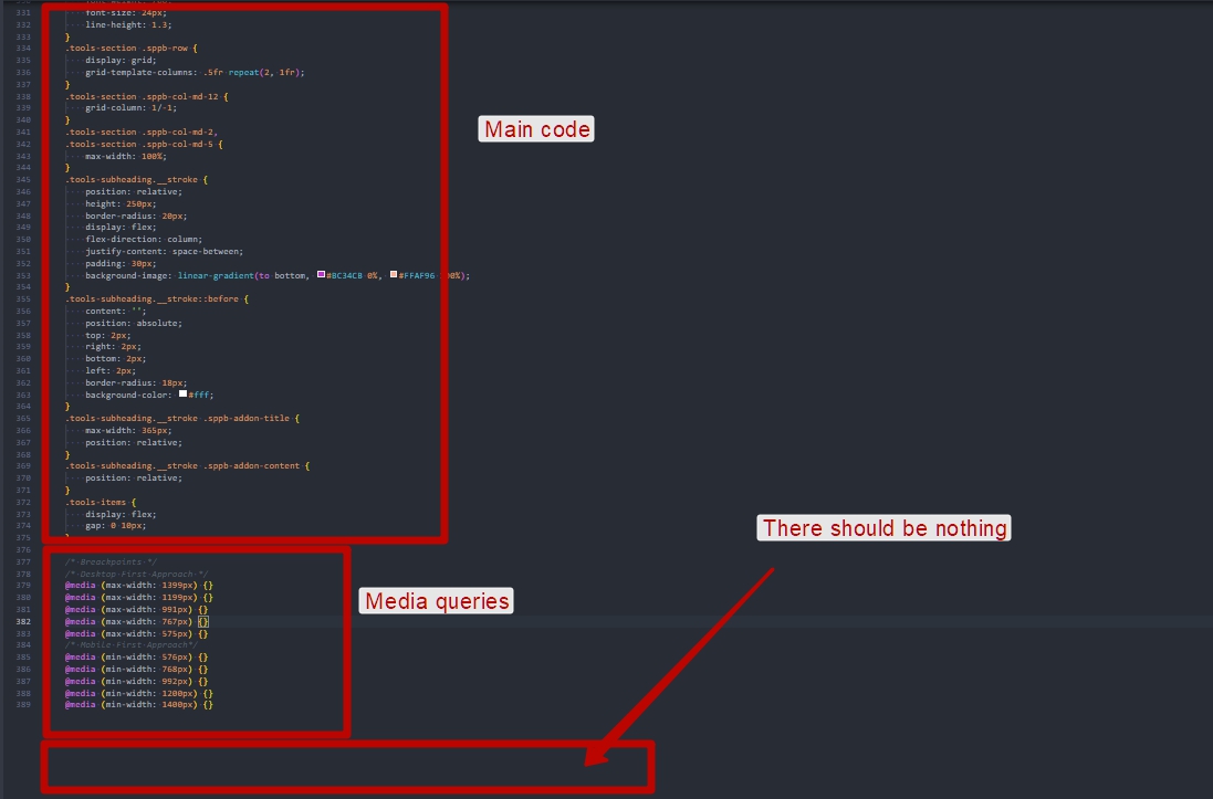
But this is just an academic council for you to know how CSS works. In your case, this is not the right approach and all your code for image height should be deleted.
Second thing. Use ID in your code only if there is no other way out. Each addon has a CSS Class field. Fill it and use your class instead of ID.
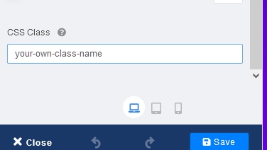
Third thing. Try this code (using your own class name)
.your-own-class .sppb-carousel-extended-outer-stage {
    height: calc(100vh - 70px) !important;
}
.your-own-class div.sppb-carousel-extended-dots {
    bottom: 30px !important;
}