

Column Breaks
MK
Michael Koerner
so i have my portfolio page and my small 4-column layout portfolio on the home page. My question is, how can i specifiy that on certain device dimensions, i can have two columns instead of 1 on smaller devices. Just for the portfolio sections?
Thanks in advance!
7 Answers
Order by
Oldest

Paul Frankowski
Accepted AnswerThx.
So by default, from settings you can use those options
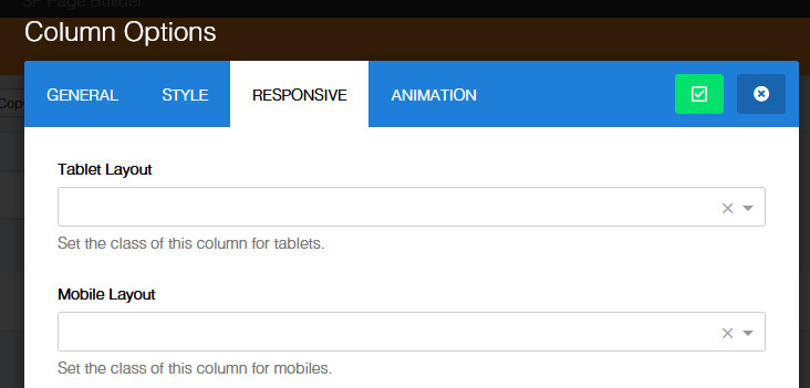
So if in Desktop you have 4 columns, you can set col-xs-6 (Mobile Layout) for each column inside the Row to have 2 columns in mobile view. Like you want.
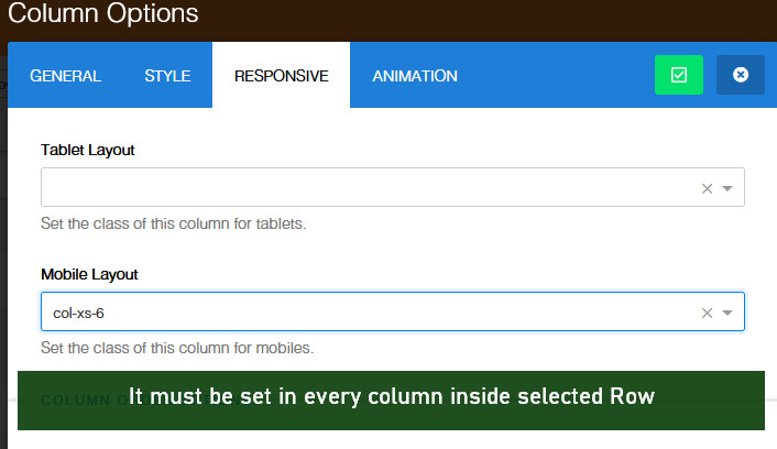
I hope you know from Bootstrap - grid based on number 12, 6+6, 4+4+4 etc.
Paul Frankowski
Accepted AnswerHi Michael,
by now only via Custom CSS you can override default grid for mobile devices.
Paul Frankowski
Accepted AnswerBelow custom CSS may help
  @media only screen and (max-width: 480px) {
.sp-simpleportfolio .sp-simpleportfolio-items .sp-simpleportfolio-item
{width: 50%; padding: 5px;}
}
MK
Michael Koerner
Accepted AnswerI'm not using Simple Portfolio though. I'm using just the Image Overlay that comes with the Page Builder.
Paul Frankowski
Accepted AnswerYou could tell that at fist post ;/
- What SPPB version you have?
- We talk about Columns in Rows, or layout of single Image Layout addon ?
- Share URL !
MK
Michael Koerner
Accepted AnswerHello Paul:
Thank you for your response. I'm using SPPB Version 3.8.9.
I'm also refering to columns within rows, not the single image layout.
The URL is here