

Image Size Within Slider Not Working

Cristina
hi, as im working further with my sliders i came up with another issue that wasnt at all before last sp. builder update. Ine the slider i have pics normally i could change the size of those, i have three different ones, idk how to fix this and personally i feel that the constant changes in the css only make things worst.
One more thing when i change the size of the images at the sp builder it shows once i save it and check the preview it doesnt shows that the size of the image has been changed at ll.
before the last update things worked much better and less messing around with the css as it is now, guys please check this and with the next update try to make things easier and not more complicated please please please
see here the link to the website
thanks in advance
27 Answers
Order by
Oldest

Pavel
Accepted AnswerAnd additionally. This code will only work in live viewing. In the editor, everything will be crooked. But do not pay attention to it. The main thing is live viewing.
Cristina
Accepted Answerguys whats going on? since the last update i have a lot of trouble with images and sliders which is very frustating since they worked fine before, is like nothing works as before and thats not whats this is meant :(
any chance this is getting solved and i get help please ?
Pavel
Accepted AnswerHi Cristina.
Slideshow Addon never worked normally (especially in the aspect of the size of the images), it has the same bugs that have been from birth. Nothing has changed, nor improved nor worsened from the 3rd version. Perhaps you just didn't notice it before.
My practice of working with this addon - I add my own classes everywhere where it is possible in the settings and set up everything only through CSS. Which is more flexible, faster and gives possibilities which there are no from the box
Cristina
Accepted AnswerHi Pavel, thank you so much for your answer, it might be indeed i didn't saw it bc i see tha changes in the backend. weird that they havent fixed this as it is imo essential in many addons. i have tried the css yet i havent been lucky yet is there maybe a way you can guide me a bit with it please?
thanks in advance
Pavel
Accepted AnswerOk.
Add your own class name to the image item.
Example from SPPB 3. In SPPB 4 should be the same class field.
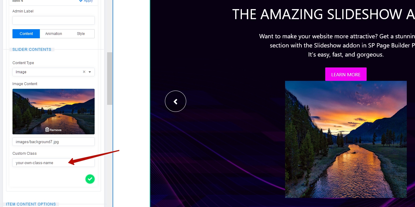
Then ispect code to find your class for purpose to create composite selector to appeal to the image.
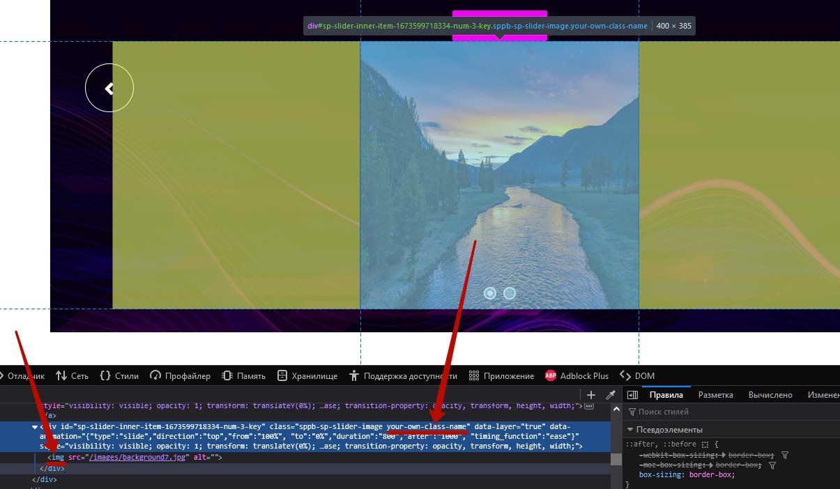
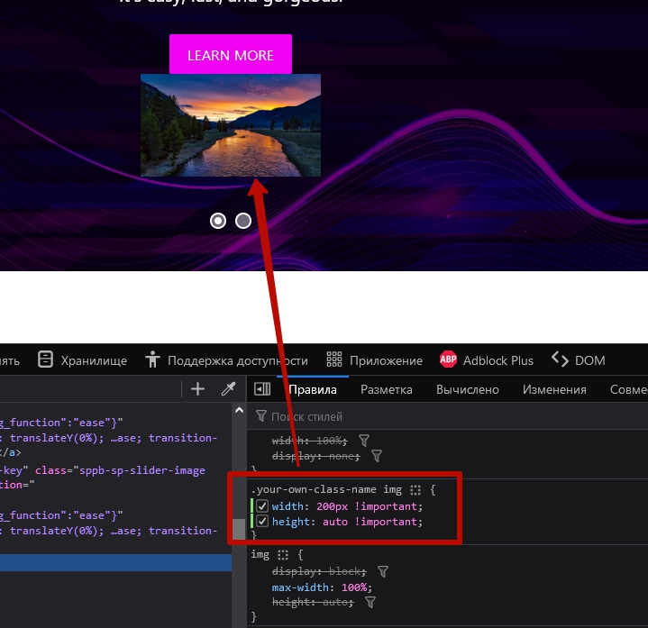
Composite selector from my example will be .your-own-class-name img as you can see on screenshot.
So now you can use it in your code.
Example:
.your-own-class-name img {
    width: 200px !important;
    height: auto !important;
}
The same principle with any other elements that have a class field.
Cristina
Accepted Answeroh my lord !! thanks so so much Pavel!! you have no idea how happy i am rn!!!
Cristina
Accepted Answer@Ofi Khan, guys please solve this issues that have ocurred since the update to spbd 4 those adjustements that were possible before and that now cause so many issues are unnecessary.
Cristina
Accepted Answer@Ofi Khan at the fb page reacted to this issue after Kawshar annouced the upcoming changes and her replied me to note this and pass it to the dev. team so here i do it so it wont get lost in the forum even tho the issue is "solved" with the fantastic help of Pavel, it isnt solved with the last update. The problem with the image size in the slider remains and also the slider size isnt working properly the slider height custom size doesnt work as soon as you choose that the whole slider disapears, the preview option isnt an option bc those changes that do show there do not show in the live version of a website.

Ofi Khan
Accepted AnswerIn my testing, there is no issue with Custom Height
Can you please share image size issue with screenshots? I will share this thread with the developers to check.
Cristina
Accepted Answer@Ofi im going to give you access so you can see it maybe is a bug yet i have alwayd updated things on time and properly
Ofi Khan
Accepted AnswerThanks for the access. But I could not clearly understand the issue.
- In the item image, there is no option to set width or height. Is it the issue?
- The frontend and preview does not look the same. Is this your issue?
Cristina
Accepted Answerhi Ofi
- there is the option window height or custom height yet I can only use the window height as soon as i use cutom one it dispears. i have tried with new add on and template it doesnt matter
- also the image within a slider cant adjust the size, i cant adjust the images size at all even if i change the css now it wont show the size i want...
is driving me nuts, anyone?
Cristina
Accepted Answerhi @Ofi yesterday i created a new database and submap to test a while new "websire" to see if the bug is in my template and it is not i used the newest template you guys released the sphere template and it happens there too, i cannot adjust the slider height nor i can adjust the image size in it. have tou had a chanve to login and see for yourself what i mean? please help me with this i have been fighting this long enough by now, also since last update the rounded corners for images are gone too. please help :(
Ofi Khan
Accepted AnswerSorry, your given credentials do not match. Please check and share again. I will check the slider height issue on your end.
Ofi Khan
Accepted AnswerPlease check the page (in the hidden content). Custom Height is working properly.
I have forwarded slider content image issue to the developer team.
Cristina
Accepted Answer@Ofi and the joomshaper team, after fighting witht the slideshow for a long time i found out what the problem is. I contacted the apple support since I have a mac computer with 24 inch screen after going through all the settings and didnt find a cause for this, we went through another steps and while doing so I made my safari screen smaller, btw i tried it too with google chrome, and firefox... and.... the slideshow appeared which means the issue is that the settings of the SPB cant cope with bigger screens and therefore you guys need to come up with a solution for it. I understand this doesnt have a huge priority yet it is an "issue" that needs to get solved to, you guys are rn in the right direction by adding more device sizes which im very thankful as I was struggling with addons for bigger tablets and ipad pro.
All and all im happy I found out what the issue is and that I could share it wiht you as we all are in this together and if we can help each other it only makes it easier for everyone.
Hopefully you guys can solve this soon and lots of love, Cristina
Cristina
Accepted Answer Pavel
Accepted AnswerHi Cristina. Add your class to the slide show addon and use the following code for correction.
@media (min-width: 1920px) {
    .YOUR_OWN_CLASS .sp-slider-outer-stage {
        height: 500px !important;
    }
}
Set height value as you like.
Slide Show Addon, unfortunately from the very first release, has always been very buggy. Therefore, most of its settings can be forgotten and instead set up everything through CSS. And by the way, in my opinion, this is more convenient and more accurate control, even if the settings worked. Especially headache with sp-slider-outer-stage, which has other bugs on mobile devices that you have not yet noticed. Therefore, the height of this block at the breakpoints is always better to control only through CSS, but not through settings.
These problems have been reported for several years. But unfortunately, the team does not fix this.
Here is full CSS snippet to control sp-slider-outer-stage height at all bootstrap breakpoints:
/* Mobile First */
.YOUR_OWN_CLASS .sp-slider-outer-stage {
    height: 500px !important;
}
@media (min-width: 576px) {
    .YOUR_OWN_CLASS .sp-slider-outer-stage {
        height: 500px !important;
    }
}
@media (min-width: 768px) {
    .YOUR_OWN_CLASS .sp-slider-outer-stage {
        height: 500px !important;
    }
}
@media (min-width: 992px) {
    .YOUR_OWN_CLASS .sp-slider-outer-stage {
        height: 500px !important;
    }
}
@media (min-width: 1200px) {
    .YOUR_OWN_CLASS .sp-slider-outer-stage {
        height: 500px !important;
    }
}
@media (min-width: 1400px) {
    .YOUR_OWN_CLASS .sp-slider-outer-stage {
        height: 500px !important;
    }
}
@media (min-width: 1920px) {
    .YOUR_OWN_CLASS .sp-slider-outer-stage {
        height: 500px !important;
    }
}
You can use not all Media Queries but do not change their order. Set height values at different breakpoints as you like.
Cristina
Accepted Answerhi @Pavel you are amazing im gonna try it now, can i ask you a question i have a post in the forum bc my website donedr scroll smoothly and idk why, maybe you have an idea bc no matter what i try nothing works and im anout to start my website from scratch :(
Ofi Khan
Accepted AnswerI also get this now, Cristina. It is a bug that the setting does not apply on the bigger screen. Developer have been working with this bug and will release the fix soon.
JG
Jeff Geisler
Accepted AnswerHello, Sorry to jump on this old thread but I am having the same problem with my slider pictures the bug in the setting that does not apply on the bigger screen. Has the bug been fixed yet?
Ofi Khan
Accepted AnswerHello Jeff Geisler,
Thank you for reaching out to our technical support forum. I’m sorry to hear about the trouble you’re experiencing. Rest assured, I will look into this issue for you and work to resolve it as quickly as possible.
Please post a new question regarding your issue. We will check and help you.
Best regards