

Off-Canvas Not Shown On Mobile
MH
Manfred Hahn
Hello, on the mobile the menu-item (three bars) is not shown. In the preview of the phon it´s vorrect. if I type on the position, the menu is shown, but in different colours, as I set it up. page is www.turnverein-heilsbronn.de Canvas-menu is in the right supper corner (for typing)
5 Answers
Order by
Oldest

Paul Frankowski
Accepted AnswerHi Manfred,
I see [=] but your mobile logo is to high :( change settings.
Make sure that you clicked in Template Options > Advanced > Compile SCSS > CSS: Off / then On > Save settings between.
Paul Frankowski
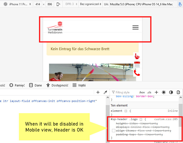
Accepted AnswerYour custom CSS make some mess in mobile view
#sp-header .logo {
  height: 110px !important;
  display: inline-flex !important;
  align-items: flex-end !important;
  padding-top: 5px !important;
}
If any ... this should be used only for Dekstop view, please correct into that
@media screen and (min-width: 990px) {
#sp-header .logo {
  height: 110px !important;
  display: inline-flex !important;
  align-items: flex-end !important;
  padding-top: 5px !important;}
    }
Then it should be better in Mobile view, trust me.
Paul Frankowski
Accepted AnswerLook at your site with virtual disabled classes from custom.css file.
Alles klar?