

Can The Main Menu Be Split To Allow A Logo In The Centre?
Dina Abramson
Hi,
My customer would like her logo to be placed in the center of the main menu. Is it possible to do this?
Her logo is currently on the left side of the header, nothing I have tried with the layout has worked.
Thanks for any assistance

Pavel
Accepted AnswerOr there is a way only using CSS with standart Logo and Menu positions from Helix. But this can cause problems with accessibility on Mac and iOS (this must be checked if you take care of accessibility)
@media (min-width: 992px) {
    #sp-menu,
    #sp-menu .sp-column,
    .sp-megamenu-wrapper,
    .sp-megamenu-parent {
        display: contents !important;
    }
    #sp-header .row {
        display: grid;
        grid-template-columns: repeat(8, 1fr);
    }
    #sp-logo {
        grid-column: 4/5;
    }
    #sp-logo,
    .sp-menu-item {
        grid-row: 1;
    }
}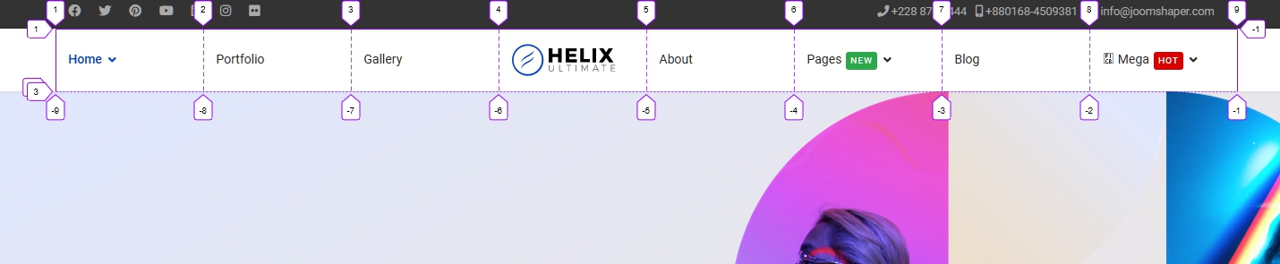
Values of properties grid-template-columns for #sp-header .row and grid-column for #sp-logo depends on the total number of menu items + logo
Dina Abramson
Accepted AnswerI should qualify what I mean by center:
HOME MEET THE TEAM | LOGO HERE | J.A.I.K.S BLOG CONTACT US
Thanks.

Paul Frankowski
Accepted AnswerHi Dina,
it request php code customization in custom header (if megamenu must be on both sides), or install one of those templates:
Pavel
Accepted AnswerHi... Or create | LOGO HERE | menu item and use it for displaing logo image. And a little CSS to bring this to the right appearance.
Paul Frankowski
Accepted Answer@Pavel indeed.
On the left side can be classic Helix Menu, then Logo, and Menu module on the "right" side. Custom Header created in Layout may look like that:
Menu | Logo | top3
Of course menu module published on the "top3" (or different name) would NOT have MegaMenu features. SO you have to consider if you need MegaMenu on left or right side. And yes, extra CSS styling may be needed for extra Menu module - this is classic webmaster task!
Pavel
Accepted AnswerI meant only the central menu item as a logo. Without top3 and menu module
<menu> item1 | item2 | item-Logo | item3 | item4 </menu>
In this case, all the functionality and appearance of the menu will remain.