

Helix Ultimate Multi Rows Header
Matt Hunt
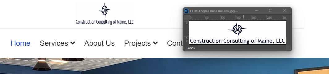
How can I adjust the width of the logo when using the Multi Rows Predefined Header? I've got a rather wide but short logo image to use, but the template is squeezing/distorting it.

Mehtaz Afsana Borsha
Accepted AnswerHi
Thanks for contacting us. Could you please give me your site URL and also screenshot of your issue? So that I can check.
-Regards.
Matt Hunt
Accepted AnswerHi, The template isn't live yet, but the url is https://ccofmaine.com Here is a screenshot with what the logo should look like on the side https://ccofmaine.com/images/Screenshot_2023-10-31_070606.png
Matt Hunt
Accepted AnswerThe client changed thier mind, so I don't need the anser for this site. I would like to know how to address it in the future though. If possible
Matt Hunt
Accepted AnswerI'd like to see if we could figure this out, please. I've another client that I would like to use the multi-row header with, but it again has a wide image/logo for use on the top row. The predefined header however is squeezing it down considerably. Please see the image "Vassalboro Sanitary District". That image should be 50x850.

Mehtaz Afsana Borsha
Accepted AnswerYou can use custom CSS for adjusting the logo. You can follow this blog below:
https://www.joomshaper.com/blog/which-line-of-css-i-have-to-edit-code-inspector-in-action

Pavel
Accepted AnswerHi. This can be solved through CSS only.
.logo-image {
    height: auto !important;
}
The width depend on the width of the Logo column.
Just to let you know. Logo settings in the template are completely suitable for SVG responsive image type only. Unfortunately, this is not universal. For any other types of images like SVG fixed size, png, jpg, gif, additional CSS coding may be required.
Matt Hunt
Accepted AnswerThat just made it smaller, but it is no longer distorted. How do I adjust the width of the logo column?
Pavel
Accepted AnswerHi. If you use predefined Header, then via CSS
Something like
#sp-logo {
    width: 300px;
}Matt Hunt
Accepted AnswerThanks, I also had to include margin:auto; to get the logo to center properly.
Matt Hunt
Accepted AnswerSorry to bother you again. It is looking perfect on the desktop, but on mobile the logo is pushed down on the Menu line and is squished again. Any chance there is css to keep that from happening?
Pavel
Accepted AnswerHi. Use media queries to change elements for different screens.
Here is all Bootstrap 5 media queries. Always place it at the very bottom of the CSS document.
/*Breakpoints*/
/* Desktop First */
@media (max-width: 1399.98px) {}
@media (max-width: 1199.98px) {}
@media (max-width: 991.98px) {}
@media (max-width: 767.98px) {}
@media (max-width: 575.98px) {}
/* Mobile First */
@media (min-width: 576px) {}
@media (min-width: 768px) {}
@media (min-width: 992px) {}
@media (min-width: 1200px) {}
@media (min-width: 1400px) {}
Example
@media (max-width: 767.98px) {
    #sp-logo {
        width: 100%;
    }
}