

Using Modul Position For Layout?
Susanne Hoischen-Taubner
I try to customize the Helix ultimate template with a custom header and a top-bar. In the top bar are thre modul positions (top1, top2 and user1). Top2 is used by social icons, user1 by contact info. (on mobile and tablet user1 is displayed in the footer). In mobile view I woult like to see the social icon in the center and I thought the top1 module could kind of "shift" top2 to the right. But this seems not to work. Will top1 only require room on the page if a module is linked to this position? How can I bring the social icon to the center on mobile and tablet? http://2024.rgzv-delbrueck.de/

Mehtaz Afsana Borsha
Accepted AnswerHi
Thanks for contacting us. Could you please give me a screenshot of your issue?
-Regards.

Paul Frankowski
Accepted AnswerHi Susanne,
Small offtopic, you used very heavy images, for example, background image (feather-pattern.jpg) has 12MB (!) and should have max 900kb. Please consider optimization for all used images. This is KEY to get good score in Google, and mobile users see all elements fast. Otherwise SEO speed disaster.
About your main question. If you created 3 columns in row (section) now you have to set their width in each view: Tablet, Mobile. Here is just example for header, but look and read "green box"
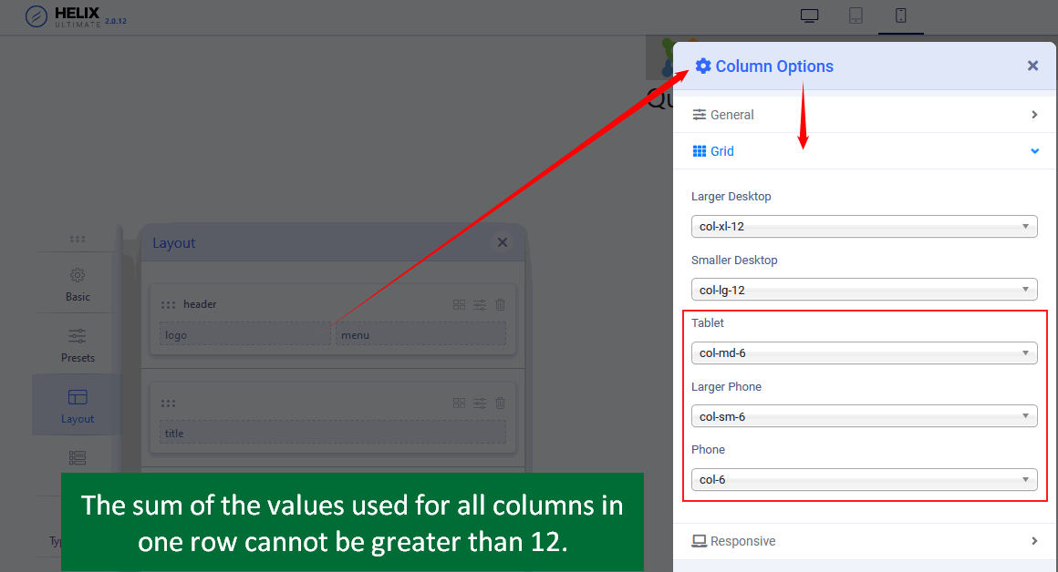
for example, if you want to keep 3 columns in tablet , you have to use col-md-4 for all 3 columns top1, top2, user1.
4+4+4 = 12, right.
Susanne Hoischen-Taubner
Accepted AnswerHi, thank you Paul for the hint on image size. I optimized that for all images.
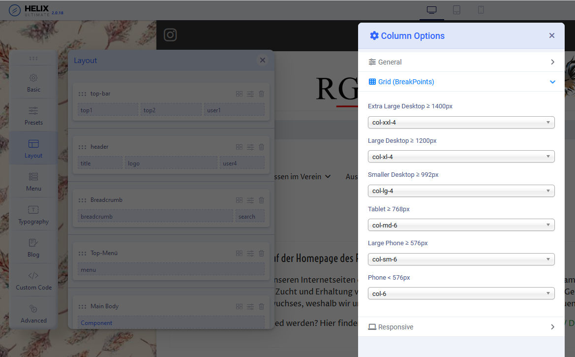
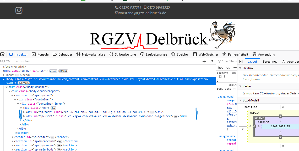
Regarding my "top-line" I already tried the grid colums but there is no change. I have thre columns with top1, top2 and user1. User 1 should not appear on tablet and phone. I switched this modulposition to "hidden" on phone and tablet. Therefore, I used col-md-4 for all 3 columns for the bigger screens and col-md-6 for top1 and top2 for the tablet and phone. I saved it and even switched the "Compile to SCSS to CSS" in the advanced section off and on (because I saw this somewhere). But the Instagram Icon is always to the left side of the top bar. Looking at the html with the "Page Inspector", there is no line with an id="sp-top1"... only lines for "sp-top2" and "sp-user1" - see on the 2nd Screenshot Is this because there is nothing assigned to that column?
Susanne Hoischen-Taubner
Accepted AnswerI created an empty custom module and assigned it to position top1. This way the Instagram Icon (the container with the icon) is placed more in the center. But still within the container the icon is on the left. Is there any option to center it? I would like to center my logo as well.
(Of course there has to be, because if I choose the predefined header with the top bar, then the icon is centered on phone and tablet...)