

Content Cut Off On Mobile
Diane
We are using a hero section on our home page and Equipment page:
On mobile, the text is getting cut off. Our logo is larger than the template logo, which I think may be causing the issue? In the template settings, I changed the header height to 150px. Otherwise the logo was overlapping the hero image.
Also, our logo looks good when the screen is higher than 1200px, but when it gets resized smaller than that, it gets blurry. Can you please advise on how to fix this?
Thank you.

Ofi Khan
Accepted AnswerHello Diane
Sorry, I could not properly get your issue. Please share a screenshot of your issue to understand it better.
Best regards
Diane
Accepted AnswerThis is desktop view - everything looks good: https://dianec16.sg-host.com/ms-desktop.jpg
When I resize my browser window, or view on a mobile device, the logo gets blurry and the heading text in our hero section gets cut off:
Ofi Khan
Accepted AnswerPlease use this CSS to Template Options -> Custom Code -> Custom CSS
#sp-main-body {
    position: relative;
    top: 150px;
}Diane
Accepted AnswerThank you, that fixed the issue with the text getting cut off.
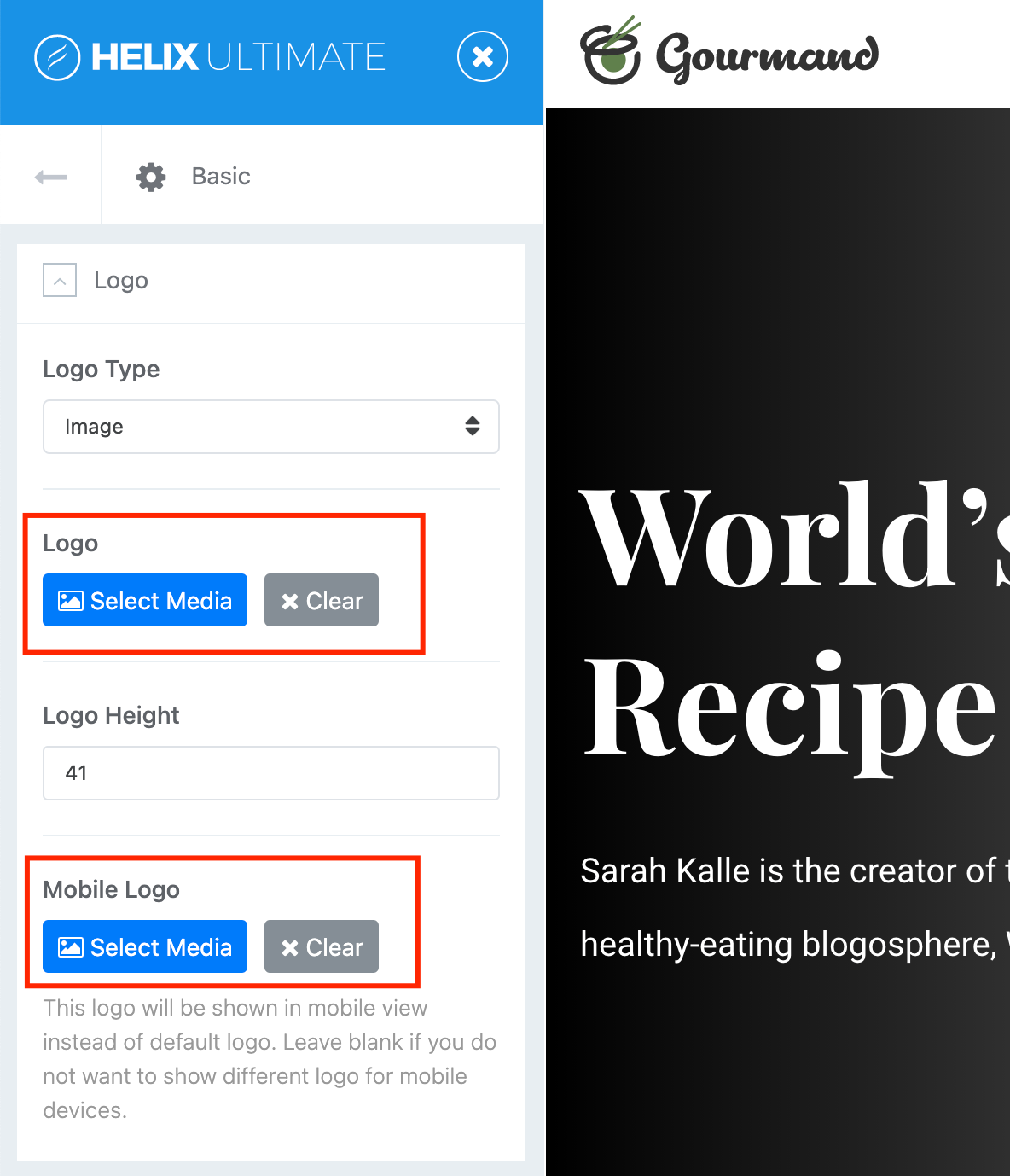
Regarding the images, I have a desktop version and a mobile version. How can I keep it from switching to the mobile version on my desktop when the browser window is sized down?
Ofi Khan
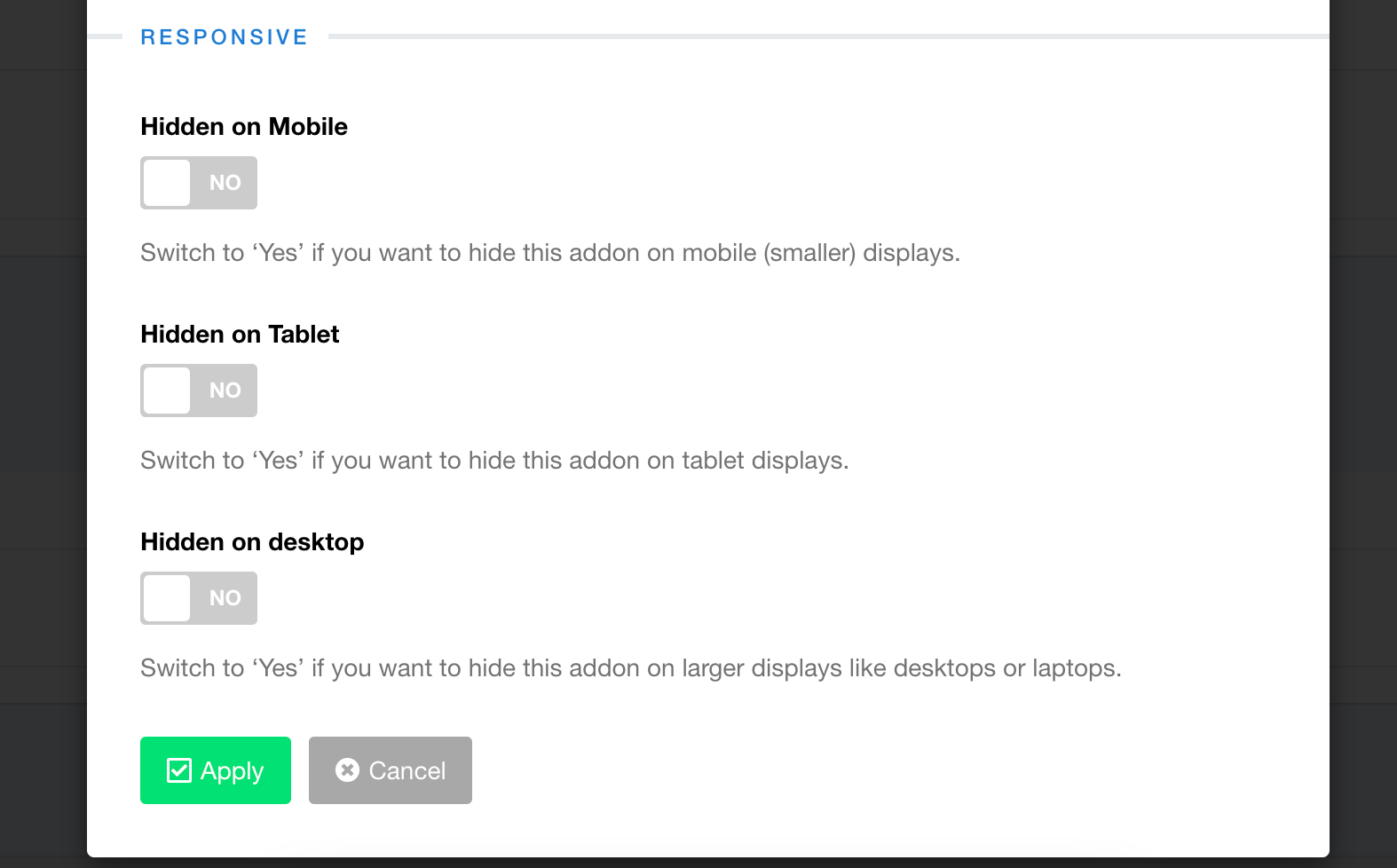
Accepted AnswerIn the row setting -> style, there is an option to hide row for desktop and mobile. Use that option.
Diane
Accepted AnswerSorry if I wasn't clear, I'm referring to our logo. I have a desktop version that is 130px high and a mobile version that is 260px high. On my desktop, when I resize the browser, the mobile version displays and it is blurry. How do I tell the template to display the desktop version of my logo when I resize the browser?
Ofi Khan
Accepted AnswerOh! You are talking about the logo. I think for desktop 260px works well and for mobile 130px works well. Have you uploaded two logos on Template Options -> Basic -> Logo?
Diane
Accepted AnswerYes, I have already set a desktop and mobile version of my logo. The problem is that on my desktop, when I resize the browser, the mobile version displays (not the desktop version) and it is blurry. How do I tell the template to display the desktop version of my logo when I resize the browser?