SP Page Builder 7 brings a completely new editing experience to Joomla, with a redesigned visual editor, a centralized design system, an expanded element library, and AI-powered tools.
But there's more to SP Page Builder 7 than a fresh interface. We've rethought how you build pages, manage styles, and create content, while making improvements to performance, accessibility, privacy, and security.
From the new editor to the tools behind it, here's everything you need to know about SP Page Builder 7.
Note: SP Page Builder 7 is currently in beta. We recommend testing it on a staging site.
A Completely Redesigned Editor
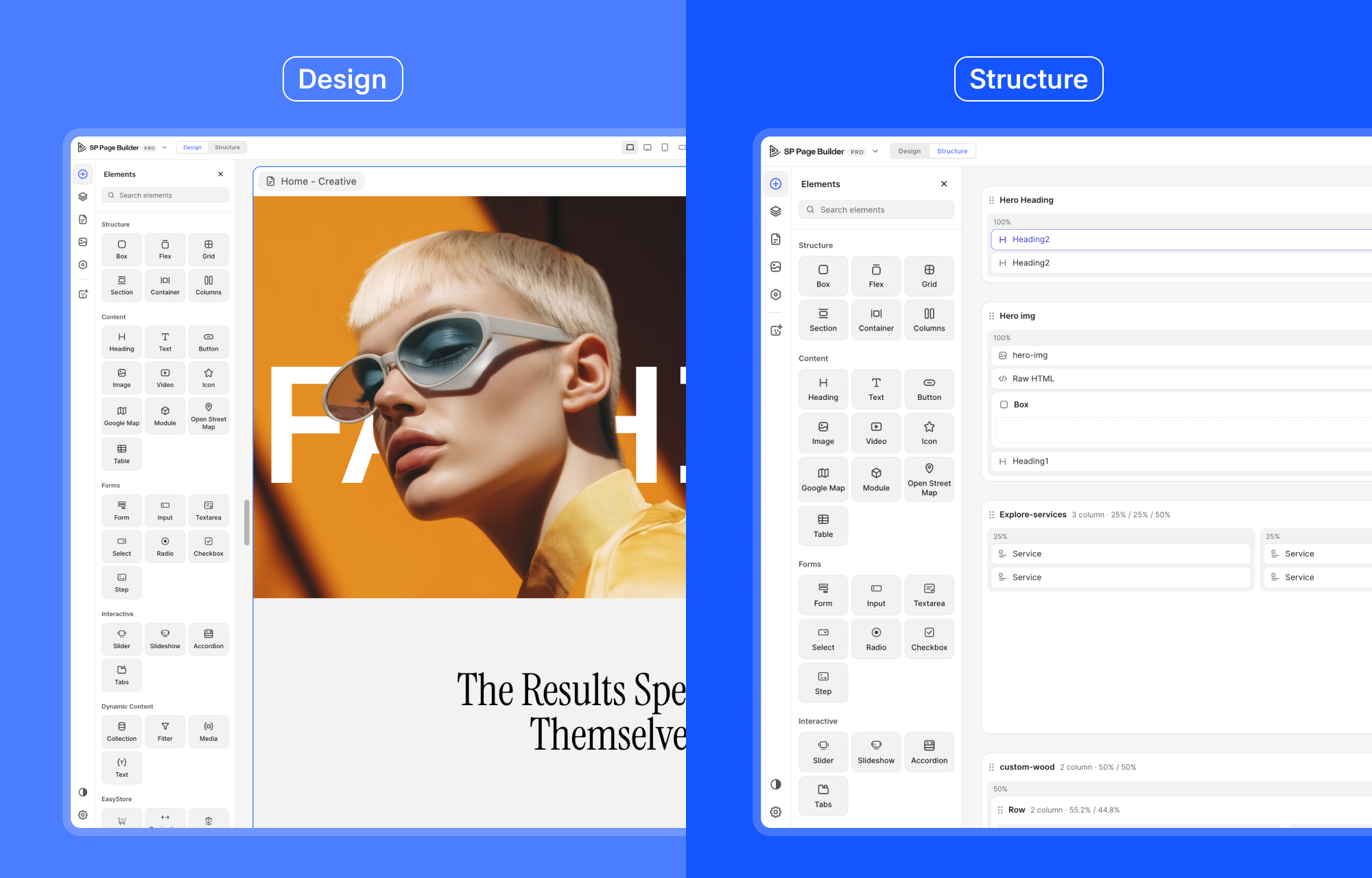
The first thing you'll notice in SP Page Builder 7 is the redesigned editor. You now build on a live canvas and see every change as you make it.
The new editor has two views:
- Design: Work directly on the visual canvas, select elements, edit content, and adjust layouts.
- Structure: Explore the page through an organized outline of sections, rows, columns, and elements.
Both views work together, so you can switch between visual editing and structural navigation without losing your place.
Resizable Canvas
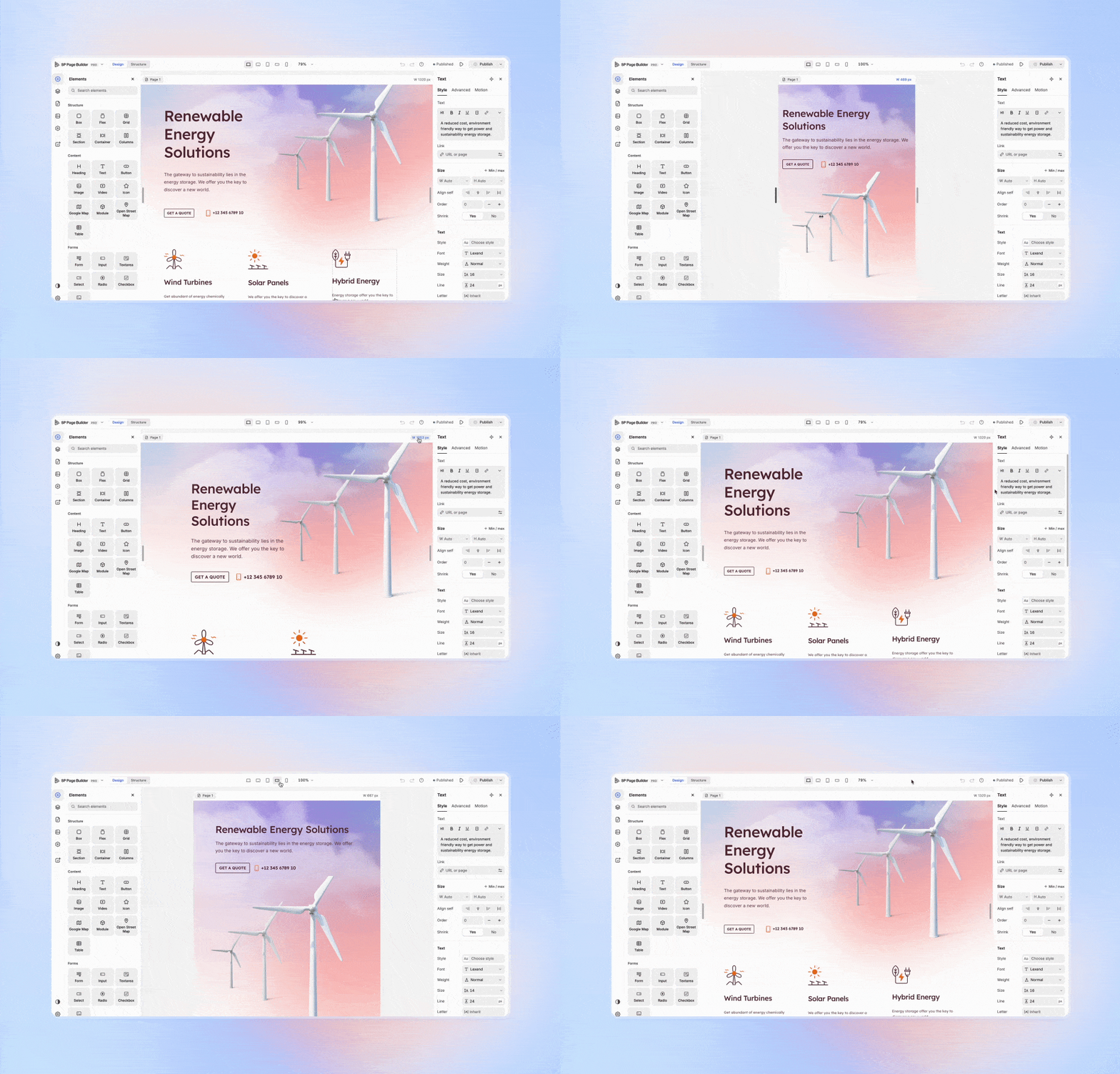
The new live canvas displays your website within a resizable frame, starting at 1320px wide.
Drag the frame's side grips to adjust its width and see how your layout responds. You can also switch between desktop, laptop, tablet, and mobile views, or zoom in and out to work on the details.
Edit Text Right Where It Appears
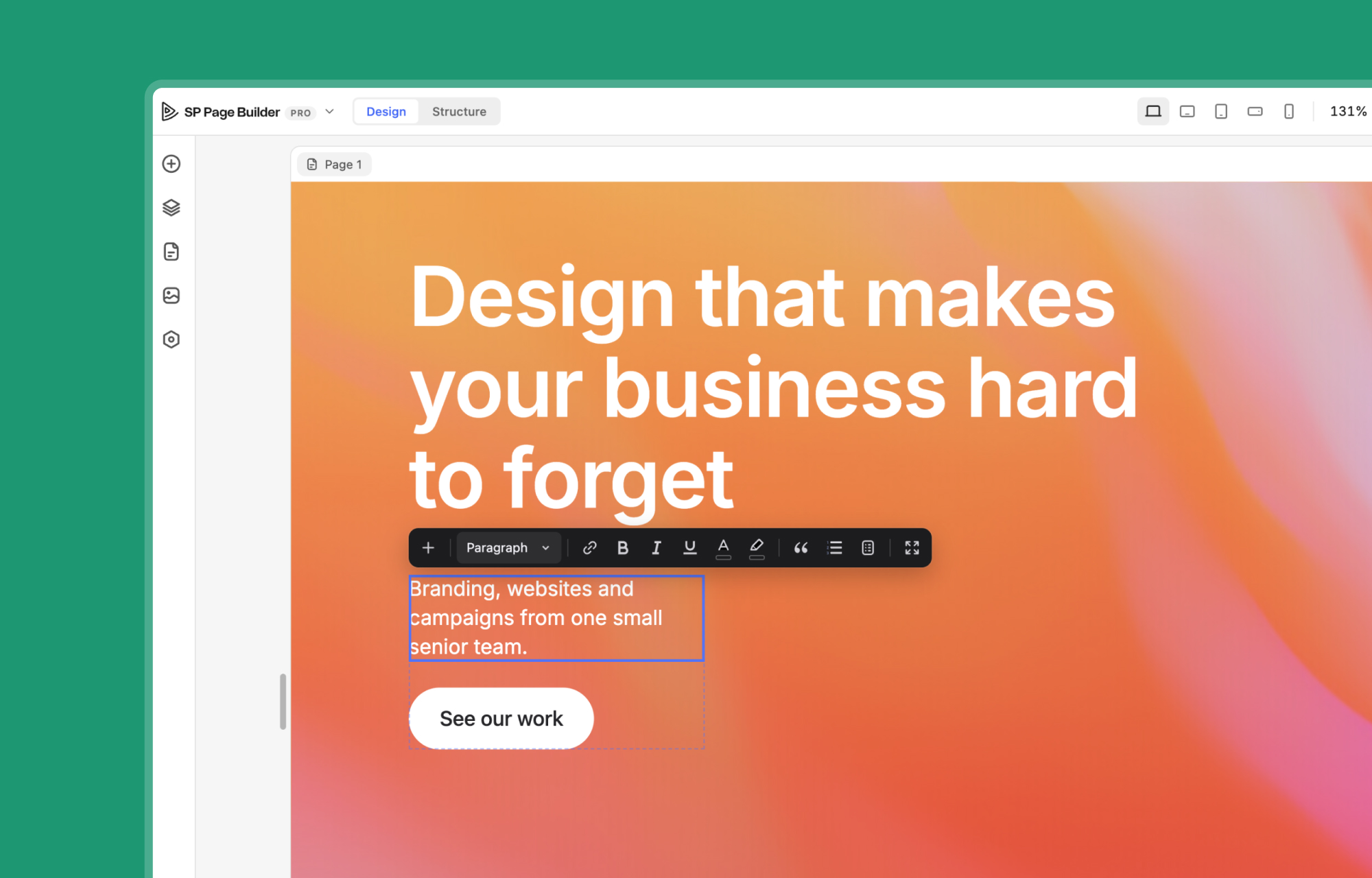
No more opening a settings panel every time you need to change a heading or paragraph. Simply double-click a text element on the canvas and start typing.
Rich text editing comes with a floating toolbar, full-screen editing, and a source view, giving you more flexibility when working with content.
Spotlight Search, Context Menus, and Shortcuts
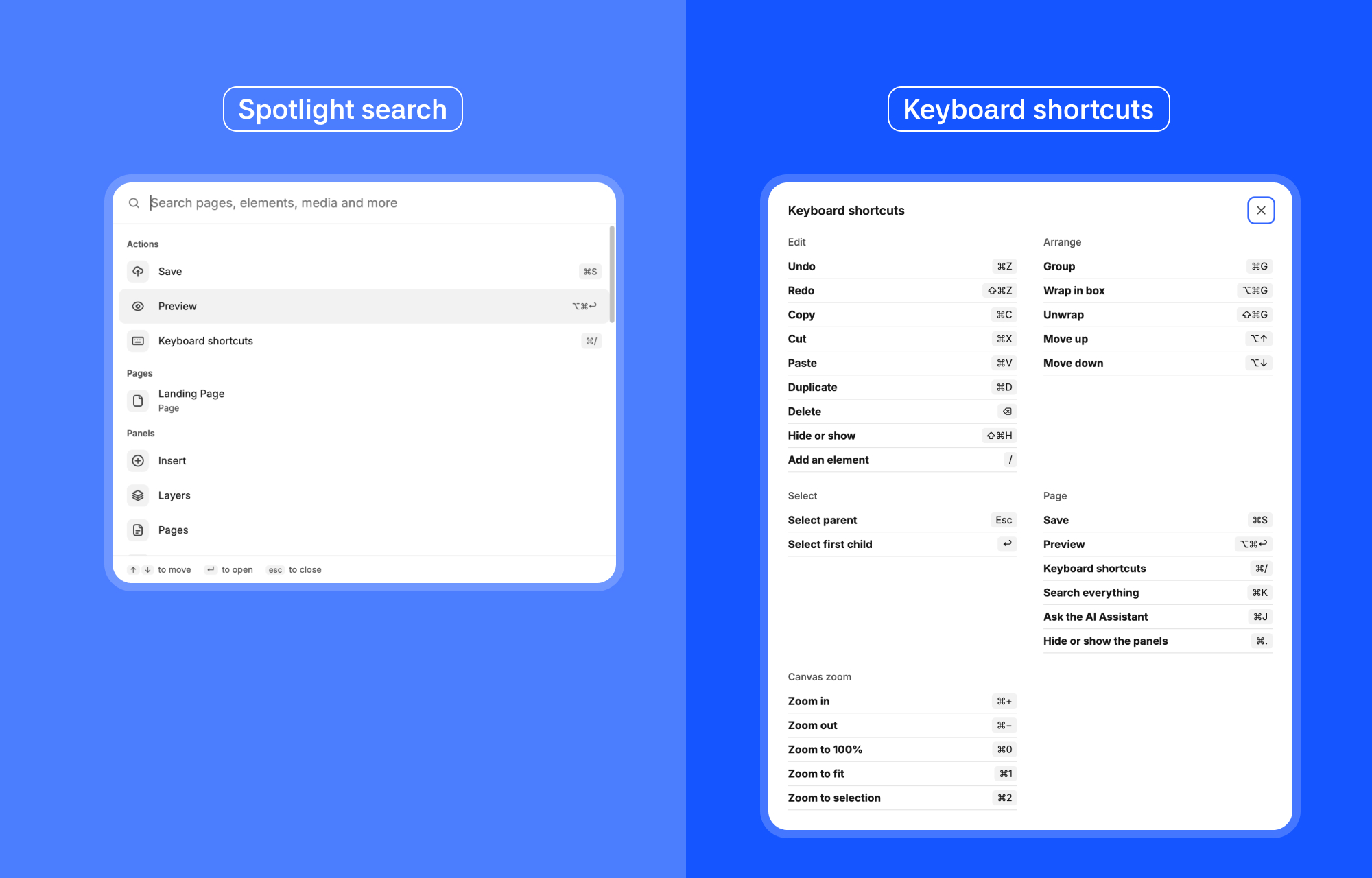
Finding a specific page, element, media file, or setting is easier with the new command palette.
Inspired by Spotlight Search, it brings these resources together in one searchable interface, so you don't have to navigate through multiple panels to find what you need.
You also get context menus and keyboard shortcuts for common actions. Duplicate, delete, copy, paste, undo, and zoom using familiar shortcuts, or right-click an item to access its available actions.
A Reusable Design System with Tokens
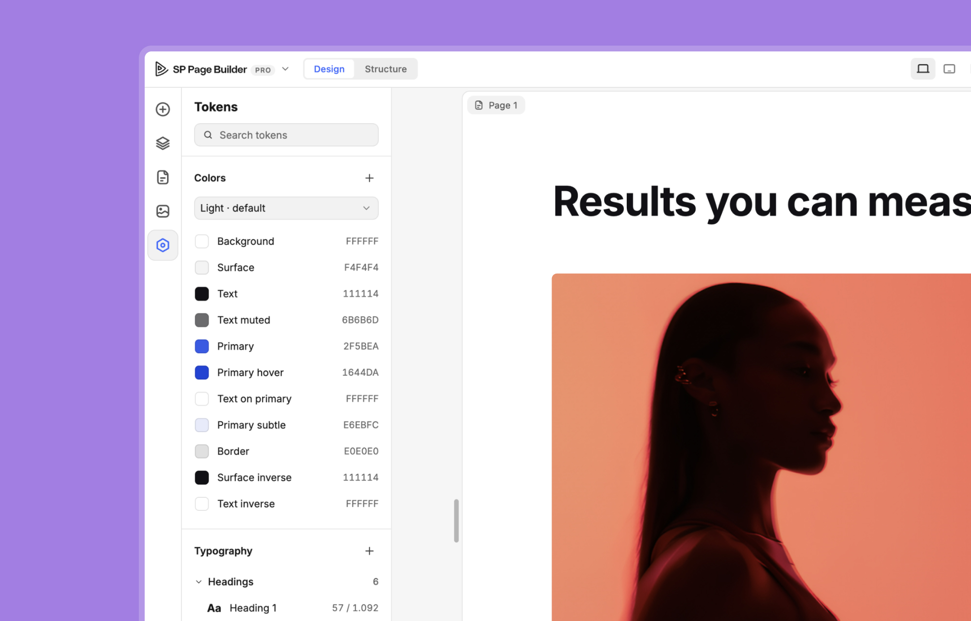
Keeping styles consistent across a growing website can be challenging. SP Page Builder 7 makes this easier with a centralized design system.
The new Tokens panel lets you create and manage reusable styles for colours, typography, buttons, and form fields. Apply them across your pages, and when you update a token, every linked element updates automatically.
You can also turn existing element styles into reusable tokens instead of creating them from scratch.
Generate a Design System from Your Website
Already have a website with established styles? SP Page Builder 7 can scan up to 20 pages and your template to identify your existing colours, fonts, typography scales, and shapes. Review the results, including how frequently each style appears, before adding them to your design system.
AI Assistant and MCP
SP Page Builder 7 brings AI into the editing experience in two ways. You can work with an AI assistant right inside the editor or connect an external AI app to build and manage your Joomla pages through MCP.
An AI Assistant Inside the Editor
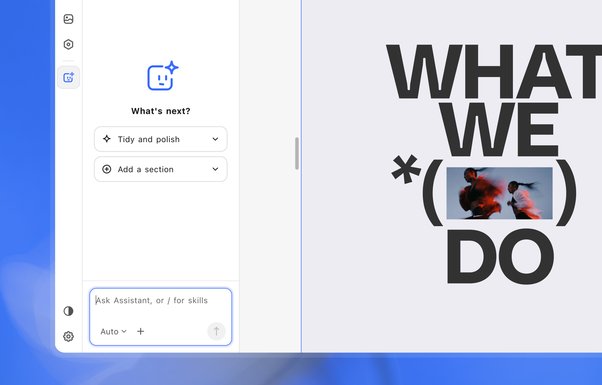
With the AI Assistant, you can build pages, rework sections, rewrite content, or organize layers using natural language prompts. The Assistant works directly with the page you're editing, so you don't have to switch between tools.
The Assistant supports Claude, OpenAI, and Gemini through your own API key. You can also track the cost of each request and view your monthly usage from the chat header.
Build With Your Preferred AI App with MCP
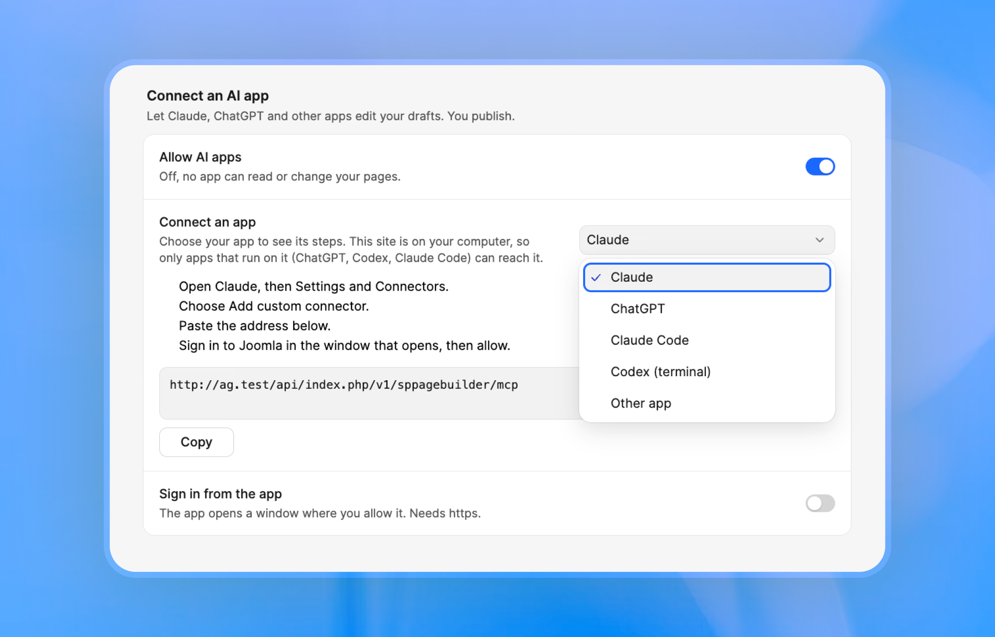
If you'd rather work with an AI app you already use, SP Page Builder 7 lets you connect it through MCP (Model Context Protocol).
With an AI app connected, you can ask your AI app to build an entire page. Start by creating a blank page in SP Page Builder, give it a title, and describe what you want. With read and edit permissions, the connected app can:
- Understand your site: Read existing pages, your design system, and design brief to keep new content consistent with your site.
- Use ready-made sections: Add sections from your library and populate them with your content.
- Build custom layouts: Create sections using headings, text, buttons, images, boxes, grids, accordions, and tabs.
- Edit existing content: Change or remove elements and sections on the page.
- Find or generate images: Search your media library for suitable images or generate new ones when needed.
- Check page quality: Review text readability, heading hierarchy, missing alt text, and empty links.
All changes are applied to the page as a draft and appear in the editor as the AI works. You can review each change, keep it or undo it, and publish the page whenever you're ready.
Bring Your Pages to Life with Motion
The old Animate.css and WOW.js setup is replaced by a built-in motion system with four different triggers for adding movement and interactive effects to your pages:
- Appear: Animate elements as they enter the viewport.
- Scroll: Create effects that respond to visitors scrolling through the page.
- Hover: Add interactive effects when visitors move their cursor over an element.
- Loop: Keep elements moving continuously with looping effects such as tickers.
You can adjust the speed, delay, distance, and other settings to get the effect just right. Motion effects can also be turned off for tablet and mobile devices, giving you more control over how animations behave on different screen sizes.
Privacy and Consent, Built In
SP Page Builder 7 ships with its own consent tools, so you no longer need a separate extension for a cookie banner.
Flexible Consent Preferences
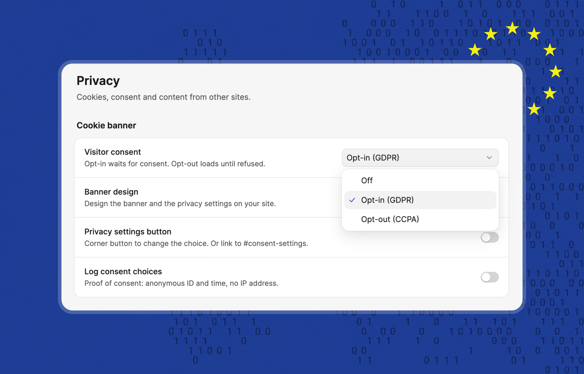
It supports both opt-in (GDPR) and opt-out (CCPA) modes, giving visitors control over how their data is used.
They can manage consent by category, such as analytics and marketing, or by individual service, such as YouTube and Google Maps, rather than accepting or rejecting everything at once.
The consent banner is fully customizable through a visual designer, with options to link your privacy policy as a page, menu item, or URL.
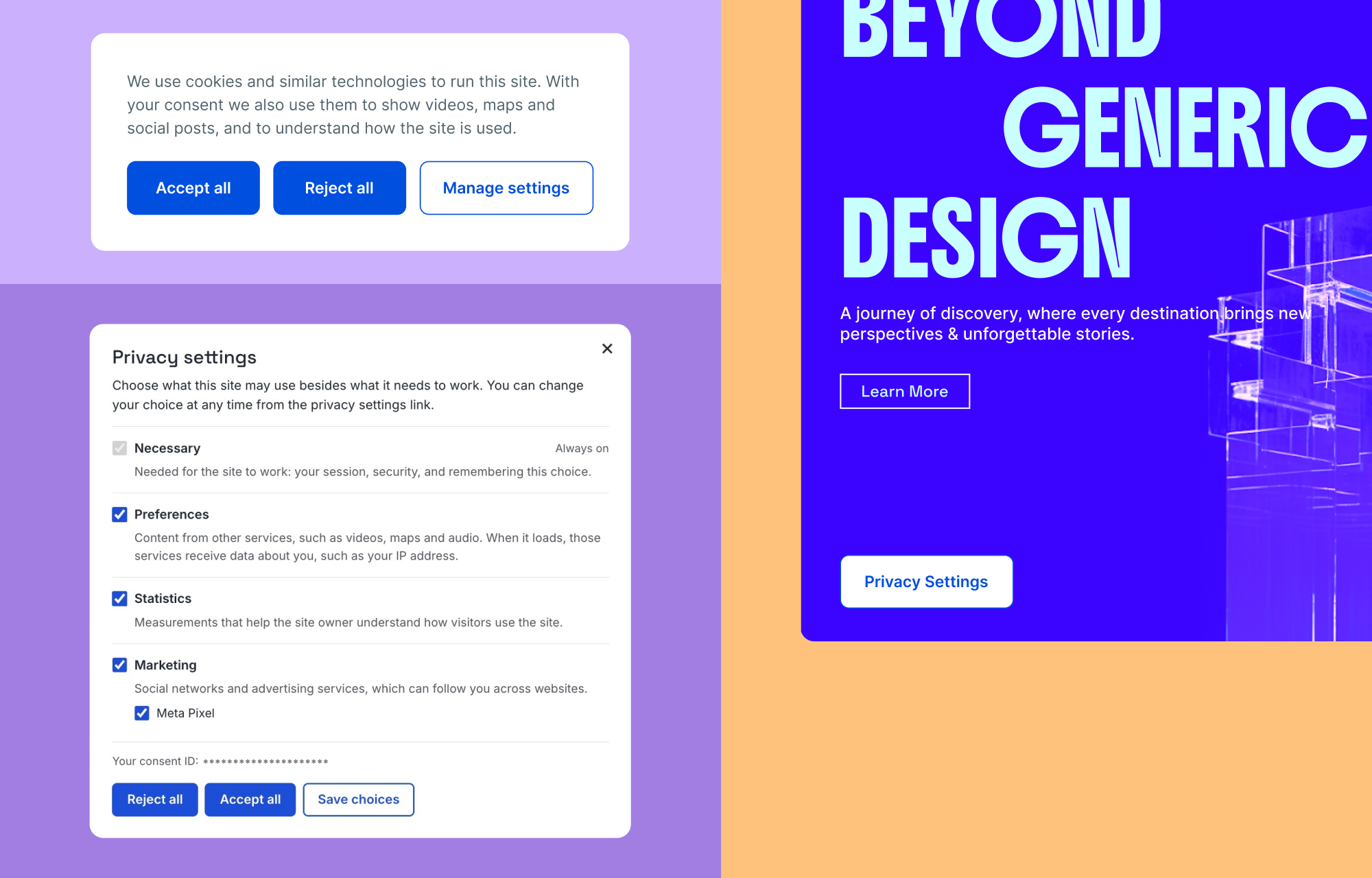
Visitors can also revisit their preferences at any time through a floating privacy button. You can disable this button and provide your own cookie settings link instead.
Consent for Embeds and Forms
Privacy controls also extend to embedded content and forms. You can prevent videos, maps, and social embeds from loading until visitors give consent.
Forms include a required, unchecked-by-default consent checkbox, and submissions don't add the sender's IP address to email notifications.
Newsletter integrations support additional consent measures, including pending confirmation by default for new Mailchimp forms and double opt-in with Brevo.
Consent Records and Data Retention
For sites that need consent records, the Pro version can log visitor choices with an anonymous ID and timestamp, without collecting IP addresses. You can set a retention period of 1 to 60 months and export consent records as CSV files.
Note: New installations have the consent banner enabled by default in opt-in mode. Updates from 6.x preserve existing settings, so enable the banner manually from settings if needed.
New Set of Elements
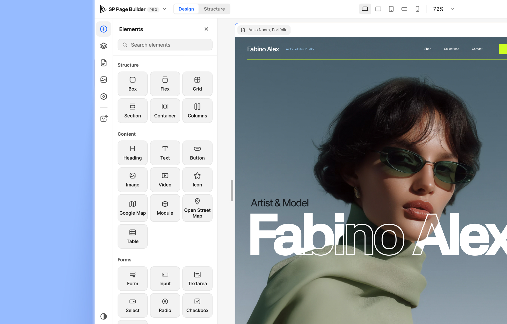
The elements are rebuilt from scratch in 7.0 Beta 1. Layout, content, forms and sliders now share the same controls, so once you learn one, you know them all.
What you get
- Box: A container that works as a stack or a flex layout. It replaces the old Div addon.
- Grid: Real CSS Grid, with child placement, wrapping and sizing, as in a design tool.
- Heading, Text, Link, Button, Image, Video and Icon: The core content elements. Button is now a container with a Text and an Icon, with Default, Hover and Active states.
- Form, Step, Input, Textarea, Select, Checkbox and Radio: Build contact forms, login forms, sign-up forms and multi-step forms with one element. Pick the form’s purpose, set success and error messages, add a webhook, and use consent checkboxes that record consent.
- Slider, Slideshow and Slide: Every part of a slide is a normal element, so you can drop a Heading, a Button or a Video into it. Autoplay, arrows, dots, vertical direction, mouse drag and transitions are all built in.
What happens to your old addons
Nothing you need to do. Your 6.x pages convert automatically.
- Div becomes Box.
- Heading and Text Block become Heading and Text.
- Button, Icon, and Image addons become their new elements.
- Form Builder and Contact Form become the Form element.
- Empty Space becomes an empty Box with the same height.
- Entrance animations become Motion.
Many addons stay as they are and keep working: Accordion, Tabs, Table, Gallery, the carousels, Pricing, Timeline, Countdown, Articles, EasyStore and the dynamic content addons.
Ready-to-Use System Pages
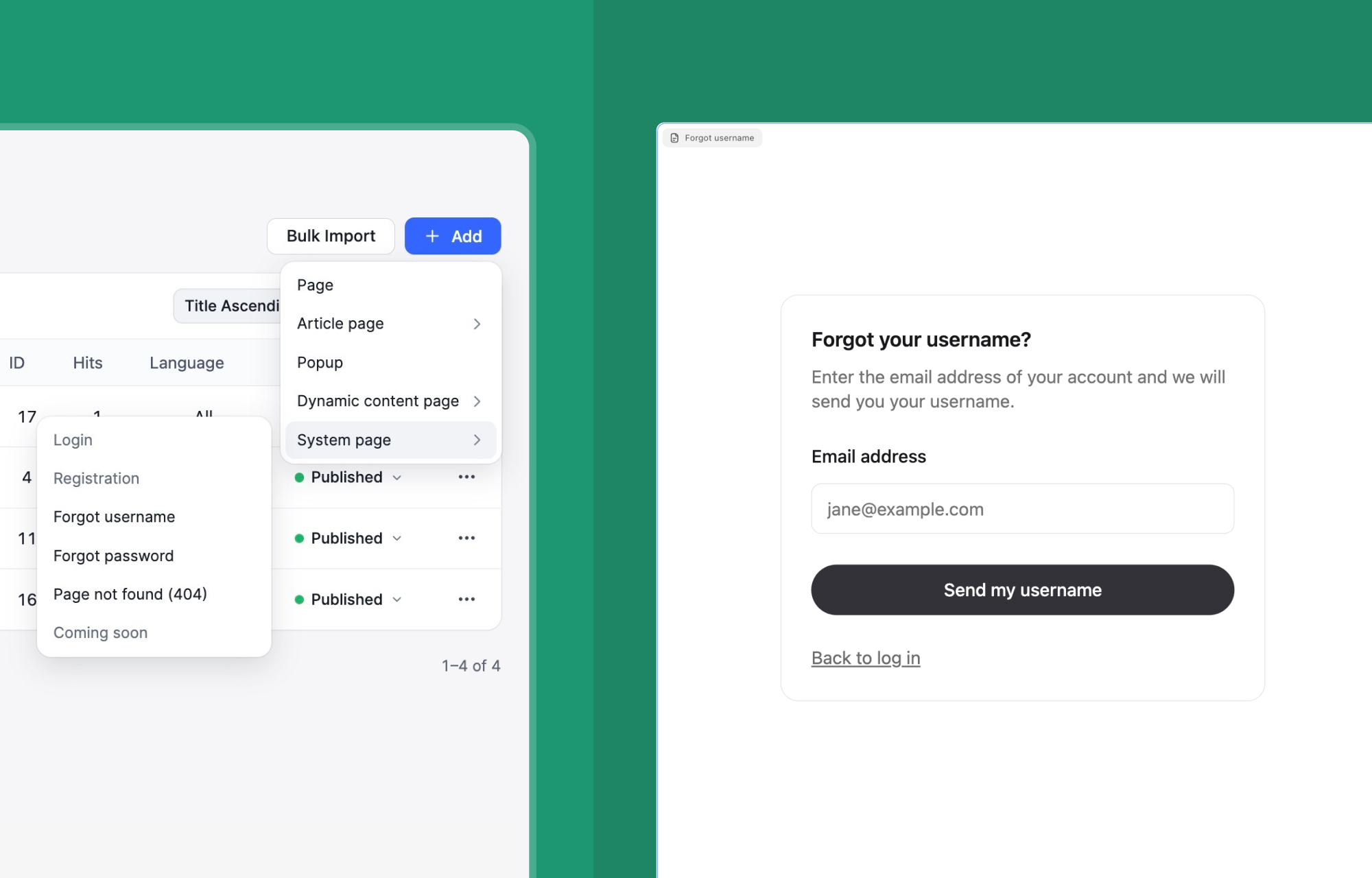
Joomla's default login, registration, and error pages don't always match the look of your website. SP Page Builder 7 gives you ready-made System pages for Login, Registration, Forgot Username, Forgot Password, 404 (Page Not Found), and Coming Soon.
Each page comes with a pre-designed layout that you can customize to match your site's design. There's one System page for each type, so you can edit the existing design instead of building one from scratch.
These pages also retain Joomla's native functionality. Their forms use Joomla's own tasks, so features like two-factor authentication, CAPTCHA, user plugins, and redirects continue to work as expected. Any additional fields introduced by Joomla are automatically included in the forms.
And if you unpublish a System page, Joomla automatically falls back to its default page.
Accessibility and Dark Mode
SP Page Builder 7 introduces dark mode and built-in accessibility options to make the editing experience more comfortable and adaptable to different needs.
Dark mode applies to both the editor and dashboard. The editor's colour combinations have been checked against WCAG AA contrast guidelines to maintain good readability while you work.
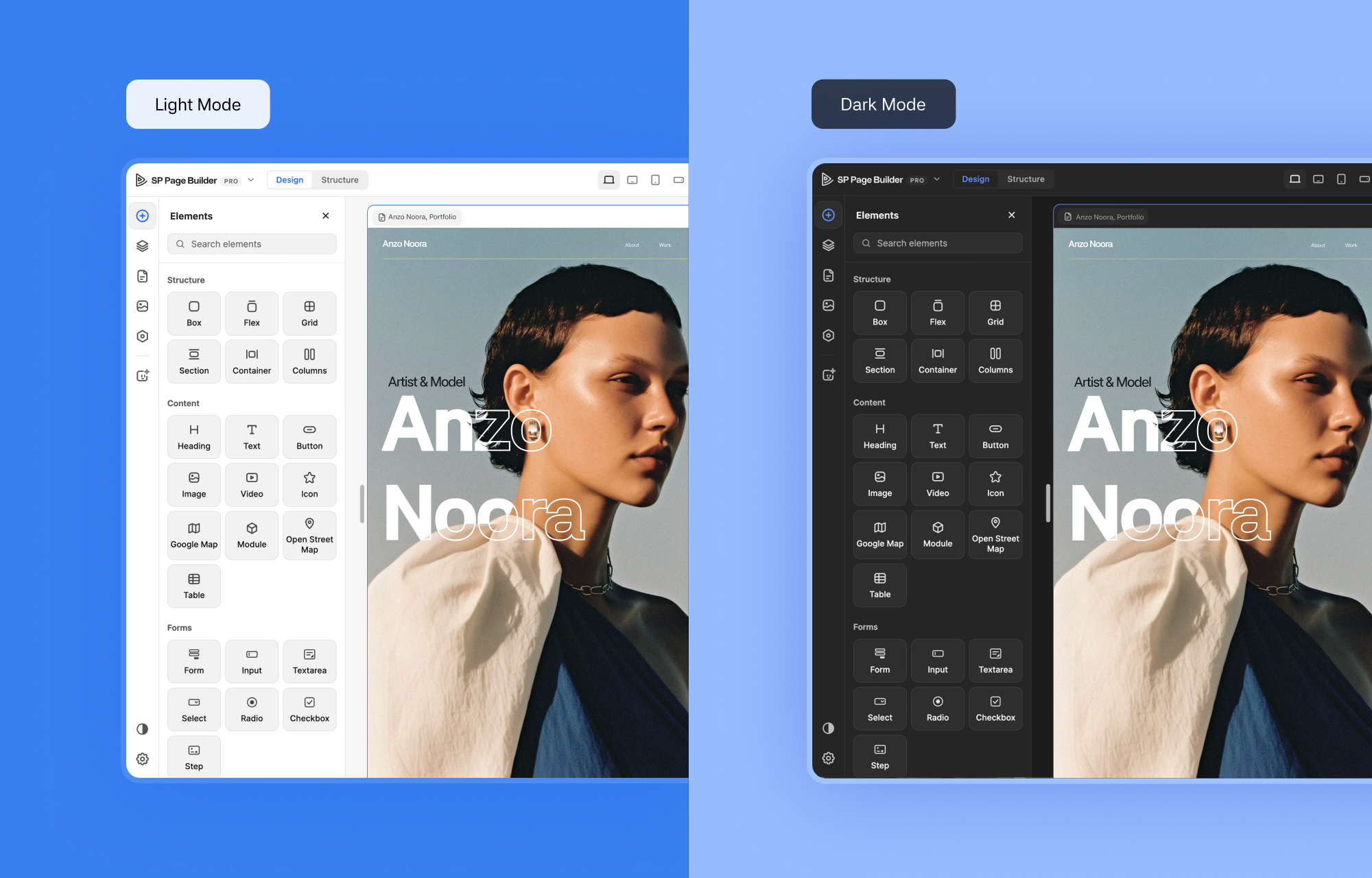
You can also open the Accessibility menu to enable three additional options:
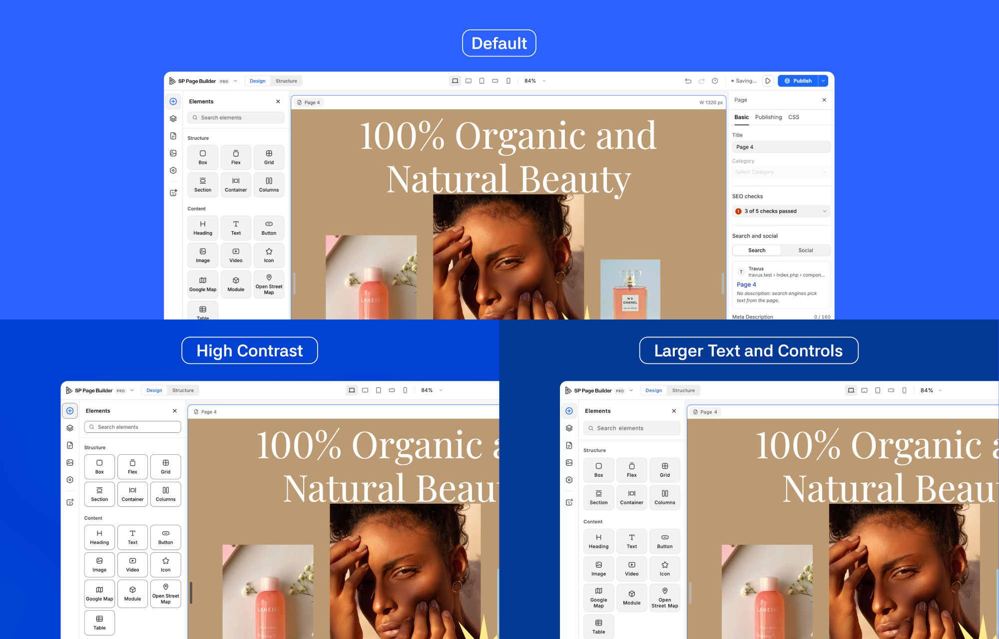
- High Contrast: Increases contrast, adds a visible focus ring, and underlines links to make interface elements easier to distinguish.
- Reduce Motion: Minimizes animations within the editor for a less motion-intensive experience.
- Larger Text and Controls: Increases text and field sizes and adds more spacing to improve readability and navigation.
Accessibility also extends to the pages you build. Motion effects respect visitors' reduced-motion preferences, while the AI Assistant can check your pages for missing alt text, heading hierarchy, and text readability.
The Next Chapter of Joomla Page Building Starts Here
SP Page Builder 7 is still in beta, so not everything is ready just yet.
We encourage you to install Beta 1 on a staging site and explore what's new. Try building a page with the new Design and Structure views, explore the Tokens panel and block library, and test the AI Assistant and MCP integration. You can also open some of your existing pages to see how they work in the new editor.
Your feedback will help shape the final release. Let us know what works well and where you run into problems. You can send your feedback directly to the JoomShaper team using the Share Feedback option in the editor sidebar or leave a comment below.
We look forward to hearing what you think!
Comments (5)