main body 100% - Forum | JoomShaper
Solved SP Page Builder

main body 100%

Asked by Puntje 5 years ago Last activity 5 years ago

Hi can i give the blog pages and recipe pages another .ccs
but the blog menu is then different. It only for the main body. I also like this in on other website of my

https://www.hetkookboekje.nl/blog-het-kookboekje/thuis-witte-champignons-kweken

I want 100% in the main-body on the blog - pages - but not on menu pages

@media (min-width: 576px) {
.container {
max-width:100%
}
}

@media (min-width: 768px) {
.container {
max-width:100%
}
}

@media (min-width: 992px) {
.container {
max-width:100%
}
}

@media (min-width: 1200px) {
.container {
max-width:100%
}}

    .container {
width: 100%;
padding-right: 0;
padding-left: 0;
margin-right: auto;
margin-left:auto

}

Accepted answer

Marked as the solution
Mehtaz Afsana Borsha Staff

HI, Could you please give me a screenshot of this issue?

15 more replies

Mehtaz Afsana Borsha Staff

HI
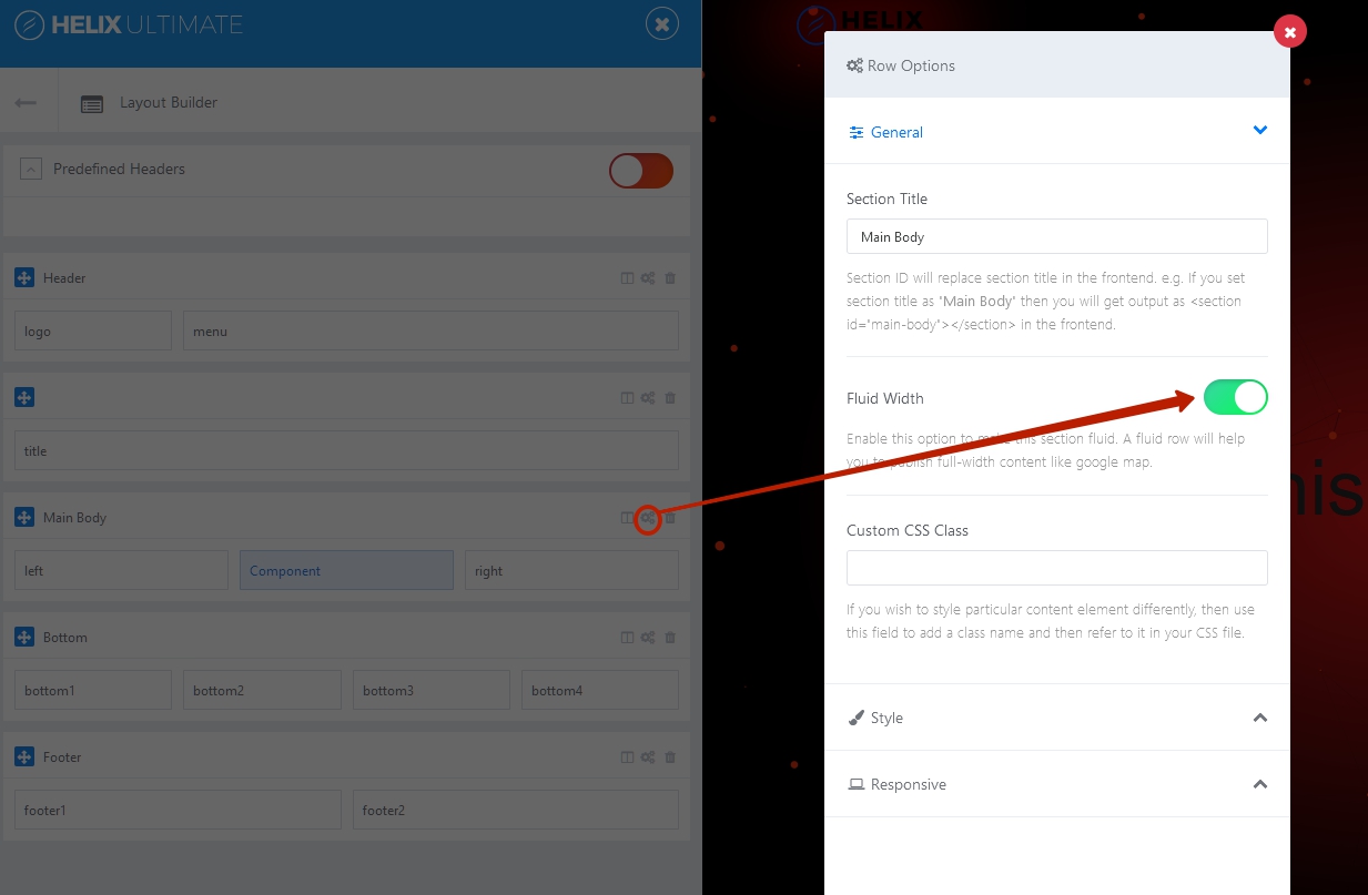
Ok but did you try this fluid row options?
fluid row option? https://prnt.sc/wdh3cl
If you enable it then there will be no padding left and right

Pavel
5 years ago · edited

Hi.
No need custom code.

Step 1: Set fluid width in Template Settings for Main Body section.

Step 2: Use a fluid section width in SP Page Builder as shown by Mehtaz above.

Puntje Asked this
5 years ago · edited

It is al right for the blog pages.

But then is https://prnt.sc/weoe0x this not aligned. And has no padding.

https://prntscr.com/wev0ws

Only on mobile and tablet size must it be fluid. The computer and larger tablet must not have an fluid width

Pavel
5 years ago · edited

It is al right for the blog pages

Create a separate template style with these settings for blog pages. For all other pages, use your old template style.

Or css that only affects blog pages.

.com-content.view-article #sp-main-body .container {
    max-width: 100%;
    padding: 0;
}

But keep in mind, this code works well for blog pages created with SP Page Builder. If you want to use the standard Joomla editor to create articles, then for such pages this code will break them. There is no one size fits all solution.
Perhaps you need some sandboxed code for blog pages made through SP PB, but not affecting the standard joomla blog pages. Then take a look at this. https://archive.joomshaper.com/forums/joomla-article-integration-full-width

Puntje Asked this

I will try

Puntje Asked this

Hi pavel

i want the mobile and tablet potrait 100% width with fluid and the computer without fluid and 100% width. Is there an css code for.

Pavel
5 years ago · edited

without fluid and 100% width

Hi. These are mutually exclusive things. Perhaps you are not explaining exactly.
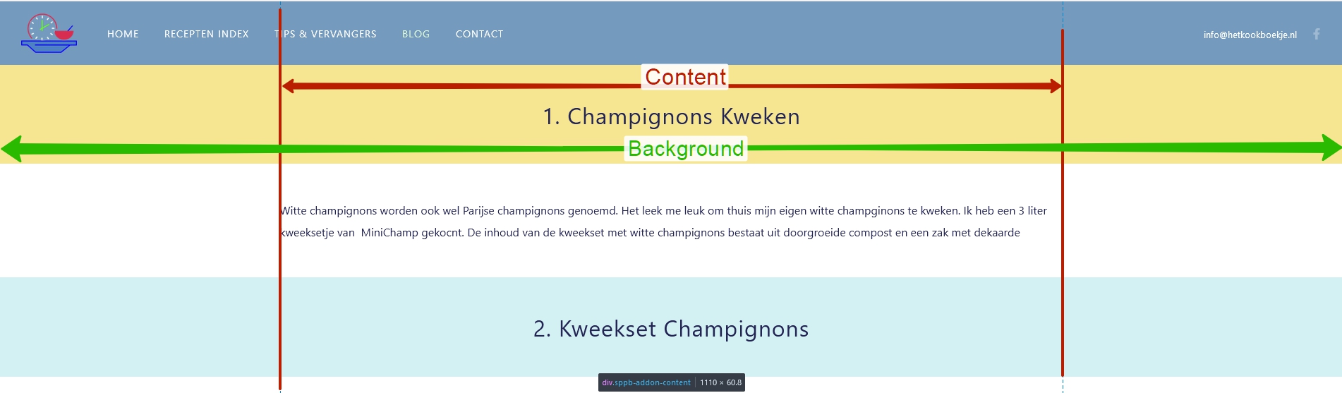
Do you want view like this on computer,?

This css code does it.

Log in to reply.