

Basic
Logo
One of the first steps you will take when setting up your site is adding your own logo. From the main Template options - Basic - Logo, you can upload and set the logo image that will then get displayed on the front end. Here you can set/upload a logo for your site (image or text). You can adjust the logo height as well. Also, you get an option to upload a dedicated mobile logo in this section. If you choose the Image logo, you can upload & use your logo image, in those formats: PNG, GIF, JPG, WEBP or SVG.
For a header with an image set as a background, we recommend using a logo image with a transparent background - PNG, SVG, or WEBP file type. For a header with a dark background color set - use a logo with contrasting colors, more light, even white color letters, and graphic elements. To get a good-looking logo you can hire a professional designer or use one of many available online logo creators (also free).
Logo - this logo image will be used as the main logo used for the website in desktop view. To use the image type of logo make sure that the "Image" tab is pressed. Click the "Select" button to choose a new logo image. For a logo image, most webmasters use .jpg, .png, gif or .webp format. Don't use images wider than 800px - it doesn't make sense here, the image will be rescaled anyway and their height is too big for logo purposes.
If no custom logo is chosen by the webmaster/site owner default template logo is used.
Retina Logo - This logo will be shown on the retina display (iPad, iPhone devices). To avoid images looking blurry on retina display devices (iPhone, iPad) it is best to use a larger image that is displayed at a smaller size on the website. If one's regular logo image is 100x100 pixels in size, the retina logo image would need to be 200x200 pixels in size. The retina logo should be twice the size of the default logo. It must be named as the regular logo image, though with @2x added to the end of the name. So, if the regular logo image was named "logo.png", the retina logo image would need to be named "[email protected]".
Mobile Logo - from this field you can add a mobile version of the logo. This logo will be shown in mobile view instead of the default logo. Leave blank if you do not want to show a different logo for mobile devices.
We suggest matched in size logo images. For sure do not use huge & heavy images for a website logo, the website is not DPT. Using logo images beyond 800px of width in most cases doesn't make sense, especially with enabled Boxed Layout, they would be resized anyway. The image should be high quality - the logo is a very important part of website design and corporate identity. If you decide to use jpg as an image format, set very low compression during saving. PNG or SVG format is more recommended.
Logo Alt Text - is alternative text, also known as "alt attribute" and “alt description" for your site logo. In general Alt text will be displayed in place of an image if an image file cannot be loaded. Alt text provides better image context/descriptions to search engine crawlers, helping them index an image properly. It can enhance your SEO performance and improve website accessibility.
In most cases, it should contain "[Organization name] logo."
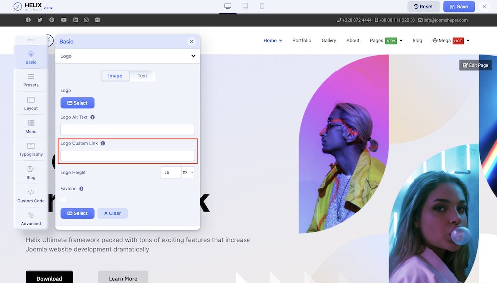
Logo Custom Link - you can add a link (URL) to your logo, by default it redirects to the root home page, with a custom URL it can redirect to a different subpage, which is useful mostly for multilanguage sites. That feature was added in Helix Ultimate 2.0.12 update.
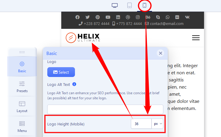
Logo Height - you can set the logo maximum height used in Desktop, Tablet, and Mobile view. Remember to resize the screen using top icons to get access to those 3 values. In most cases, the logo height value should be smaller than the header height.
Favicon - is a small icon that displays next to the site title in the browser. It serves as a recognition element that builds trust among viewers because it helps them visually identify the website. It is recommended by Google that you create a favicon that is at least 48×48 pixels in size. Google also states, that if you want to have bigger sizes for a favicon, they should be a multiple of 48px square, for example, 96×96px or 144×144px. For organic search results, Google recommends using a 48×48 pixel .ICO or .PNG file. Google won't show any favicon that it deems inappropriate. And keep the "favicon" filename in all cases, no fancy names. Google Search only supports one favicon per site, where a site is defined by the hostname.
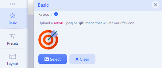
We also recommend uploading a favicon.ico image (48x48px) to the root folder of Joomla by using the FTP tool or File Manager from cPanel. It's better to use both methods together (Template Options and file upload). If your site has a favicon, it can be included in Google Search results for your site, not only in the browser address bar. A favicon is an important aspect of online branding.
Sticky Header Logo - The sticky header allows you to set a dedicated logo that is separate from the default header logo. This makes it easy to use a smaller or more compact logo when the header becomes fixed at the top, helping maintain a clean and balanced layout while scrolling.
Sticky Header Logo Height - This option lets you control the height of the logo displayed in the sticky header. Adjusting the logo height helps maintain proper spacing and ensures the sticky header remains visually balanced and unobtrusive while users scroll the page.
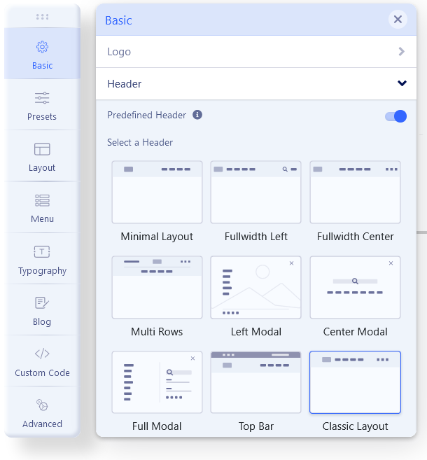
Header
Predefined Header - Enable this option to use a predefined header provided by Helix Ultimate.
Select a Header - You can mark and use one of the preset layouts. If you would choose one, you may see two headers if the original (old one) was created using Layout Builder.
Header Height - you can choose header height used in Desktop, Tablet, and Mobile views. Remember to resize the screen using the top icons to get access to those 3 values.
Enable Search - it allows you to enable and show the search field inside the header.
Enable Login - it allows you to enable and show the login area inside the header (icon and text).
Sticky Header - this option can be used when you need the header with a logo and navigation bar (menu) fixed at the top position even page scroll down to the bottom. It means the header will be always fixed on the top. They will make your site design more useful and improve the client experience. Your sticky header will be used on desktop, tablet, and mobile view.
Sticky Offset - set scroll offset value after which the header will be sticky.
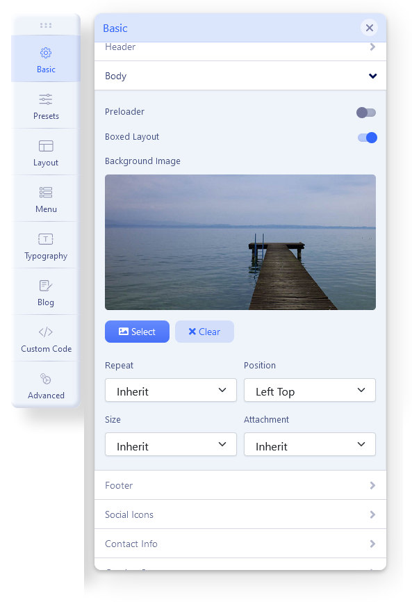
Body
Preloader - if you turn on the preloader, the chosen animation will be shown while loading your site. It can also be a website logo image if you select the last option. If you want to speed up the site loading process, that option will not help you with that task. In general, we don't recommend using it for a site where JavaScript compression will be used. While Google doesn't explicitly tell developers not to use preloaders, they're generally not a recommended practice for a good user experience, and can actually have a negative impact on that. This is because the goal of a preloader is to hide slow-loading content, which is a workaround for a problem, not a solution to it. The best approach is to optimize the website so it loads quickly in the first place, making a preloader unnecessary.
Here you can also switch between Boxed Layout and a wide site layout (default). The boxed layout means that the whole website template's max-width would be 1240px.
When you turn on the Boxed Layout option, you get several other relevant options (e.g. Background Image, Background Repeat, Background Size, Background Attachment, and Background Position) to customize the boxed layout appearance.
- Container Max Width (px): Specify the maximum width for the container. The value you input will be in pixels. If you prefer not to set a maximum width, simply leave the field empty.
Please note that the Container Max Width setting does not affect Tablet & Mobile devices.
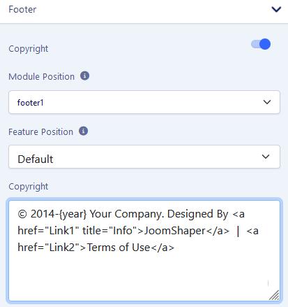
Footer
If you want to show a copyright notice on your website footer, turn on this option. Select the appropriate module position for the copyright notice (e.g. footer1, footer2). If you want to show some features along with the copyright notice module, choose the ordering using the Feature Position menu. Below the Feature Position drop-down menu, you get a text box to put the footer copyright text.
Inside that text field you can use basic HTML code to add links or extra class names.
Tip! Use {year} to get an auto-updated current year.
EXAMPLE (screenshot)
Instead of using Footer settings, you can publish there (in footer positions) any module you want. It can be a Custom module, Menu module, or SP Page Builder module.
Social Icons
Those social icons are localized in the top left corner of the template in a predefined header with a top-bar. in that row, there can be several icons with links to popular social network services: Facebook, Twitter, Pinterest, Linkedin, Dribbble, Behance, YouTube, Flickr, VK (VKontakte), and Skype communicator. By default, this object is using a "top1" module position.
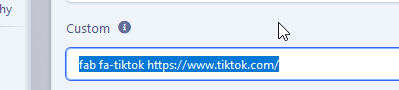
Yes, you can also use a custom icon (there is a field for that) using the FontAwsome 5.x Free icon class in Joomla 4.x or FontAwsome 5.x Free icon class in Joomla 5.2.x.
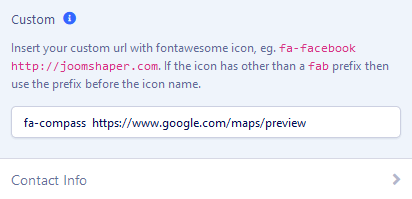
For the TikTok icon the correct code should be:
fab fa-tiktok URL
where "URL" is the full link (with https://) to the TK profile etc.
You can easily disable/enable this feature and choose which social icons must be shown. Remove "#" in input fields to hide the icon on the front-end view.
Contact Info
Instead of using a Custom HTML module, you can use this feature to show small contact info in the top right corner, which includes a phone number (active link) and e-mail address (active link). The Phone icon and e-mail icon are added automatically and they are based on Font Awesome 5 Free icons. By default, this object uses a "top2" module position.
Coming Soon
With Helix Ultimate, you can display a customized maintenance mode page (e.g., under maintenance, coming soon, site offline or so on) on the frontend of your site when your site is under construction. You can craft this page the way you want. Setting up the expected time and date to be back is also possible. Use the Coming Soon option to go to a coming soon/maintenance mode on your site. Add a page title, page contents, date, logo, background image, and social icons on your coming-soon page. You don’t need to add a custom page for this; rather, Helix Ultimate will show the coming soon/maintenance page once you simply turn this option on from the Helix Ultimate template option.
- Enable Coming Soon: Enable this option to set your site to the maintenance mode page (e.g. under maintenance, coming soon, site offline or so on) on the frontend of your site.
- Page Title: Use this field to display the main title of your coming soon page. For example: Under Maintenance, Coming Soon, Site Offline, and so on.
- Page Content: Provide additional information regarding the maintenance mode of your website. Providing additional information can help your visitors gain a comprehensive understanding of the site maintenance process.
- Date for Countdown: Add a countdown timer specifying both the date and time to provide precise information about the conclusion of the site maintenance period.
- Social Icons: Enable this option to display the social icons on the Coming Soon page.
- Page Title: Enable this option to display the title you have used in the Page Title field.
- Page Content: Enable this option to display the page content you specified in the Page Content field.
- Countdown: Enable this option to display the countdown time you have set in the Countdown option.
- Logo: Add a log to your Coming Soon page.
- Background Image: Add a background image to your Coming Soon page.
- Enable Login: Enabling this option allows users to access the site’s frontend editor while the site is still in Coming Soon mode.
Note: To view the login options on the frontend, you must first navigate to Global Configuration > Site and enable the Site Offline setting.

Suggestion: Do not enable Coming Soon mode while planning to work on the site. Use it after this period. This was the original purpose of this view & option. Coming Soon =/= Offline mode.
Notice! You cannot use the front-end editor when the Coming Soon mode is enabled. First, you have to disable it, then you may switch the website into Offline mode from Global Configuration > Site.
Error Page
A website may face several errors like 404 and so on. You can create a custom page for these errors. Use the Error Page option to do so. Upload a custom background image and a Logo to display on the error page(s).
If you're using raw Helix Ultimate, you can on the error page display the selected module; just choose "404" for module position. It can be a Custom Joomla module or an SPPB module. That simple feature allows you to customize the error page even more.