
When will you make a breakpoint for 320px?
Solved
SP Page Builder
When will you make a breakpoint for 320px?
Asked by Dmitry Goncharov
5 years ago
Last activity 5 years ago
Accepted answer
Marked as the solution
Paul Frankowski Senior Staff
Screen resolution 320px -- was/is used for very old smartphones.
People changed their phones at least ones every two years.
Bootstrap v5 layout breakpoints start from 576px
but always you can add manually your own breakpoint for: 320px, 360px, 380px or 480px
9 more replies

Pavel
5 years ago
· edited
О, а зачем вам это? Брейкпоинт 320px не существует нигде. Это не брейкпоинт, а минимальная разумная ширина, ниже которой не стоит заморачиваться о верстке вообще, так как адекватных устройст с меньшей шириной экрана нет. 320 - это iPhone 5S.
Почитайте документацию бутстрап, что бы понимать что такое брейкпойнты и как они строятся. В билдере сейчас не хватает двух брейкпоинтов, вот этих - от 1199 к 991 и от 575 к 0 (или к 320 если хотите, это условный 0). Ниже 575 идет полная резина а не адаптив, поэтому никакие точки там не требуются

Rashida Rahman Staff
Hi,
Yes, as Pavel stated, Helix Ultimate and SPPB is built on bootstrap; there are no additional breakpoints that you offer.
But you may wait for Page Builder 4, that will bring more break points as per my knowledge.
Best Regards
Dmitry Goncharov Asked this
Rashida Rahman
Very sorry. Many customers wonder why their website is not displayed correctly on the device. Believe me, many more people use devices with a screen diagonal of 4 inches.
Dmitry Goncharov Asked this
Pavel
Я все прекрасно понимаю. Может не так выразился. Речь шла о разрешении экрана. Но отображение сайтов на 320px еще актуально.
Paul Frankowski Senior Staff
5 years ago
· edited
I understand that not everyone has new iPhone, Samsung, HTC, Mi or other brand even in Moscow.
But you have to understand us, that we cannot add breakpoint for phones produced 7-5 years ago. As you may noticed even Boostrap "forget" about legacy.
If you have such client that need it - spend extra 30 min and add custom code,
I do it as well.
// Small screen devices (less than 380px)
@media (max-width: 380px) {
YOUR-CUSTOM_STYLES_HERE
}
380px is used for "all" smartphones with less than 4" screen.
Pavel
5 years ago
· edited
Hi Paul. I think Dmitry meant not this, but control inside the Page Builder interface. In view of the controller 575> 320 (Mim-Width View). Also, existing now controllers are not objective. For example, when you configure things focusing on the Phone View, which in the Page Builder interface is 480px wide, in reality you set up the range 767> 576. Thus, for the range 575> 320, there is no control or settings. Every time we have to tune it through CSS. The same applies to control 1199> 992. Every time we need to configure it range through CSS.
For example, I want to change the font size on the screens less than 575 px. I can't do it in any way using the Page Builder interface. Only via css.
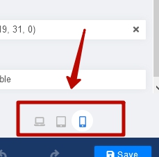
And 320 not as breackpoint, but as min width view contoller will be good feature
Pavel
It would be great if the viewpoint contains the exact values of the Bootstrap breackpoints, and not abstract averaged values.
< 1439 (bootstrap 5) < 1199 < 991 < 767 < 575 < 320 (min width)
Dmitry Goncharov Asked this
Pavel
I think Dmitry meant not this, but control inside the Page Builder interface. In view of the controller 575> 320 (Mim-Width View).
That's exactly what I meant.
https://mega.nz/file/W3InwIYS#E3DPSgcExpYHYJTwnfIfsOci05_tCxMJfLfX1JdSIoc
Paul Frankowski Senior Staff
I cannot promise anything, but I will ask our developers if we can improve this area somehow.
Log in to reply.