I upgraded my Joomla to version 5. I have the Educon theme and upon upgrade some articles that we created in the blog using the ARTICLE extension. The mobile version of the site is not anymore responsive. Please see this article: https://www.qualityleadersacademy.com/benefits-of-value-based-care in the mobile version. The text and image is not wrapping properly (Not Responsive). Maybe the EDUCON theme is not compatible with Joomla 5 Article Editor.
But some articles are responsive. I am trying to find a solution but I cannot anymore. I also copy and paste the article in the NOTEPAD and paste in the Article Editor and save but the problem still exist.
Please help. Thanks.
The EDUCON Template is using the HELIX 3 FRAMEWORK. I think the bootstrap of Helix 3 is not compatible with Joomla 5 Core new bootstrap.
I have problem with EDUCON theme in the Article (after upgrade to Joomla 5). Not responsive in the Mobile Version.
Accepted answer
Marked as the solution
Ok, I added fix for Chrome browsers (Mobile)
Please refresh browser cache 2x to see my changes.
8 more replies

Hello,
Thanks for reaching out to us. Could you please share temporary administrator access to your Joomla backend? You can provide the credentials securely in the hidden content section. Also, please take a full backup of your site before we make any changes.
Once I have access, I’ll investigate further and see what’s causing the issue. Let me know once you’ve shared the details!
Best regards,
Hi Wesam.
Here is my comment
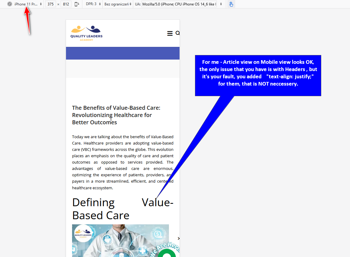
Used Bootstrap version doesn't matter. Mobile Responsive style inside BT wasn't invented this or past year.
As extra Tip, I would also reduce top space by using that
@media screen and (max-width: 680px) {
article.item .content-wrap {margin: 10px 0;}
.view-article #sp-main-body  {padding: 30px 0;}
}The div style, i just use it because just to try if it fixes the problem but it is not...In our side the mobile wrapping is still showing the problem.. It is still not wrapping on our side. We use the mobile to see it but still the same.

I don't know what did you do in your side why it is wrapping ok for you.
- What Smartphone or Screen Size.
- What Mobile browser ? Check also on others than defult one.
- And yes, we may need access to admin area as Super User (shared in Hidden Content)
Hello thank you for your response.
Mobile is Samsung Galaxy Note 10+
Mobile Browser: Chrome
Thanks for the response.
- OK
- Later, yes.
- Chrome have its own "World of CSS" sometimes extra line is needed.
Thank you very much for your response.
You're welcome.
Yes, delete support J! admin account.
Mark topic as solved.