Customize Breakpoint - Forum | JoomShaper
Solved Helix Framework

Customize Breakpoint

Asked by Giovanni 5 years ago Last activity 5 years ago

Hello! Sorry for my English. I hope to explain correctly my problem.
In Joomla there are four breakpoint for various device (mobile phone, tablet ecc..).
Screen-lg for 1200px, md for 992, sm for 768 and xs for 480px.

How I can change this value? For example is possible to have three breakpoint instead of four? In my case only large desktop, medium and small. If it is possible how I can customize?
Or...it's possible to keep them but with different values?

I would be interested in both solutions to test.

Thank you very much in advance.

ByeBye

Accepted answer

Marked as the solution
Ofi Khan Staff

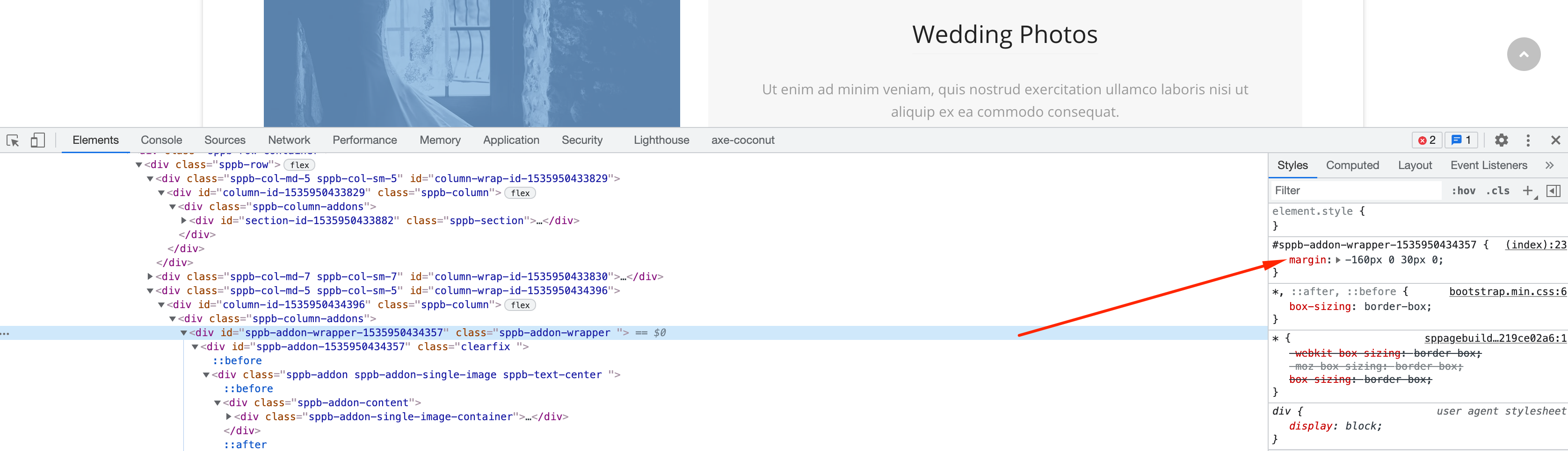
Sorry, we do not provide customization support. You have to find it on your own. Here is a tip for you. You can try changing the margin.

@media only screen and (max-width: 992px) {
  /* add your css here */
}

Screenshot at Sep 09 18-08-18.png

15 more replies

Pavel
5 years ago · edited

Hi. It's not in joomla but in bootstrap based templates like Helix Ultimate. And in Helix Ultimate 2 more breakpoints. Learn bootstrap 5 grid system doc. And yes, you can customize it using css media queries in your own css code to override existing breakpoints

Giovanni Asked this

Thank you Pavel for the help.

I follow your advice.

My request is about a little problem on my website: in responsive mode from 991px the view is ok. From 992px to 1199px images and text have problem and from 1200 and over is ok.
For solve the problem I would delete or modify the range from 992px to 1199. It's a little range and imho can be deleted. I hope to do this. I'm not very expert with override css.

ByeBye :-)

Ofi Khan Staff

Hello Giovanni

This is kinda difficult task. Better way is modify with Custom CSS. Most importantly, you should take an expert help.

Best regards

Pavel

From 992px to 1199px images and text have problem

Hi. I understood your problem. In this case, change, or delete a breakpoint does not fix it, but only to break even more. Breakpoint - is the width of the container, and nothing more.

To fix, you should modify the code for things that are broken, but not the code itself for the breakpoint.
Use the following structure:

@media (max-width: 1199px) and (min-width: 992px) {

    /* Here goes your own code for things that are broken. */

}
Giovanni Asked this

Hello Pavel. Thank you very much for your help.

Thing that is broken is a section created with sp page builder. I started with default layout "photography studio" (page Services).

Where I can insert the code? In CSS Custom Code?

Thank you very much.

Giovanni Asked this

Hello to all. Thank you a lot for the links. Today I followed them and tried to apply to my site to solve the problem. Unfortunately nothing changes, but I'm not an expert and maybe I'm wrong.
I have a basic knowledge of html and css. I know the inspector option that I use with firefox, but probably I make a mistake.

If possible have an another little help I attach screenshots of the problem that I trying to solve.
If not possible....no problem, I change idea and try with another layout.
I'm sorry of that because I love this.

Many thanks in advance.

ByeBye

Ofi Khan Staff

Please share the page link in the hidden content to check.

Giovanni Asked this

Hello. Thank you. You find the link in the hidden content.

Ofi Khan Staff

I got your issue. You have to use Custom CSS for it. Generally, the addons settings are available for desktop, tablet and mobile view.

Log in to reply.