

Customize Breakpoint
Giovanni
Hello! Sorry for my English. I hope to explain correctly my problem. In Joomla there are four breakpoint for various device (mobile phone, tablet ecc..). Screen-lg for 1200px, md for 992, sm for 768 and xs for 480px.
How I can change this value? For example is possible to have three breakpoint instead of four? In my case only large desktop, medium and small. If it is possible how I can customize? Or...it's possible to keep them but with different values?
I would be interested in both solutions to test.
Thank you very much in advance.
ByeBye

Ofi Khan
Accepted AnswerSorry, we do not provide customization support. You have to find it on your own. Here is a tip for you. You can try changing the margin.
@media only screen and (max-width: 992px) {
  /* add your css here */
}

Pavel
Accepted AnswerHi. It's not in joomla but in bootstrap based templates like Helix Ultimate. And in Helix Ultimate 2 more breakpoints. Learn bootstrap 5 grid system doc. And yes, you can customize it using css media queries in your own css code to override existing breakpoints
Giovanni
Accepted AnswerThank you Pavel for the help.
I follow your advice.
My request is about a little problem on my website: in responsive mode from 991px the view is ok. From 992px to 1199px images and text have problem and from 1200 and over is ok. For solve the problem I would delete or modify the range from 992px to 1199. It's a little range and imho can be deleted. I hope to do this. I'm not very expert with override css.
ByeBye :-)
Ofi Khan
Accepted AnswerHello Giovanni
This is kinda difficult task. Better way is modify with Custom CSS. Most importantly, you should take an expert help.
Best regards
Pavel
Accepted AnswerFrom 992px to 1199px images and text have problem
Hi. I understood your problem. In this case, change, or delete a breakpoint does not fix it, but only to break even more. Breakpoint - is the width of the container, and nothing more.
To fix, you should modify the code for things that are broken, but not the code itself for the breakpoint. Use the following structure:
@media (max-width: 1199px) and (min-width: 992px) {

    /* Here goes your own code for things that are broken. */

}Giovanni
Accepted AnswerHello Pavel. Thank you very much for your help.
Thing that is broken is a section created with sp page builder. I started with default layout "photography studio" (page Services).
Where I can insert the code? In CSS Custom Code?
Thank you very much.

Mehtaz Afsana Borsha
Accepted AnswerHi,
Add css here
Template Option -> Custom Code -> Custom CSS
For Break points you can follow this
https://www.w3schools.com/css/css_rwd_mediaqueries.asp
For custom you cam follow this blog
https://www.joomshaper.com/blog/which-line-of-css-i-have-to-edit-code-inspector-in-action
-Regards
Giovanni
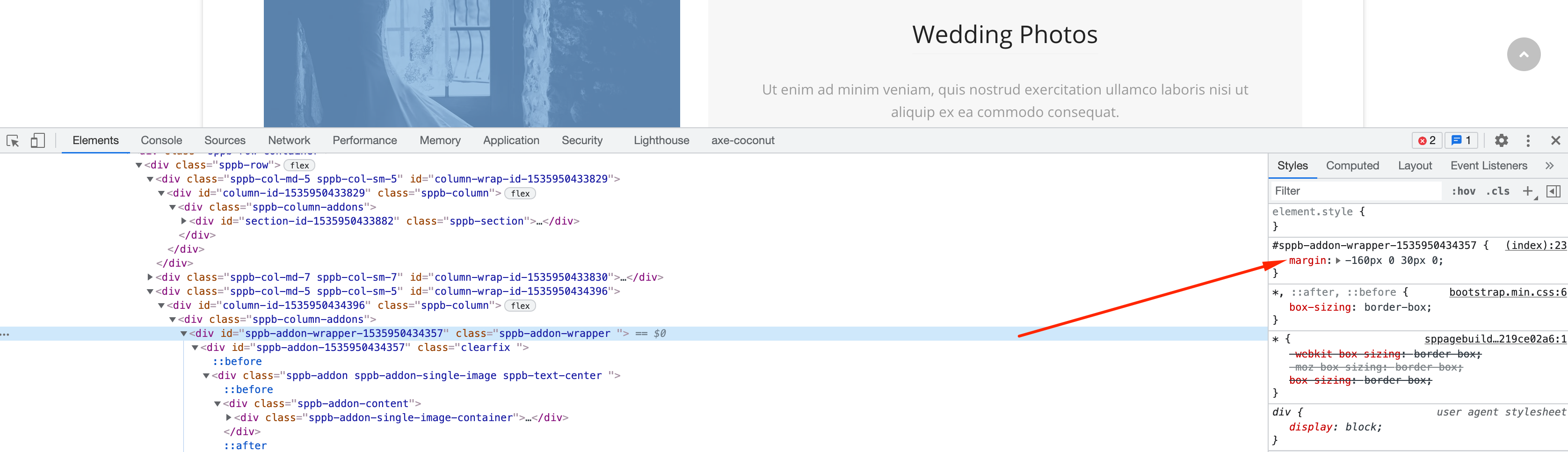
Accepted AnswerHello to all. Thank you a lot for the links. Today I followed them and tried to apply to my site to solve the problem. Unfortunately nothing changes, but I'm not an expert and maybe I'm wrong. I have a basic knowledge of html and css. I know the inspector option that I use with firefox, but probably I make a mistake.
If possible have an another little help I attach screenshots of the problem that I trying to solve. If not possible....no problem, I change idea and try with another layout. I'm sorry of that because I love this.
Many thanks in advance.
ByeBye
Ofi Khan
Accepted AnswerI got your issue. You have to use Custom CSS for it. Generally, the addons settings are available for desktop, tablet and mobile view.
Giovanni
Accepted AnswerHello. Thank you very much for your check. What parameters should I add/change by Custom CSS to solve the problem?
Thanks
ByeBye
Giovanni
Accepted AnswerHello Ofi Khan, Thank you very much for your kindness. Thanks to your advice, I was able to understand the mechanism and solve/fix the problem. Now the contents are perfect even between 992px and 1199px.
Ofi Khan
Accepted AnswerYou are welcome. I am really happy that it helped. Please accept the answer that helped you. It will be then easier to find the solution for the other users with the same issue. There is a button to accept answer after each comment.
Ofi Khan
Accepted AnswerI have a humble request. It would be very kind of you if you can manage some moment to give us feedback on Joomla Extension Directory