Desktop, Tablet and Phone Display Resolution in Helix Framework - Forum | JoomShaper
Solved Helix Framework

Desktop, Tablet and Phone Display Resolution in Helix Framework

Asked by Walter Wood 4 years ago Last activity 4 years ago

I am trying to figure our how to layout the header for a computer with a resolution of 1024 pixels wide. What page resolution is set in the Helix Framework for desktop, tablet and phone? And, how does Helix determine which resolution to provide to the device?

Thanks

Accepted answer

Marked as the solution
Ofi Khan Staff

Hello Walter Wood

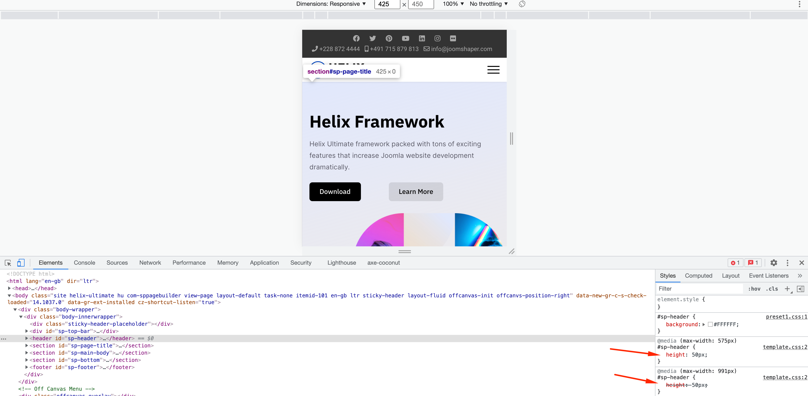
You can check on the browser's inspection. But you don't actually need to learn this. Rather focus on what you want. You can easily manipulate the design with Custom CSS.

Screenshot at Nov 04 13-08-40.png

Best regards

2 more replies

Paul Frankowski Senior Staff
4 years ago · edited

Hi,
If we talk about Helix Ultimate 2.0 - it uses Bootstrap 5.
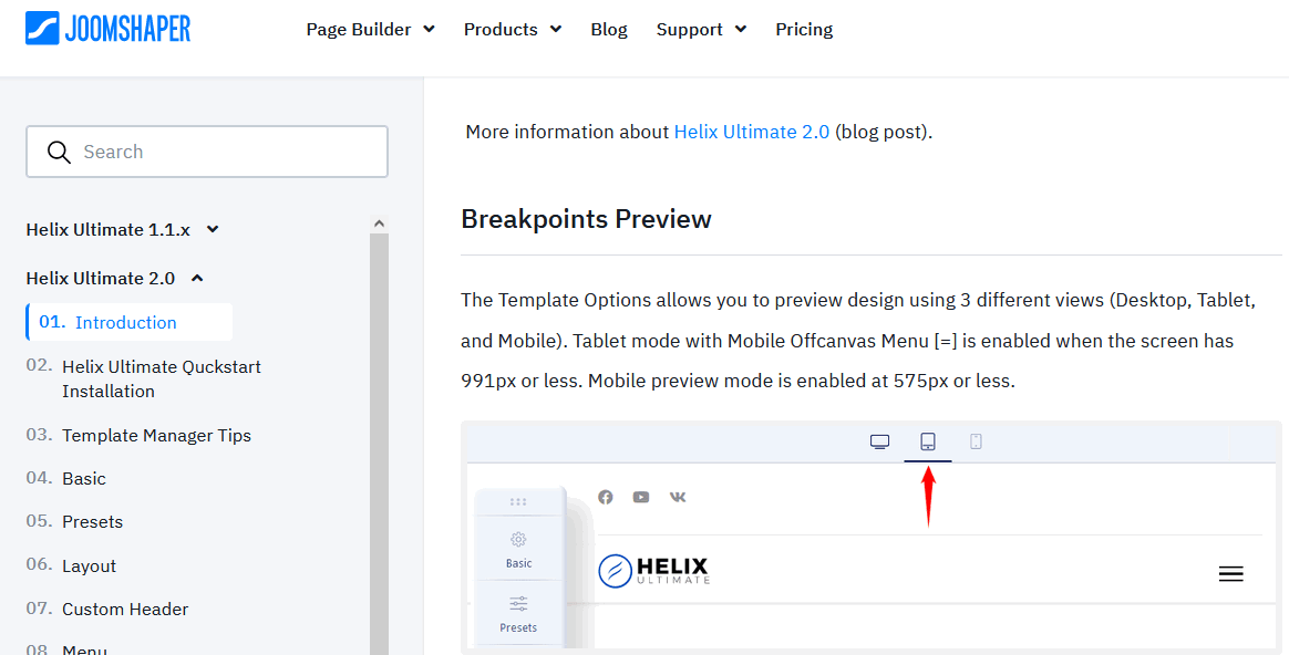
And tablet mode is enabled when the screen has 991px or less.
Mobile mode is enabled 575px or less.

Look at the switchers from Template Options

foto_7066_2021.png

Log in to reply.