

Display Tablet Like Phone
Ralf Besl
Can we set it that Tablet views always look like Phone views? So that 2 columns become 1 column on Tablet sizes already.

Mehtaz Afsana Borsha
Accepted AnswerHi,
Thanks for contacting us. In SPPB, you can adjust the responsive settings to ensure that tablet views mimic phone views. Here’s how to make sure that your content appears in a single column on tablet sizes:
Access the Page Builder: Open the page you wish to edit in the SPPB.
Edit the Row Settings: Click on the row where you want to change the layout.
Responsive Options: Look for the responsive options, which might be labeled as 'Tablet' or 'Responsive Layout' under the column settings.
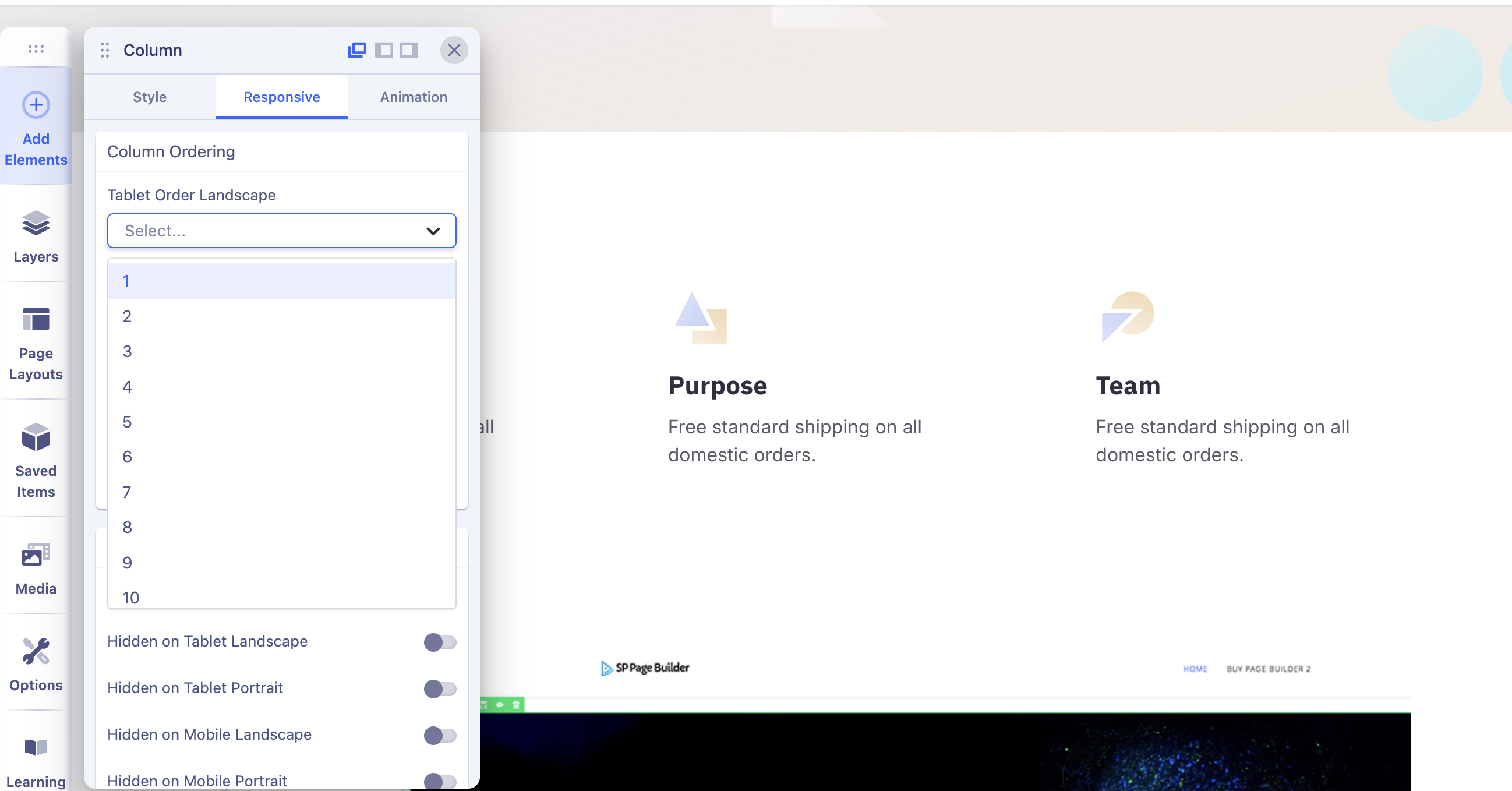
Column Layout: Change the column layout settings. If you originally have two columns, adjust the tablet layout to a single column. This often includes selecting '1 Column' for tablet views.
Preview and Adjust: Use the preview feature to ensure the layout appears as desired on tablet sizes.
Save Changes: Once satisfied with how it looks, save the changes to your page.
If you're not seeing the expected results, verify that there are no custom CSS rules affecting the tablet view, and check if there are widget settings that might have responsive configurations.
This should help in achieving a consistent look between phone and tablet views. If you need further assistance with specific settings, feel free to ask!
-Regards.