

Mobile Menu
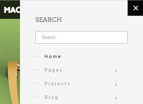 This template was based on Helix3 framework it means that allows you to use Off Canvas Menu [=] - look at the image on the left side). It doesn't have to be Main Menu, it means that you can easily use different menu for desktop and separate menu for Mobile & tablet devices.
To create such a menu Add/Edit a Menu module and change its position to "offcanvas", select Menu from the list and assign module to all pages. Offcanvas menu can be also used together with classic desktop menu in one row. Like you might seen on demo page. Just check Menu tab in template settings to customize it. 
To add search or other module inside offcanvas menu window, you have to publish those additional module(s) in "offcanvas" position and then choose their order relative to each other.