Solved Templates

Responsive Categories module Megadeal

Asked by KOSTAS DIMITRAKAKIS 4 years ago Last activity 4 years ago

Hello joomshaper

We face an issue in our eshop
We use Shaper Megadeal 2 template

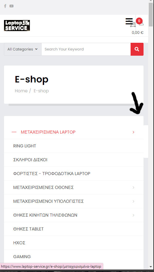
Our issue as i told you is with the Categories Module appearance, position left and applies in all eshop pages.
In the desktop version it looks great as choosing one category opens a box in the right that shows the subcategories.

The issue is in mobile version where the same module opens in the right to show the subcategories and these doesn't show at all in the mobile. You will notice that in the main page of the mobile version we replaced it with a menu but we cannot do the same in the e-shop. We wonder if there is a way where the box with subcategories could open down instead or right.

Accepted answer

Marked as the solution
Toufiq Senior Staff

You can do it easily using media query css code.

@media screen and (max-width: 900px) and (min-width: 320px) {
.className or #divName{
display:none;
}
}

4 more replies

Toufiq Senior Staff

Hi there,

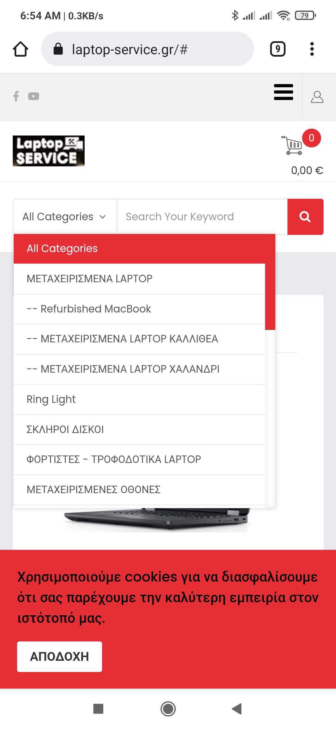
Thanks for contacting us. Sorry for the inconvenience. Can you share an screenshot about your issue?

No problem found my end.
Screenshot_2022-05-01-06-54-41-434_com.android.chrome.jpg

-Thanks

KOSTAS DIMITRAKAKIS Asked this

Hey Toufiq , it not about the search bar but the SP VirtueMart Category Menu - Module named Categories that shows inside the Eshop in left position.

After all we decided to remove this module from Mobile View, and we want to ask if there is a way to show the module only in Desktop version?

KOSTAS DIMITRAKAKIS Asked this

That worked great, thank you very much for your assist Toufiq

Log in to reply.