How to keep The Three cols structures smaller devices

In tablet view i am getting this

I have tried adding display: flex; to the row but it did not work and messed up the desktop view
How to keep The Three cols structures smaller devices
In tablet view i am getting this
I have tried adding display: flex; to the row but it did not work and messed up the desktop view
Have you set for tablet layout as well? please double check (!)
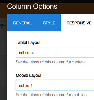
Hi Graeme,
have you tried that option in all used columns ?
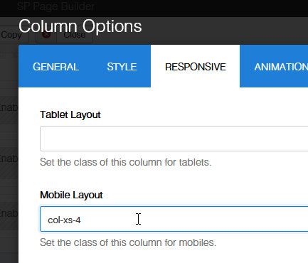
If you set col-xs-4 for all 3 columns, it should be 3 columns in Mobile view as well.
Hi That works perfectly on desktop and moble but fails to affect tablet view any thoughts?
Perfect Thanks