

Gap Between Columns In Responsive View
Frédéric Bianchi
Hi, I have a problem with the gap between columns in responsive view. As you can see below i have a gap in the desktop view. But if you turn to mobile view, the 2 columns go one under the other, but the space disappears.
Also, if i go in mobile view in real (or with dev tool), the button of the first column is hided. And i have the possibility to drag the page to the left...
Many problems just on one page. I precise i am in Joomla 4 and have Nicepage installed too on the site. Perhaps some conflicts ?
Why this gap disapear ? Regards

Paul Frankowski
Accepted AnswerHi Frédéric,
explanation is very easy.
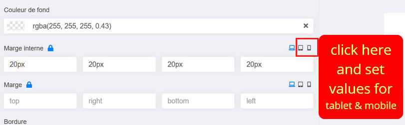
You set the right padding, but you forgot to add/set bottom padding. And on smaller screen "right" =/="bottom" it doesn't work this way.
Set bottom padding for tablet and mobile view as well. You can also put top 7px and bottom 7px for 2nd block - also OK. Just Play!
Frédéric Bianchi
Accepted AnswerThank you, but already tested. Just see screenshot. Nothing change.
Frédéric Bianchi
Accepted AnswerIn fact, whatever i make in responsive view, in this section or other, nothing move. Only the text color work. The border, size of border, width, heigh, padding, margin, nothing work.
EDIT : It work in mobile view, but not in tablet view.
Frédéric Bianchi
Accepted AnswerAnd here is the difference between the component mobile view, and the real mobile view. Nothing to do with.
So either the component is malfunctioning, or I don't know how to use it, or there is another problem.
But frankly, so much complication for a simple page, it won't be possible for me. If I have to spend 2 hours to set up a responsive view that should work by itself, I can't use this component.
Frédéric Bianchi
Accepted AnswerOK, after some other tests, i understand now why my button is not visible correctly in mobile view. When i create a column and i put a text + a button, there is a big space between the button and the border bottom of the column (why, i dont know). So i have put a heigh for the columnn. So the heigh force the heigh of my column on mobile view too. If i put min heigh instead of heigh it work.
In summary of my posts above, what I don't understand:
- Why in the tablet view, nothing changes when I change settings.
- Why the mobile view in the editor does not correspond to the real mobile view (window width and therefore text placement etc). And in the mobile view of the editor, the button is correctly visible, while in the real mobile view, it is hidden (because of the height of the column).
I did tests on another site with a fresh installation of Joomla 4 (only Joomla 4 and no other components or plugin), with the addition of the first section (a text+button and an image), same problems.
For the horizontal scroll bar, was not related to SPPB, so it is OK now.
Paul Frankowski
Accepted Answer difference between the component mobile view, and the real mobile view. In SPPB mobile preview you have only ONE resolution, but your browser (firefox) have Code Inspector and Responsive tab you can preview with many mobile devices.
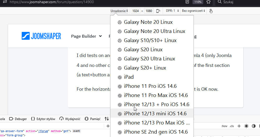
There is about 10 popular resolution that REAL mobile device uses.
In upcoming SPPB 4 it has more responsive options, but it's not all you may need. Even on WordPress page builders nobody add so many options.