Hi at all,
on the tablet and mobile view, the search box is displayed much too wide, although I have adjusted the colum width accordingly in the template settings.
Does somebody has any idea?
Thank you!
Hi at all,
on the tablet and mobile view, the search box is displayed much too wide, although I have adjusted the colum width accordingly in the template settings.
Does somebody has any idea?
Thank you!
Hi 8ITS,
small custom CSS should help also in that case. Example:
@media (max-width: 980px) {
#sp-search .search form input {width: 94%; }
#sp-search .search form::after {right: 25px;}
#sp-search {max-width: 90%;}
}
After (iPhone emulator)
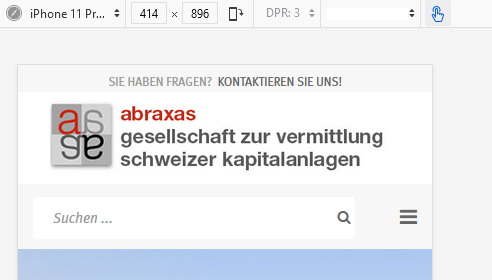
it`s working.
Thank you.
please mark as solved, you're welcome