

Responsiv
Uwe Decker
Hi guys,
I am actually working on a customers website with page builder and helix ultimate template, newest versions. Joomla latest version. Everything is fine, except the presentation on mobile phones. I use a slider module for the header. This module is fine on PC and tablet, but on mobile phones it compresses the slider to much. Everything else is presented fine. What can I do to prevent this? I would more like to show the whole width of the slider, even if it will be a bit small...I hope, I have explained my issue well (?) Maybe you can give me some advice. Best regards, Uwe

Paul Frankowski
Accepted AnswerHi, to be honest the best way would to to create separate Addon for mobile view only. Then you will be able to reduce unwanted text and use smaller, more scaled bg image.
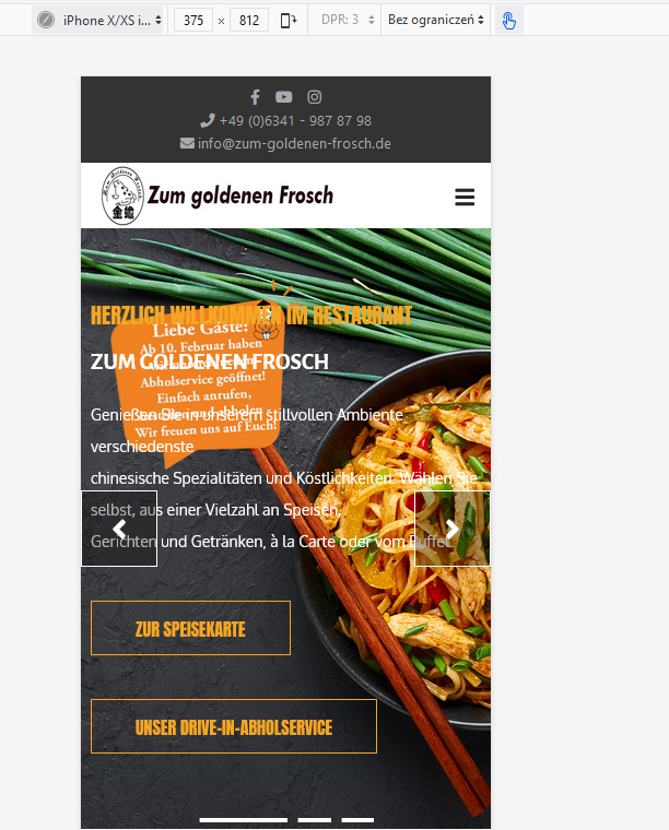
This is how it's presented in iPhone elmulator right now (below) and I see the part of the dish. Which looks very tasty by the way.
Paul Frankowski
Accepted AnswerOf course there is also 2nd way.
- Set smaller slider hight for mobile view only (for example 280px)
- Use below custom CSS
@media (max-width: 580px) {
.sp-slider .sp-item .sp-background {background-size: contain; }
        }