

Page Builder 4 Full Width Hero Image In Articles
G
Graeme
Hi I am redeveloping a site in SP Pagebuilder and helix Ultima I had startred of in SPPB3 All seemed fine And as its a development site i thought I switch to SPPB 4
To get A full With hero Image in within Articles I use this CSS Provided buy this forum
/*************SPPB Full Width Section for articles and sppb modules*******/
.phm-mod-article-full-width-section .sppb-row-container,
.phm-mod-article-full-width-section .sppb-container-inner {
    margin: auto;
}
@media (min-width: 1140px) {
.phm-mod-article-full-width-section {
    margin: 0 -21vw !important;
    width: inherit !important;
    }
.phm-mod-article-full-width-section .sppb-row-container,
.phm-mod-article-full-width-section .sppb-container-inner {
    max-width: 1140px;
    }
}
@media (max-width: 1140px) {
.phm-mod-article-full-width-section {
    margin: 0 -10vw !important;
    width: inherit !important;
    }
.phm-mod-article-full-width-section .sppb-row-container,
.phm-mod-article-full-width-section .sppb-container-inner {
    max-width: 992px;
    }
}
@media (max-width: 991px) {
.phm-mod-article-full-width-section {
    margin: 0 -16vw !important;
    width: inherit !important;
    }
.phm-mod-article-full-width-section .sppb-row-container,
.phm-mod-article-full-width-section .sppb-container-inner {
    max-width: 768px;
    }
}
@media (max-width: 767px) {
.phm-mod-article-full-width-section {
    margin: 0 -17vw !important;
    width: inherit !important;
    }
.phm-mod-article-full-width-section .sppb-row-container,
.phm-mod-article-full-width-section .sppb-container-inner {
    max-width: 576px;
    }
}
@media (max-width: 575px) {
.phm-mod-article-full-width-section {
    margin: 0 -5vw !important;
    padding-left: 20px !important;
    padding-right: 20px !important;
    width: inherit !important;
    }
.phm-mod-article-full-width-section .sppb-row-container,
.phm-mod-article-full-width-section .sppb-container-inner {
    max-width: 100%;
    }
}
/*****************End******************/
But i have had unusual results See link in hidden
Website
https://skm2.dns-systems.net
12 Answers
Order by
Oldest

Pavel
Accepted AnswerI would have done this more precisely aimed
.view-article .phm-mod-article-full-width-section:first-child {
    padding: 550px 0px 30px 0px !important;
}
G
Graeme
Accepted AnswerHi I have recrated this page and removed the CSS which was previously needed in SPPB3 It seems that this CSS is not needed within SPPB4 Joomla Articles Can you confirm please
G
Graeme
Accepted AnswerHi Futher experimentation Although removings the Old CSS The Page works in Preview mode But when accesed as via a a live page the hero element is not full width
It seems that the Old CSS is neccessary but element needs modifying in the SPPB4 to work correctly
Or Dose the CSS need modifing to Taking in to account the new media breaks Is this somthing anyone can help with?
Pavel
Accepted AnswerHi. As far as I see on this page, it works well. What is the problem?
G
Graeme
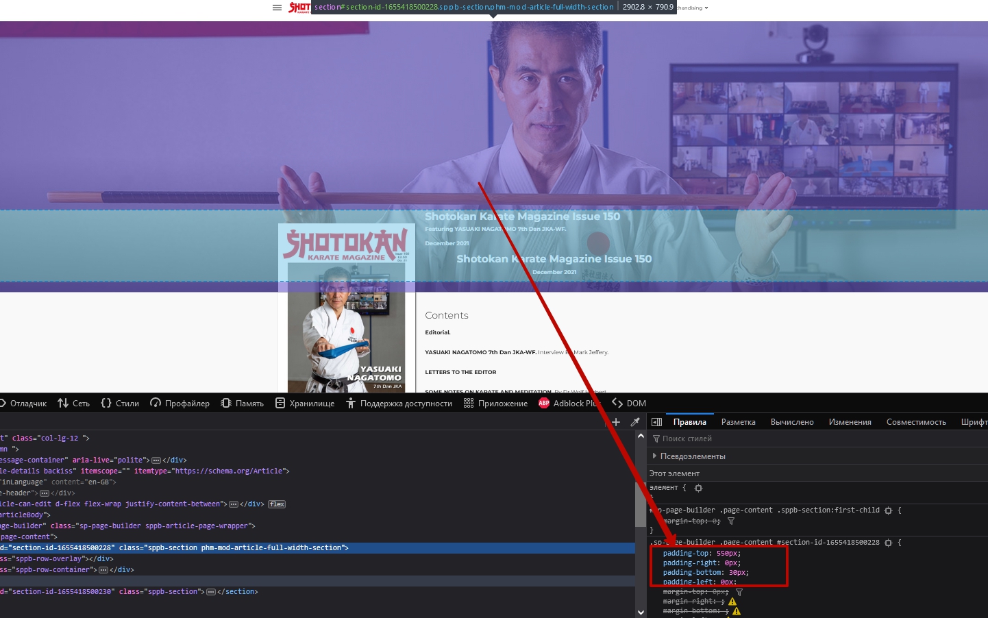
Accepted AnswerHi Pavel the page should look like this one https://skm2.dns-systems.net/skm-back-issues/issues-150-to-159/shotokan-karate-magazine-issue-150.html
This is the only article page i have edited as there several other issues with the page Redamore not working and Visabilty does not work on device all content is displayed So i dont want to make any other pages work till i have resolved all the issues
I can make style edits to the hero section which makes it display correct At the moment it just displays a thin strip at the top of the pages This was working correctly in SPPB3
Pavel
Accepted AnswerHi.
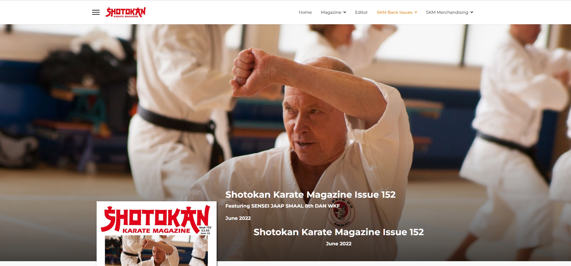
If you add paddings in section settings on this page https://skm2.dns-systems.net/index.php/skm-back-issues/issues-150-to-159/shotokan-karate-magazine-issue-152 it will works like on this one https://skm2.dns-systems.net/skm-back-issues/issues-150-to-159/shotokan-karate-magazine-issue-150.html
Add the same paddings
Or I don't understand the essence of the problem?

Toufiq
Accepted AnswerHi there,
Thanks for contacting us. Sorry for the inconvenience. Does solved your issue? If not, Please let me know.
-Thanks
G
Graeme
Accepted AnswerHi, yes this is the solution to the problem. After the Upgrade to SPPB4 and seeing the problem I added these padding changes this section on Issue 150 (the Upgrade must have removed the Padding) Previously In SPPB3 All 153 pages worked like page 150 and I was asking if there were some generic solution which could be included in to the Custom CSS. if not I will Have to Manually Update all 153 pages If this is the case then i will work through the pages once the other issue have been resolved I would prefer to only update the pages once not to have to makes several set updates (153 times)
If it is possible to add the padding to the existing custom css I assume I would also need to add the extra media breaks which are included in SPPB4 to match the padding i have added to page 150 across all the meda break options. i hope this makes sence
I do know what to do to solve the issue manually but was asking if there was a way to amend the custom CSS for a more efficent solution
Graeme
Toufiq
Accepted AnswerWill you please check & let me know. I just added custom css code.
.view-article .phm-mod-article-full-width-section {
    padding: 550px 0px 30px 0px;
}
G
Graeme
Accepted AnswerHi Pavel Thanks for this do you know what the media break is for the smllaes mobile view option is in SPPB4
/*************SPPB Full Width Section for articles and sppb modules*******/
.phm-mod-article-full-width-section .sppb-row-container,
.phm-mod-article-full-width-section .sppb-container-inner {
    margin: auto;
}
@media (min-width: 1140px) {
.phm-mod-article-full-width-section {
    margin: 0 -21vw !important;
    width: inherit !important;
    }
.phm-mod-article-full-width-section .sppb-row-container,
.phm-mod-article-full-width-section .sppb-container-inner {
    max-width: 1140px;
    }
    .view-article .phm-mod-article-full-width-section:first-child {
    padding: 550px 0px 30px 0px !important;
}

}
@media (max-width: 1140px) {
.phm-mod-article-full-width-section {
    margin: 0 -10vw !important;
    width: inherit !important;
    }
.phm-mod-article-full-width-section .sppb-row-container,
.phm-mod-article-full-width-section .sppb-container-inner {
    max-width: 992px;
    }
        .view-article .phm-mod-article-full-width-section:first-child {
    padding: 550px 0px 30px 0px !important;
}
}
@media (max-width: 991px) {
.phm-mod-article-full-width-section {
    margin: 0 -16vw !important;
    width: inherit !important;
    }
.phm-mod-article-full-width-section .sppb-row-container,
.phm-mod-article-full-width-section .sppb-container-inner {
    max-width: 768px;
    }
        .view-article .phm-mod-article-full-width-section:first-child {
    padding: 400px 0px 30px 0px !important;
}
}
@media (max-width: 767px) {
.phm-mod-article-full-width-section {
    margin: 0 -17vw !important;
    width: inherit !important;
    }
.phm-mod-article-full-width-section .sppb-row-container,
.phm-mod-article-full-width-section .sppb-container-inner {
    max-width: 576px;
    }
        .view-article .phm-mod-article-full-width-section:first-child {
    padding: 400px 0px 30px 0px !important;
}
}
@media (max-width: 575px) {
.phm-mod-article-full-width-section {
    margin: 0 -5vw !important;
    padding-left: 20px !important;
    padding-right: 20px !important;
    width: inherit !important;
    }
.phm-mod-article-full-width-section .sppb-row-container,
.phm-mod-article-full-width-section .sppb-container-inner {
    max-width: 100%;
    }
        .view-article .phm-mod-article-full-width-section:first-child {
    padding: 200px 0px 10px 0px !important;
}
}
/*****************End******************/
This is the last setting i have but unsure of the @media size
    .view-article .phm-mod-article-full-width-section:first-child {
    padding: 60px 0px 10px 0px !important;
}Pavel
Accepted Answer@media (max-width: 575px) it meants from 575px to 0 (320 px conditional zero, smaller size does not make sense)
If you need another breakpoint in front of conditional zero, add it.
For example:
@media (max-width: 480px) {
    /*your code goes here*/
}