Hi,
I noticied since few days, when I visit my website on my iPad, the menu position is lower than it should be:
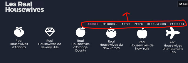
The menu should be align with the logo.
No issue on computers or phones, only iPad.
Hi,
I noticied since few days, when I visit my website on my iPad, the menu position is lower than it should be:
The menu should be align with the logo.
No issue on computers or phones, only iPad.
Hi
Thanks for contacting us. Use this custom CSS
@media only screen and (max-width: 1199px) and (min-width: 990px)  {

  .sp-megamenu-parent{
        position: relative;
     bottom: 85px;
  }
}
Path towards custom CSS: Extensions>Templates>Styles> Click on your current default template name then choose Template Options. Then find custom CSS within the custom code.
-Regards.
Thank you Mehtaz! 👍Have a nice day
You are always welcome. Have a nice day too.