Solved Templates

CSS Text Gradient on a Button

Asked by SIHAME ALLALI 4 years ago Last activity 4 years ago

I am trying using CSS to do something without any luck:

I want for the text of a button to have a CSS Text Gradient and on hover for the background color of the button to be a linear gradient.

I can do 1 but not both :(

https://www.pgtgroup.fr/index.php/fr/

for the button Contact Us [upper right]

Currently, I managed to get the button on hover to behave as I want with:

.sppb-btn.sppb-btn-default.sppb-btn-outline.btn-black:hover { background: linear-gradient(80deg, rgba(0,14,70,1) 0%, rgba(30,24,207,1) 35%, rgba(0,226,102,1) 100%);}

but if I add :

#sppb-addon-wrapper-1603870286770 .btn-black { background: -webkit-linear-gradient(22.5deg, #000e46, #1E18CF, #00E266); -webkit-background-clip: text; -webkit-text-fill-color: transparent;}

I get the desired colored text on a white button background with black outline but the Hover does not work ;(

Any idea/help would be amazing !

Accepted answer

Marked as the solution
Pavel
4 years ago · edited

Hi @SIHAME.

Here is

.contact-us-button-bg {
    display: inline-block;
    padding: 12px 31px 12px 32px;
    border: 2px solid #252525;
    font-weight: 600;
}
.contact-us-button-bg:hover { 
    background: linear-gradient(22.5deg, #000e46, #1E18CF, #00E266);
}

.contact-us-button-text { 
    background: linear-gradient(22.5deg, #000e46, #1E18CF, #00E266); 
    background-clip: border-box;
    -webkit-background-clip: text; 
    -webkit-text-fill-color: transparent;
}
.contact-us-button-bg:hover .contact-us-button-text {
    background: linear-gradient(22.5deg, #ffffff, #ffffff, #ffffff);
    background-clip: border-box;
    -webkit-background-clip: text;
    -webkit-text-fill-color: transparent;
}

Just to let you know:

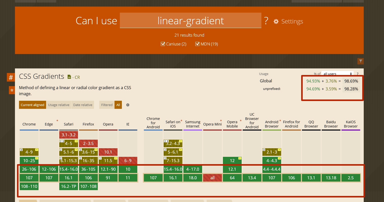
For a linear gradient no longer needs -webkit- prefix

8 more replies

Mehtaz Afsana Borsha Staff

Hi

Thanks for contacting us. When I hover the button then it seems like this. isn't it ok?

Screenshot 2022-11-02 at 10.43.53 PM.png

-Regards.

SIHAME ALLALI Asked this

Hi Mehtaz,

THAT is what I want for when you hover over it to visually synchronize with the logo of course

BUT when it is NOT on :hover, I want to be able to have the Contact Us be like the ACCUEIL [using CSS Text Gradient] with a white background...

And the BOTH conditions of regular with the CSS Text Gradient + :hover showing what you see is what I can't seem to find a way to do ;(

Thank you very much.

Mehtaz Afsana Borsha Staff

But its already seems like this on your site. I have just insert the CSS from your site. Then what's the issue? Could you please explain it a bit more?

SIHAME ALLALI Asked this

It is NOT as I described wanting it on the website.

The button Contact Us in the upper right hand corner when NOT hovering over it is in black letters, right?

That's not what I want, I want it to looking just like like Accueil with a blue to green color gradient.

That is what is missing - when I manage to get that to work, then the Hover effect no longer works.

I want both effects to work not one or the other.

Pavel
4 years ago · edited

THAT is what I want for when you hover over it to visually synchronize with the logo of course
BUT when it is NOT on :hover, I want to be able to have the Contact Us be like the ACCUEIL [using CSS Text Gradient] with a white background...

Hi. To achieve this, you need to make a button using HTML. It is impossible to do it using Button Addon.

There should be such a design

<a href="#" class="your-button-class">   <!-- for this element bg gradient on hover -->
    <span class="your-button-text-class">Contact Us</span>   <!-- for this element text gradient -->
</a>
SIHAME ALLALI Asked this

Hi Pavel,

I have tried what you suggested in the form of :

<a href="#" class="contact-us-button-bg">
<span class="contact-us-button-text">Contact Us</span>
</a>

with CSS:

.contact-us-button-bg:hover { background: -webkit-linear-gradient(22.5deg, #000e46, #1E18CF, #00E266); -webkit-background-clip: text; -webkit-text-fill-color: transparent;padding: 12px 0px 12px 0px;}

.contact-us-button-bg .contact-us-button-text { background: -webkit-linear-gradient(22.5deg, #000e46, #1E18CF, #00E266); background-clip: border-box;padding: 12px 31px 12px 32px;-webkit-background-clip: text; -webkit-text-fill-color: transparent;border: 2px solid #252525;font-weight:600;}

but on hover, it's not working...

The non hover state is as it should be (the text is showing a text gradient) - but on hover,
the background does not turn gradient :(

HELP ?

Thanks.

https://www.pgtgroup.fr/index.php

SIHAME ALLALI Asked this

Hello Pavel,

THANK YOU so very much - I get it to be exactly what I wanted based on what you gave me.
and thanks for the caniuse hint... I use it often - great resource !

Log in to reply.