
Hello, I have a problem with the width of my responsive menu, given its width, I would have to be able to trigger the hamburger menu before the screen resolution which is the default.
How can I do.
Thanks for your help.
Chris
Hello, I have a problem with the width of my responsive menu, given its width, I would have to be able to trigger the hamburger menu before the screen resolution which is the default.
How can I do.
Thanks for your help.
Chris
Hi Chris,
it's possible only via custom CSS, about what screen resolution we are talking about ?
This information is critital to help you.
Example Custom CSS code, published few times on the forum:
@media (max-width: 1024px) {
#sp-header #offcanvas-toggler.offcanvas, #sp-header #offcanvas-toggler.mega
{display: block !important;}

 .sp-megamenu-parent.d-none.d-lg-block
 { display: none !important; }
}
CODE UPDATED
Thanks for your reply Paul. I was talking about the screen resolution, that's right.
On smaller screens my menu (normal desktop type) slides below.
I would have liked to replace that with the hamburger menu at that time. The css you gave me doesn't work (of course I changed the values to 1024) for testing.
Hi
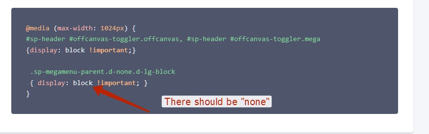
Thanks Pavel, indeed ... I had to be tired.
CODE UPDATED, check again
you can also use with:
@media screen and (max-width: 1024px) {
Thank you for the correction and your involvement to both of you! Indeed it works, on the other hand it appears a second hamburger menu?