

SPPB - Tablet Display Of 3+ Items Per Row
Carrie M Wrigley
Hey guys, I'm creating a number of rows in SPPB containing 2-6 images, flipboxes, and other elements per row. These look great in computer view, displaying all elements in one row as expected. However, when I click to tablet or phone view, all the addons appear in only 1 column, not side by side as expected or hoped. This is OK on phone, but on tablet all those 1-column displayed elements display oversized and look weird.
In contrast, I noticed this doesn't happen with your blocks (eg., content and team blocks) where multiple elements per row display side by side, in a nice sizing. Most commonly, when there's 4 addons in a row, then when in tablet display, those content blocks display the items appear 2 per row (2 columns), side by side, which looks nice. Rather than in one oversized column.
I am replicating the layout numbers from what I observe in the content blocks. (most commonly, 3+3+3+3, or 12+3+3+3+3. ) But in tablet display, I keep getting a 1-column display of these items, rather than a 2-per-row display as in the content blocks with the same layout.
Is there any way I can get that 2-column display in tablet as in the content blocks, when initiaiting a layout myself? Or do I have to start with a content block to get this result?
(You can see this on my newly-created site https://impactmusic4kids.org/. I have several sections of 3+3+3+3 layouts (feature boxes, images, and icons). You'll see that on computer view, these display 4 to a row as expected. But in tablet view (as well as phone view) it jumps to 1 addon (oversized) per row - rather than the 2 per row in tablet view that's visible in the content blocks for similar 4-item sections. )
Carrie M Wrigley
Accepted AnswerThanks so much, Pavel - I've been searching for this answer for months now, and would never have found those tiny controls, in a million years. Now that you've shown me what to look for, I can now locate and replicate the responsive settings in those content and team blocks. Happy day! :-)
I searched the documentation - didn't see anything on this. Know if there's any more information about this function anywhere? I found a "Column Options" section, but it didn't seem to have anything about width settings. Looks like you have to set each column individually, yes? And if you clone an addon after resetting width, it doesn't translate to the next column - but if you do all the columns and clone or save the section with those width adjustments, it does reflect the new settings in the clone. I think?
Thanks again! :-)

Ofi Khan
Accepted AnswerHello Carrie M Wrigley
Great! It looks like you have found the solution. Thanks Pavel, for your valuable contribution to the community.
Best regards

Pavel
Accepted AnswerI searched the documentation - didn't see anything on this
Unfortunately, the documentation contains very poor information on this matter.
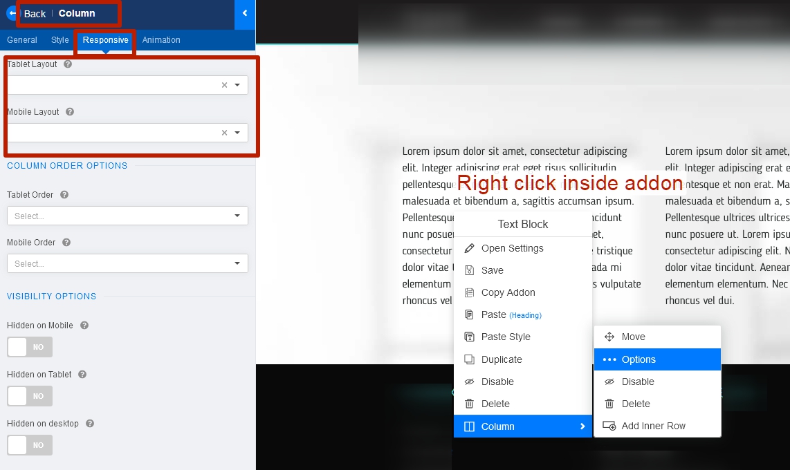
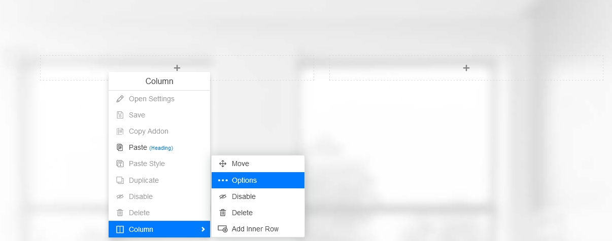
Yes, the addon does not transfer the settings when copying, because these are the column settings, not the addon. You can enter these settings without an addon by right-clicking on an empty column.
And yes, you should set up each column separately. The total amount for the columns to fit in one row should not exceed 12. For a better understanding of how this works, check out the bootstrap documentation https://getbootstrap.com/docs/4.0/layout/grid/
Carrie M Wrigley
Accepted AnswerAwesome - thanks, Pavel, for your clarifications, and for the links you've provided. So much to learn!
I'm trying to understand this better, by watching training videos on OS Training on Bootstrap. I'm assuming SPPB is built on / consistent with Bootstrap 4 - yes/no?