

Logo Mobile Problem HU2
yo_ray
Hi I found an Issue (maybe you see it as an feature but for my needs its an issue). On my site i use the latest Helix Ultimate 2 Template. I have a setting where i just want the logo set for mobile. There i just use it for the offcanvas. We use other Logos on our site thats why this setting is so important.
But when i want to set the logo just for mobile and delete the regular then the view is not for all three categories (desktop, tablet, mobile anymore). Its just the one select button. But not all three as it was also in older Helix Templates.
Is this an issue? If so could you fix this please.
If its a feature how can i set just a logo to the offcanvas like it would be with this function. I can send you more info if you dont know what i mean. Thank you
yo_ray
Accepted AnswerAnother question. When i make an pagespeed test then google gives me a bad score for best practice at the point of the logo. It says something like there is no explicit width and height defined. What i cannot understand because at the code that they are refering to the is a width and height but it is data-width and data-height. Maybe they just want it just with width and height and not data-width? Here is the short code that i got.
<img class="logo-image-phone d-inline-block d-lg-none jch-lazyloaded" src="/https://.........png" data-src="https://.............png" alt="Logo" data-width="400" data-height="252">

Paul Frankowski
Accepted AnswerHi,
It's becuase sometimes Google "likes" more classic HTML values like width= and height= ... we used those values but inside CSS styles, not inside html (php) code.
.. the only way to change it now is to customize template code, hopefullly you have to edit only one file logo.php in /features/ folder in template folder.
I agree, that probably we have to improve it that becuase of Google weird requests.
Paul Frankowski
Accepted AnswerQ: But do you have raw Helix Ultimate or template based on it??
In general you should have 3 logo inserted: Desktop, Mobile (smaller), and Retina (for iPad,Iphone - good quality, bigger than mobile, you can use this same as for Desktop)
Or at least you should have Desktop and Mobile logo
yo_ray
Accepted AnswerThank you Paul Yes if this would be possible to look at the width thing for the template itself it would be great, so that all users can profit from that. I think this alert is shown to a lot.
And for the question i use just the Helix Ultimate Template/Framework with SPPB Pro (so no other named Template).
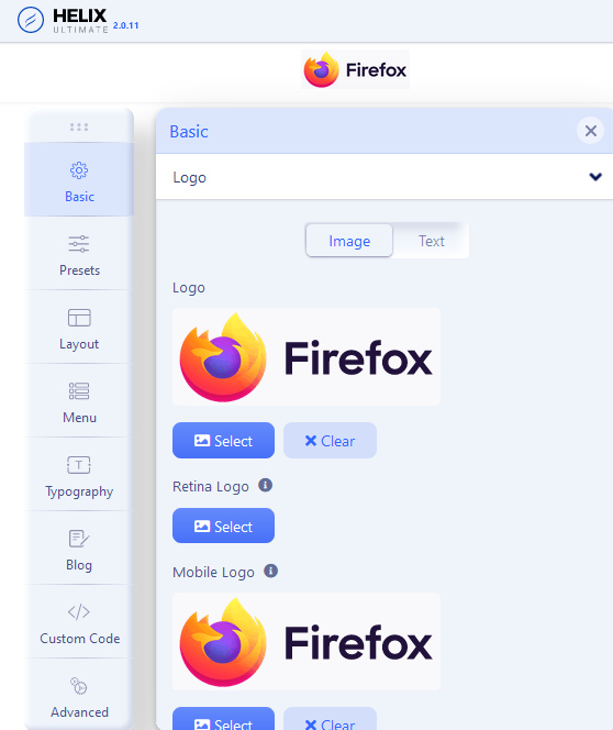
Please try with this example of the screenshot above when you clear now the first Logo then it changes with the view like there is no logo and there are also not three settings. In older Template there were always the three visible. As you can see on the first screenshot there is no logo set and just the one button (but i can see the mobile logo). On the second screenshot is a logo set and now all three are visible (there i cleared the mobile logo for the test but i can set i know).
https://ibb.co/PZJT93z https://ibb.co/6mCc6J9
Hope you know what i mean. At the moment i have set it without Retina. Like you mentioned. But i would like to just set the mobile Logo. Thats not possible with the setting when i clear the regular top logo (first image)
Thanks a lot and have a nice day :)