Solved Templates

Menu switch to a line between the header

Asked by crea-arte GmbH 3 years ago Last activity 3 years ago

Hi

My homepage is test.creaarte.ch and I use the Helix Ultimate template.

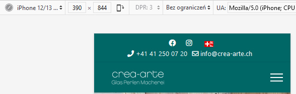
If I make the windows smaller, the menu move to a row unter the header area. If you make the windows much smaller, the menu will gone away, just the Offcanvas is visible.
What can I do against it? Is the a limit (width of the windows) where the menu gone away?

Can I expand the menu over the full width of the window? I use the predefined header "Top bar".

Thanks
Hans

Accepted answer

Marked as the solution
Paul Frankowski Senior Staff

yes, but by custom CSS only ... I think we have that tip in documenation search...

but first use my tips!

3 more replies

Paul Frankowski Senior Staff
3 years ago · edited

Hi Hans,

it's a simple math, you have to reduce space used in menu column to get more space for menu items. It's like when you trying to put 6-7 people into 5 sits car!

Step 1: in Template Options > Menu > Mega Menu > set only "MegaMenu" then [=] will dispapear in desktop (laptop/pc) view, and you will safe ~40px !

Step 2: reduce space between menu items and "v" icon on smaller screen sizes.

 @media (max-width:1270px ) {
.sp-megamenu-parent > li > a, 
.sp-megamenu-parent > li > span {padding: 0 10px;}

body.ltr .sp-megamenu-parent > li.sp-has-child > a::after, 
body.ltr .sp-megamenu-parent > li.sp-has-child > span::after {margin-left: 3px; }
}

it should help ! I use it on all my private sites. We have those tips in Helix docs as well.

Paul Frankowski Senior Staff

Yes, offcanvas menu [=] is decicated for Tablet and Mobile devices. So it's totally normal.

foto_9366_2022.jpg

crea-arte GmbH Asked this

Hi

Thanks for the answer.

Can I switch off the Mega menu, if the width is below a minimum?

Log in to reply.