

Need To Hide One Menu Item On Off-canvas
Anders Wiik
Hello.
Is there a way I can make one menu-item hidden on the off canvas? I use a picture as a menu item when using computer but would like to use text on phone. My plan is to have two menu items. One which only is visible on computer and one which is only visible on phone.
How to I add this css to a menu item?
/Anders

Pavel
Accepted AnswerHi. Add this code to custom.css file. Hide on mobile.
@media (max-width: 991px) {
    .item-180 {
        display: none !important;
    }
}
Hide on desktop
@media (min-width: 992px) {
    .your_desktop_item_class {
        display: none !important;
    }
}
Ofi Khan
Accepted AnswerHello Anders Wiik
You can hide this with Custom CSS just like Pavel said. Add your CSS here
Best regards
Anders Wiik
Accepted AnswerOk. I can hide the item I want to hide on off-canvas but where do I add the css-class to the item I only want to be displayed on iphone?

Paul Frankowski
Accepted AnswerFor all new Iphones would be
/* Portrait and Landscape */
@media only screen
  and (min-device-width: 375px)
  and (max-device-width: 812px)
  and (-webkit-min-device-pixel-ratio: 3) {

    YOUR-CLASS

}Anders Wiik
Accepted AnswerI added
@media (max-width: 991px) {
    .item-180 {
        display: none !important;
    }
}
to custom css. It worked fine.
When adding
 @media (min-width: 992px) {
    . .onlyvisible_menu_item_on_phone {
        display: none !important;
    }
}
nothing happens.
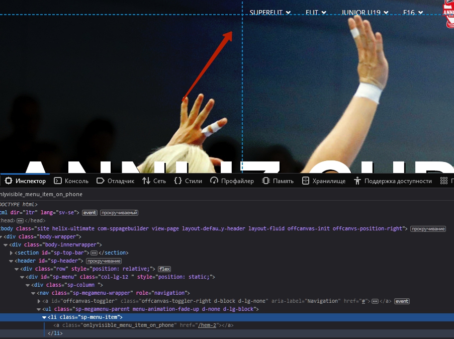
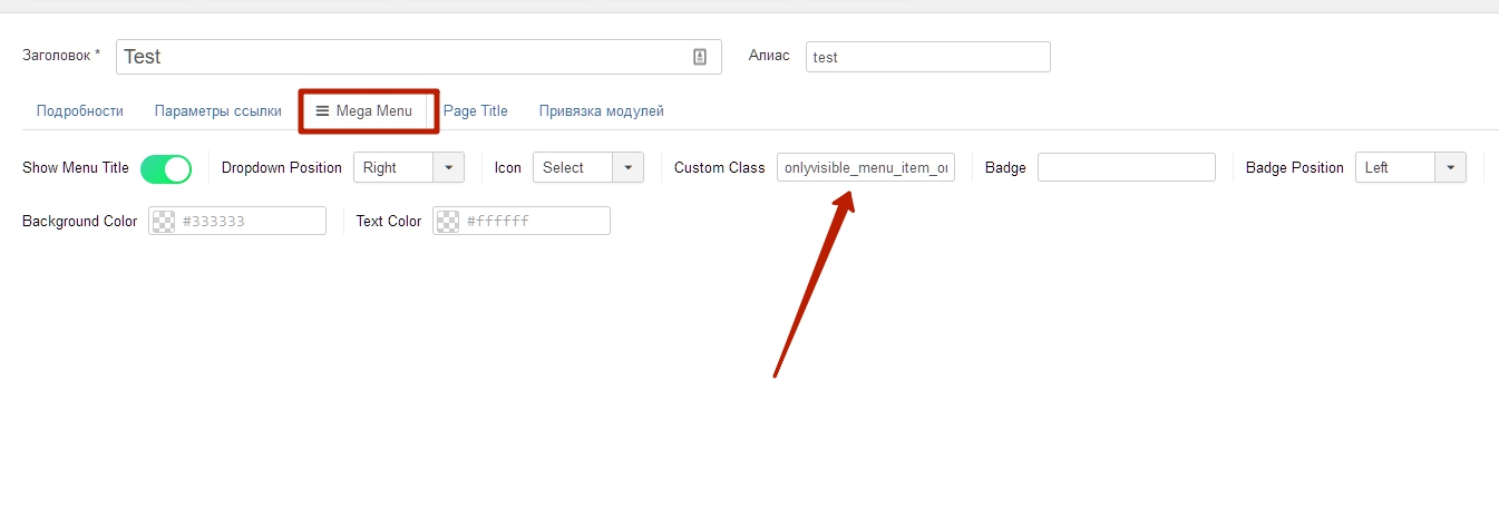
I edit the menu item and try to write onlyvisible_menu_item_on_phone on the link class field but still nothing happens.
Should I add
/* Portrait and Landscape */
@media only screen
  and (min-device-width: 375px)
  and (max-device-width: 812px)
  and (-webkit-min-device-pixel-ratio: 3) {

    onlyvisible_menu_item_on_phone
}
to make it work?
Pavel
Accepted Answernothing happens.
Looks like a cache problem. Clear your joomla cache.
And paste the code into custom.css file, not inline
 Also, I would recommend using the class not in the link but in the li element. Because the li is still visible and takes up space.
 Now empty

Helix Ultimate makes it easy
Anders Wiik
Accepted AnswerThanks Pavel for your support. However, it still doesn't work.
I moved the css to custom.css as you said.
then I cleared the cache.
Result: No change.
The image in the center of the menu is the one I want to dissappear when using the off-canvas menu. Since this is an image maybe I need to do something different?
The Start item is what I want only to show up on the off-canvas menu.
I really hope you have the solution!
Pavel
Accepted AnswerIt cannot fail to work. I have no other solution. I don't see you adding code to custom.css.
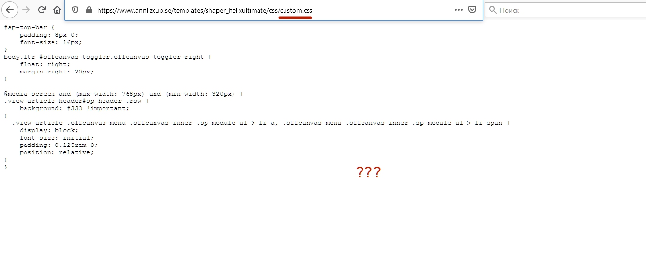
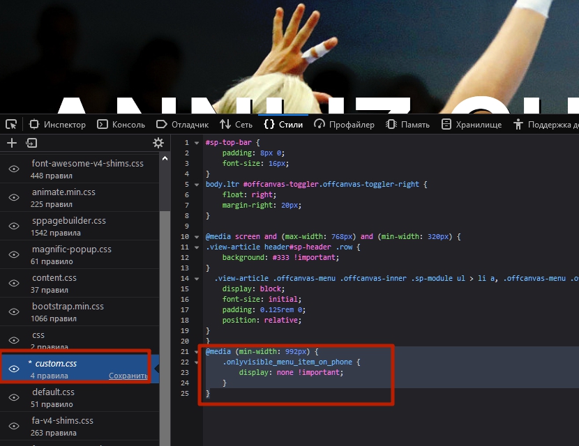
https://www.annlizcup.se/templates/shaper_helixultimate/css/custom.css
Anders Wiik
Accepted AnswerThis is my custom.css. I see it when clicking on the link you provided.
sp-top-bar {
padding: 8px 0;
font-size: 16px;
} body.ltr #offcanvas-toggler.offcanvas-toggler-right { float: right; margin-right: 20px; }
@media screen and (max-width: 768px) and (min-width: 320px) { .view-article header#sp-header .row { background: #333 !important; } .view-article .offcanvas-menu .offcanvas-inner .sp-module ul > li a, .offcanvas-menu .offcanvas-inner .sp-module ul > li span { display: block; font-size: initial; padding: 0.125rem 0; position: relative; } }
@media (max-width: 991px) { .item-180 { display: none !important;
}
@media (min-width: 992px) { .onlyvisible_menu_item_on_phone { display: none !important; }
/* Portrait and Landscape */@media only screen and (min-device-width: 375px) and (max-device-width: 812px) and (-webkit-min-device-pixel-ratio: 3) {
  .onlyvisible_menu_item_on_phone {
    display: none !important;
}
}
When I use my safari browser on my mac and minimize the screen size the logo menu item dissapears. But the START menu item does not dissapear when showing the page in full screen.
Anders Wiik
Accepted AnswerPavel, it works. It was missing a bracket and when I cleared the cache on my iphone all worked!!! Perfect.
Very much thank you!!
/Anders