- TemplatesTemplates
- Page BuilderPage Builder
- OverviewOverview
- FeaturesFeatures
- Dynamic ContentDynamic Content
- Popup BuilderPopup Builder
- InteractionsInteractions
- Layout BundlesLayout Bundles
- Pre-made BlocksPre-made Blocks
- DocumentationDocumentation
- EasyStoreEasyStore
- ResourcesResources
- DocumentationDocumentation
- ForumsForums
- Live ChatLive Chat
- Ask a QuestionAsk a QuestionGet fast & extensive assistance from our expert support engineers. Ask a question on our Forums, and we will get back to you.
- BlogBlog
- PricingPricing
Image Carousel Responsive Not So Responsive
Cristina
hi everyone, at my home page I have under the slider a image carousel, but I'm having trouble to get to show better in tablet mode, both ways. Is anyone that would be so kind to help me please ? here the website
15 Answers
Order by
Oldest
Paul Frankowski
Accepted AnswerHi Cristina,
but what is wrong with Tablet view?
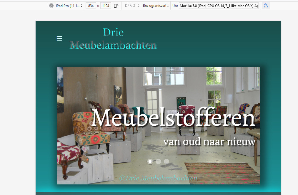
Here is screenshot from iPad emulator

Paul Frankowski
Accepted AnswerLet me guess, you want to show the whole image, not cropped. Yes, it's possible, example code for main top slider:
@media screen and (max-width: 1024px) {
.sp-slider .sp-item .sp-background
{background-size: contain !important; background-repeat: no-repeat;}
#section-id-1511613808 .sp-slider-outer-stage {
  height: 380px !important; max-height: 380px;}
}Paul Frankowski
Accepted AnswerAbout carousel-extended next to "Groot of kleine"
Easier would be to use different slider for mobile/tablet view only.
Use addon "Image Carousel" instead of, is much more responsive and works better for tablet and mobile view. Add images and set that addon to display only for Tablet and Mobile, and hide in Desktop. Opossite do for carousel-extended addon.
Cristina
Accepted Answerhi Frank thanks so mych for your fast answer, you are the best!! yes i meant the image carousel next to the groot of kleine. i have an image carousel that was in the template. But if I understanr you correctly i can put two carousels there then and one for the desktop and the other for the tablet and mobile, tho my question is how do i get both at the same place then? bc rn is one row wirh two columns.
thanks so so much
Paul Frankowski
Accepted Answeryes, on that same column. One below the other, but with different view settings
Cristina
Accepted Answerthanks Paul, tho I do have another question, you said before that the carousel for the tablet and mobile to use the image caousel unlike the extended one for the desktop extended addon. Yet the current one is an image carousel i dont quite understadn what you mean by extended, unless you mean that instead of showing three pics, one in the center and half of two pics on each side is extended then. ;) trying to get it all properly sorted out and i must say the more im getting used to it the more i like it... except for the few bugs i had before in my other post ;D
Paul Frankowski
Accepted Answeryes, You should use only a single image per slide for mobile view, less problems.
SPPB 3 or SPPB 4?
Cristina
Accepted Answerhumm tiny hiccup, i have done so yet on the ipad pro landscape the carousel that gets showed still is the desktop one even tho is hidden on the options. what now? recreat the big and try if that works ?
Paul Frankowski
Accepted AnswerIt's becuase iPad Pro has resolution of laptop. And Hide/Show detection is based on basic resolution rules. Do we talk about iPad Pro 10.5 or Pro 9.7?
so extra CSS with @media with -webkit-min-device-pixel-ratio is needed. Do you need extra tip?
Cristina
Accepted Answerif you wouldn't mind yes otherwise idk how to fix it for the bigger ipad :s and make a new carousel for this isn't an option and the ipad is 12,9 inch
Cristina
Accepted Answer@Paul i hope you had a great weekend, can you please help me solved the ipad 12.9 inch issue with the carousel? :) thanks so much :*
Paul Frankowski
Accepted AnswerSure, I had, but we still have winter here with wet snow.
Let me check my CSS notes...
Paul Frankowski
Accepted Answerso let's imagine that we want to hide addon in iPad (9.7"-12.9") only:
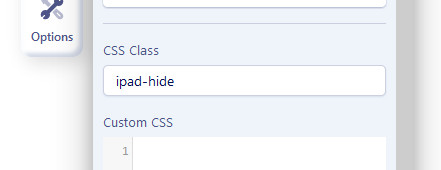
- In addon "CSS Class" put name: ipad-hide
- Then inside template or page Custom CSS add
@media only screen
  and (min-device-width: 768px)
  and (max-device-width: 1366px)
  and (-webkit-min-device-pixel-ratio: 2) {
.ipad-hide { display: none !important; visibility: hidden;}
}
it should help (in theory)

Cristina
Accepted Answerhi Paul, sorry i couldnt answer you before but the flu got the best of me... but now im back working on it and it works yet the mobile one wont show now even tho isnt hidden for tablet and didnt added the ccs at the mobile one and in the settings isnt hidden either... what do i do now?

