Top Bar Alignment On Tablet/mobile
M
Marin
In Helix Ultimate, the Top bar alignment on the desktop is so that elements in modules are placed left and right. On mobile view, elements are in one row, placed one on top other. Can this desktop view also be forced on mobile?
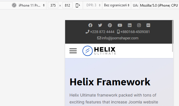
Ordering on desktop

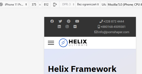
and on mobile phones

4 Answers
Order by
Oldest

Paul Frankowski
Accepted AnswerBut if you really need that ... and you have set pre-defined header:
@media screen and (max-width: 680px) {
#sp-top1, #sp-top2  {width: 50%;max-width: 50%;}
}
Custom CSS method.
AFTER using it.
Paul Frankowski
Accepted AnswerHi Marin,
In theory yes, but it may not be place to keep both columns. Remember that not users have iPhone XXL or huge Samsung.
M
Marin
Accepted AnswerHi Paul, thank you very much. But, yes, as you mention, it's better to keep it as it is because not everyone had a large phone :)