- TemplatesTemplates
- Page BuilderPage Builder
- OverviewOverview
- FeaturesFeatures
- Dynamic ContentDynamic Content
- Popup BuilderPopup Builder
- InteractionsInteractions
- Layout BundlesLayout Bundles
- Pre-made BlocksPre-made Blocks
- DocumentationDocumentation
- EasyStoreEasyStore
- ResourcesResources
- DocumentationDocumentation
- ForumsForums
- Live ChatLive Chat
- Ask a QuestionAsk a QuestionGet fast & extensive assistance from our expert support engineers. Ask a question on our Forums, and we will get back to you.
- BlogBlog
- PricingPricing
The Hide Mobile Or Tablet Or Desktop Flag Doesn't Work
afavaro
After the update the hide flags on mobile, tablet and desktop don't work and I see double blocks on devices.
Joomla 3.10.11 Helix 3.0.3 Theme: Shaper Newedge
Website
http://www.nowpadova.com
18 Answers
Order by
Oldest
Mehtaz Afsana Borsha
Accepted AnswerHi
Thanks for contacting us. Could you please give me a screenshot of your issue?
-Regards.
afavaro
Accepted Answerafavaro
Accepted AnswerQuesto problema l'ho riscontrato anche in un altro template.
nel sito http://falieretoniolo.it/
se spunto il comando "nascondo per mobile" in realtà non lo nascondo e mi pubblica doppia la riga
Mehtaz Afsana Borsha
Accepted AnswerWe only communicate in the English Language. Please help us understand your issue by translating it!
afavaro
Accepted AnswerI also encountered this problem in another template.
on the site http://falieretoniolo.it/
if I tick the "hide for mobile" command, I don't actually hide it and it publishes the line twice
Paul Frankowski
Accepted AnswerCiao,
please add this custom CSS
@media screen and (max-width: 760px) {
.d-none, .hidden-sm, .hidden-xs {display: none !important; visibility: hidden;}
}
it should help fix it, of course keep current settings.
afavaro
Accepted AnswerHi I haven't written to you anymore but I keep having problems. I'll give you a screenshot. The highlighted screen should only be seen in the mobile and instead it also appears in the desktop even if I check "hide desktop" can you help me?
Paul Frankowski
Accepted AnswerUse updated CSS code
@media screen and (max-width: 760px) {
.sppb-hidden-sm.sppb-hidden-xs, .sppb-hidden-sm,
.d-none, .hidden-sm, .hidden-xs {display: none !important; visibility: hidden;}
}Paul Frankowski
Accepted AnswerMy CSS was OK, but you have wrong Responsive settings in column.
If you have SPPB 4.0x - Please switch to ENG lang and check column settings again, column must be hidden in Desktop and Tablet !
afavaro
Accepted AnswerI have SPPB 3.X installed
Whatever I want to hide on both mobile and PC, it doesn't work.
I'll give you the screenshot.
Please help me as I have been having this problem for quite some time now
Paul Frankowski
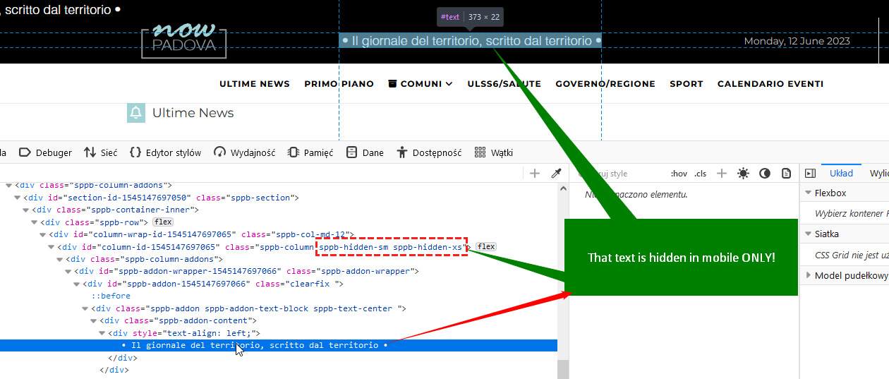
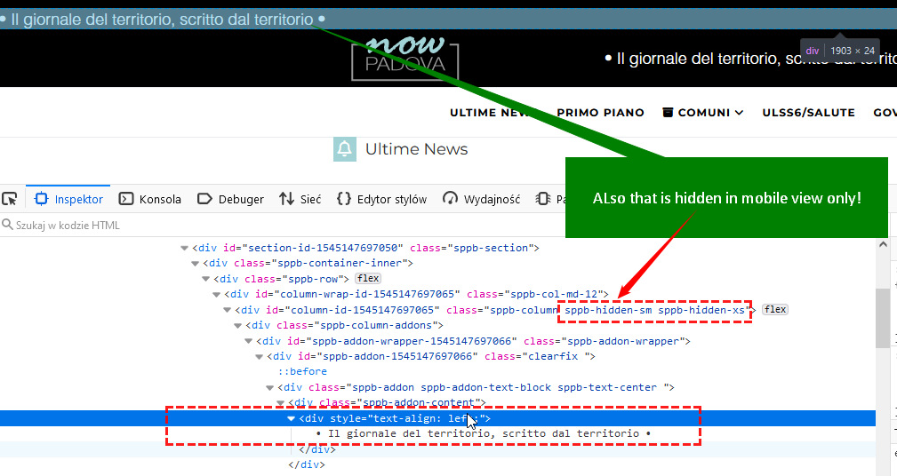
Accepted AnswerYou have two rows, one is hidden in desktop (screenshot), and second is hidden on mobile

Paul Frankowski
Accepted AnswerAnd look here
and here

so I think it's not a problem with SPPB , but your settings. Small confusion.
Paul Frankowski
Accepted AnswerI have question for you
- Which text should be displayed when
- And give me access, and I will set as it should be
afavaro
Accepted AnswerThe writing above must not be seen on the desktop but must be seen only on tablets and smartphones.
The writing between the logo and the date should only be seen on the desktop.

