

Mobile Header Area
DMG Support
Hi there, I have just started this build so please be kind in your response. Logo is great on desktop but for tablet and for mobile is there a way to give padding to make the header area taller? For example if I do this code it will sit outside of the area. I assume there is a way to adjust the height as well. You can see it by viewing the site on your mobile. Thanks
@media(max-width:992px) { .logo-image-phone { height: 70px !important; } }

Paul Frankowski
Accepted AnswerSo let's say that you want to fix Mobile view using CSS method.
I checked your site, and only small touch is needed
@media screen and (max-width: 680px) {
#sp-header {height: 50px;}
}Paul Frankowski
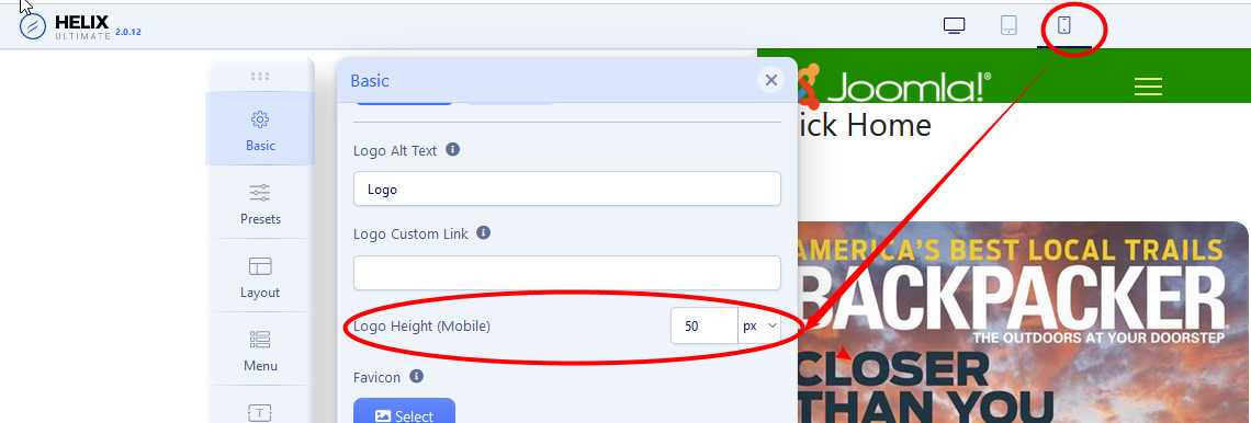
Accepted AnswerHi,
it looks that you have Helix Ultimate there, so use Settings.
check image 4 and decription for it from here >> https://www.joomshaper.com/documentation/helix-framework/helix-ultimate-2/custom-header
and that setting
DMG Support
Accepted AnswerHmm ok, I did that but for it to fit I have to go to a 30 and man that is small. Tried this to give the header area more space but it doesn't do anything. Any other suggestions?
@media (max-width: 575px)
sp-header {
height: 80px; }
Paul Frankowski
Accepted AnswerExtra tip, a simple math calculation:
If your Mobile header has height 40px for mobile view to fit logo, the logo height must be not higher than 40px, right.
DMG Support
Accepted AnswerCorrect, my mobile logo is 136x40. Mobile logo setting in system is 40 still doesn't fit 100% and I would like it all to fit and be larger. LOL. I love our chats, you know this stuff in your sleep and just so you know I have gotten WAY better, only need to bug you occasionally now.
DMG Support
Accepted AnswerThis is their parent site https://www.adr-am.com/ (see mobile) so I would like the mobile to at least have our logo as large as this is. I haven't had an issue before but this is my first time in Ultimate.
Paul Frankowski
Accepted AnswerIndeed, I am with on eye and one leg in bed now... late hour.
But I am not sure if you read to do that ....
Template Options > Advanced > SCSS (tab) > Compile SCSS to CSS : off/on - save settings, it should reload style
DMG Support
Accepted AnswerOhhh ok, no I did not meran to do that not even sure where that setting is but I will find it. THanks and good night. Sleep well.
DMG Support
Accepted AnswerDidn't fix it but I know you are out for the night. Can you help in the morning? Just tell me how to make it large like the parent site example above. Thanks