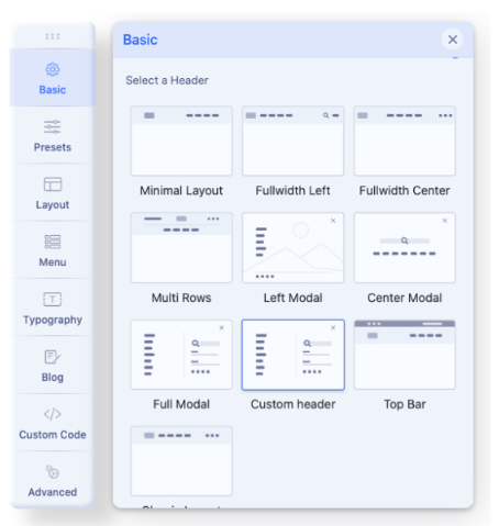
Custom Header
By default, in the raw Helix Ultimate template, there are 9 predefined Headers. But any time you can disable this option and build your own custom header variation. You can do this using two alternative methods depending on your expectations and skills by using:
- "Layout" features - with new rows, columns, and module positions inside, or
- A Custom Header File - where you should use the needed structure code and custom HTML/PHP code as well.
Helix Ultimate Layout is based on a 12-column layout from Bootstrap 5. It also means that the summary of columns inside each row (section) should be always 12. For example 6+3+3.
Custom Header from "Layout" options
- In Template Options - "Basic" tab - Header - Predefined Headers - Turn it Off.
- Go to the "Layout" tab
- Hover over the first row.
- To create a new row click on (+) icon which should appear under the first row.
- Grab that Row and move up to make it first on the layout grid.
- Click the "sliders" icon to get into row options.
- Inside the field "Section Title" add name: header
- You can also set the header a full wide just by enabling the option "Fluid Width"
- Now you have to click a boxed icon to set the columns layout.
Choose one from predefined or set your own (Custom).
Less area reserved for the logo column - means that the presented logo would be smaller. - Then for each column choose the module position from the list, for example, logo and menu*
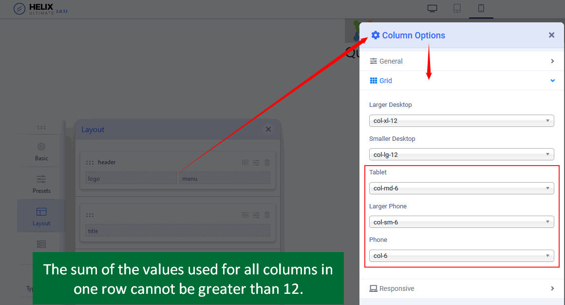
- Select a responsive grid for each column, for Tablet and Mobile view. There are five grid breakpoints, one for each responsive breakpoint.
- Remember to Save changes to see results.
- Later you can set a Header height for the Tablet and Mobile view.
CHECK SCREENSHOTS BELOW
Notify that Logo will be taken from Helix Basic settings and Menu from Helix Mega Menu engine.
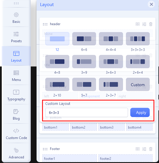 Custom Layout for a new Header.
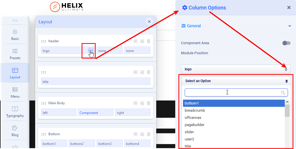
In Columns Options set Grid: The sum of the values used for all columns in a row can not be greater than 12. So, for example for two columns grid, 6+6, 4+8, 2+10, or 3+9 are the correct values. We talk about "col-X" and "col-sm-X" numbers.
 Notice! You can create a custom top-bar section with top1, top2, and top3 positions. That Row is beyond the header area, so must be created as a separate & new Row with a column grid and selected module positions for them.You can set also Custom Header Height for each view: Desktop, Tablet, and Mobile. Make sure that the logo image height will fit inside the new header height value. In most cases, the Header height must be at least 10-20px higher than the logo height. To see changes (and recompile styles) remember to change in Advanced > SCSS > Compile SCSS to CSS turn Off / On.
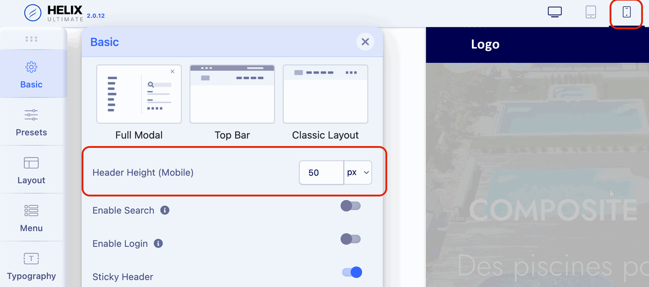
As an additional source of knowledge, it is also worthwhile to watch some video guides: https://www.youtube.com/results?search_query=helix+ultimate+custom+header
Custom Header based on File
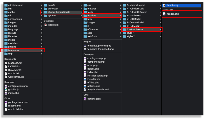
The easiest way to create your own header (based on the header.php file) will be to use the header's code, which is already in the template, and which is graphically most closely resembles the one you want to achieve. Then you have to edit HTML and/or PHP code inside. This way allows you to create a more flexible header also with two rows inside and/or module position one below the other. All are based on simple php code and Bootstrap 5 grid system with all available classes for columns. You can also create your own graphic preview file (thumb.svg).
After creating a custom header file (with custom design there) you have to choose the "Custom header" option to make your file active. If you used a custom thumbnail image - it should be visible there.