Custom CSS entry not working - Forum | JoomShaper
Awaiting an answer Helix Framework

Custom CSS entry not working

Asked by Bruno Bissig 3 years ago Last activity 3 years ago

Hi,

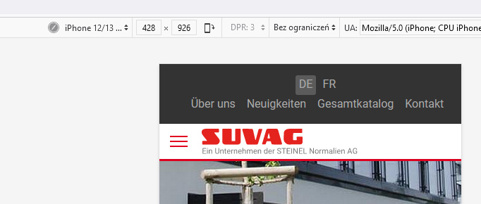
on my iPhone is a problem with the space under the logo, see https://imgur.com/BO9OLoG On page Builder and on Firefox or Chrome Inspector it looks ok. Pic https://imgur.com/bZWqEX6

So ive added a entry in custom.css to solve that

@media (max-width: 575px) {

sp-header {

    height: 60px;
}

}

but it doesnt work. I have also tried with !important. Live URL https://www.suvag.ch/de/

Please help!

Thanks in advance

Bruno

13 replies

Paul Frankowski Senior Staff
3 years ago · edited

Hi Bruno,

indeed on browser mobile view looks OK

info_795_2023.jpg

so maybe for iPhone/Safari you should use 60px or 65px?

@media only screen 
  and (min-device-width: 360px) 
  and (max-device-width: 840px) 
  and (-webkit-min-device-pixel-ratio: 3) { 
 #sp-header {height: 60px !important;}
}
Bruno Bissig Asked this

Hi Paul,

thanks for your fast response, your code fixed the issue on my iphone in Safari, but not on Edge or Chrome on iPhone. And the problem is according to my client also on Anrdoid.

Can you please take a closer look in my backend.

Thanks for your fast help!

Bruno

Paul Frankowski Senior Staff

I don't have iPhone to confirm...

I can only check on Android devices, but I have few ideas what and where to check.

Paul Frankowski Senior Staff

Check now, it should be OK now. I tested on real device.
In general I focused on Helix header mobile height settings.


Remember to refresh/reload mobile browser 2x

Bruno Bissig Asked this

Hi Paul,

now it works on iPhone Safari, Edge, Firefox but not on Chrome see pic https://imgur.com/S119GWq

Thanks for your fast help!

Bruno

Paul Frankowski Senior Staff

There are no extra styles for Chrome... this browser should use this same like for others.
Sorry, I don't have more ideas :/

maybe ask on designer forum - this is not Joomla releated, so maybe somebody will have better fix.

Paul Frankowski Senior Staff

I can only check on Chrome Android (Xiaomi) - real device to compare - if this may help somehow?

Bruno Bissig Asked this

Hi Paul,

yes please check it, i have no Android Device, but my client...

Thanks a lot for your help!

Bruno

Paul Frankowski Senior Staff
3 years ago · edited

Mobile Chrome v96.0 + Android 11 + Screen 6.43" (1080 x 2400 pixels)

Looks totaly OK, as it should, header is no cut off.


also OK - Mobile DuckDuckGo browser.

Bruno Bissig Asked this

Hi Paul,

ok thanks, so it works now on most used Android Browser, and iPhone except Chrome. Thats good news for now.
If you have any further idea about to fix this iPhone Chrome issue, i would be happy...

Thank you very much for your fast support!

Thanks & Greetings from Switzerland

Bruno

Log in to reply.