- TemplatesTemplates
- Page BuilderPage Builder
- OverviewOverview
- FeaturesFeatures
- Dynamic ContentDynamic Content
- Popup BuilderPopup Builder
- InteractionsInteractions
- Layout BundlesLayout Bundles
- Pre-made BlocksPre-made Blocks
- DocumentationDocumentation
- EasyStoreEasyStore
- ResourcesResources
- DocumentationDocumentation
- ForumsForums
- Live ChatLive Chat
- Ask a QuestionAsk a QuestionGet fast & extensive assistance from our expert support engineers. Ask a question on our Forums, and we will get back to you.
- BlogBlog
- PricingPricing
Inconsistent Design, I Can't Update From 4.0.7 To 4.0.8
M
Morphinestyle
Hello, there's some problem from 4.0.7 to 4.0.8 (and 4.0.9) with hide/show section based on devices.
24 Answers
Order by
Oldest
M
Morphinestyle
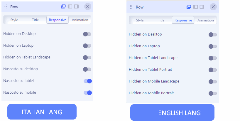
Accepted AnswerHere a screenshot of a "strange" responsive menu: duplicate menu in english and also italian language.
M
Morphinestyle
Accepted AnswerFIRST ISSUE: HIDDEN/SHOW SECTIONS In hidden content you'll find some display issue: responsive no more working correctly. I use two page covers: one for desktop and one for mobile, after the upgrade you can see doubled page covers, after the update it display both mobile and also the desktop covers (sections) at the same time. You'll find some example page urls 4.0.7 and 4.0.9 pages in the hidden content.
SECOND ISSUE: COLUMN ORDER NOT WORKING WELL 4.0.7 using 600px width viewport shows correctly the column order set for resposive IN THE 4.0.9 UPDATED WEBSITE using 600px width viewport it no more respect column order for mobile/tablet devices You'll find some example page urls 4.0.7 and 4.0.9 pages in the hidden content.
Toufiq
Accepted AnswerHi there,
I appreciate you reaching out. I sincerely apologize for this oversight. We just released a new version. Would you please check & let us know.
V 4.0.10
-Thanks
M
Morphinestyle
Accepted AnswerHi Toufiq!
Unfortunately SPPB 4.0.10 solve only one of the two issues which we discussed, so i still cannot upgrade the website over the SPPB 4.0.7 version.
Workflow:
- removed files and databases
- installed a website backup with SPPB 4.0.7 (perfectly working version)
- upgraded to 4.0.10
- disabled and cleared every server, page, and system cache.
STILL REMAIN DOUBLE COVER. Can you see the websites by urls in the "confidential data".
I'm willing to cooperate quickly to fix at least this website which is the only one we have on SPPB 4.x (built directly with 4.x). But that seems to fail to maintain compatibility and reliability with a couple of older versions.
I will wait your news.
Paul Frankowski
Accepted AnswerCiao,
If I may... a small problem probably caused by missing translation, that cause confusion in Hide settings. If you would use ENGLISH version of SPPB you would see real list of settings.

I will try to prepare you IT LANG fix for that.
And yes, please keep SPPB 4.0.10!
Paul Frankowski
Accepted Answerplease download, unzip, and using FTP override all files (!) keep folder struture.
then check ROW Options > "Responsive" tab again !
M
Morphinestyle
Accepted AnswerHi Paul! I have the response.
-
about the main issue it still remain: i have THE DOUBLED SECTIONS (PAGE COVER), it stop me to upgrade to 4.0.10 the live version (see previous hidden content: you can find the urls with online live 4.0.7 and 4.0.10 version of the same website)
-
about the translations files: your ZIP was correctly loaded and now that panel is displayed just a little bit better in a strange "italISH" https://ibb.co/1Jvnbtr
-
about the translations: please let me take care of SPPB italians translations! it now are bad capitalized, and translated, and the last ZIP you gave me was partially translated and partially not in the same sentence! I'm already translator for NextEnd, hCaptcha and other Joomla and Wordpress extension developers. Give me this opportunity, please.
Paul Frankowski
Accepted AnswerSorry for "italISH" - I made it quick for that area only - you have to correct that in administrator/language/it-IT/it-IT.com_sppagebuilder.ini edit that file in Text Editor, make changes. Indeed lot more phrases needs to be translated.
You have to compare with that file: administrator/language/en-GB/en-GB.com_sppagebuilder.ini
it contains all needed phrases.
Paul Frankowski
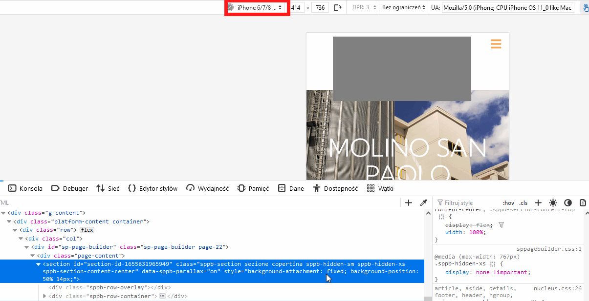
Accepted AnswerCan you help me a little more, for example here (I hide logo with grey box). Row is already hidden on mobile view, that is correct or not?

RD
Robert Deutschmann
Accepted AnswerHi
Today i tried to update vom 4.0.7 to 4.0.10 and i do have the same issue like Morphinestyle:
about the main issue it still remain: i have THE DOUBLED SECTIONS (PAGE COVER), it stop me to upgrade to 4.0.10 the live version (see previous hidden content: you can find the urls with online live 4.0.7 and 4.0.10 version of the same website)
br, Robert
M
Morphinestyle
Accepted AnswerSorry for the delay Paul.
There is two SIMILAT (but not the same) row/sections. One is designed to be displayed on mobile and tablet. Another one (similar but not the same) is designed to be displayed on desktop.
In the live website (SPPB 4.0.7) everything is working perfectly. In the hidden website (SPPB 4.0.10) everything is no more working perfectly.
(urls of LIVE and HIDDEN websites are in past hidden content)
Paul Frankowski
Accepted AnswerIn SPPB 4.0.10 there are more options to hide Rows. And we will keep it.
Before I get crazy, please do that:
-
on Joomla where you have SPPB 4.0.10 with new translation even if it has small mistakes.
-
Create a new Page
-
Add two rows with different image addon
-
Set different "Hidden" values, Hide one on Desktop and second row on Mobile etc.
-
Save settings
-
Preview
-
Tell me it it works or not.
M
Morphinestyle
Accepted AnswerHello Paul, i tried again your ZIP: please delete every translation and use this one in this order:
Nascosto su Desktop
Nascosto du Laptop
Nascosto su Tablet orizzontale
Nascosto su Tablet verticale
Nascosto su Mobile orizzontale
Nascosto su Mobile verticale
PLEASE DON'T ADD PERIODS
it will replace this https://ibb.co/HT44NXm
About the responsive test you ask for i will give you feedback soon.
M
Morphinestyle
Accepted AnswerHello Paul, about the responsive issue: i tried as you asked to make a responsive on new page and this is the response: It works well for tablet/mobile, but it is buggy for Laptop/Desktop mode.
Between Laptop and Desktop there's no difference! It never worked! I'm very thrilled about some future correction of this feature that will impacts again with page design: please fix it now and make it working as well.
However, about my website: excluding the Laptop/Desktop issue, the responsive is working well on new page, but: WHY I LOST EVERY PAGE CONFIGURATION UPGRADING over 4.0.7???
May I need to reconfigure again from scratch: 8 pages x 2 rows x 3 languages = 48 element???
Paul Frankowski
Accepted AnswerWHY I LOST EVERY PAGE CONFIGURATION UPGRADING over 4.0.7???
Sorry, but it's not question to me, but I agree - it shouldn't be like that :(
sometimes legacy is a painful pin.
Hopefully, you have only 8 pages, not 80.
Thanks for Italian language update, I will update my private file.
Paul Frankowski
Accepted AnswerBetween Laptop and Desktop there's no difference
There is:
- Desktop - hide if screen resolution is min 1400px or bigger
- Laptop - hide if screen resolution is min 1200px or bigger
easy to check&confirm in browser Code Inspector and CSS preview
and works tested!
M
Morphinestyle
Accepted AnswerHi Paul, desktop and laptop: it is not working properly! Please, please, please test before answer me!
In hidden content you'll find a page. In that page you will find a "DESKTOP" title HIDDEN ON LAPTOP, and "LAPTOP" title HIDDEN ON DESKTOP.
The behaviour should be: DESKTOP title visible only on DESKTOP (>= 1400px: visible on DESKTOP, hidden on LAPTOP) LAPTOP title hidden only on LAPTOP (>= 1200px AND < 1400px: visible on LAPTOP, hidden on DESKKTOP)
It not works as should be: please try it before answer me! And more: in editing mode, clicking on Desktop and Laptop switcher nothing changes at all! So i cannot see any difference if set visibility properties!
I've been reporting this issue since version 4.0! You can find a test page in hidden content.
P.S.: you will not see any title on desktop (BUG) please try on <1200px
Paul Frankowski
Accepted Answerdesktop &laptop hide is working fine (1690px my default)
= removed privacy =
min 1200px in CSS means 1199px
So 1200px and all above .... are hidden.
= removed privacy =
- max-width works from the number.
- min-width works below the number
Paul Frankowski
Accepted AnswerMaybe read that "Grid options" >> https://getbootstrap.com/docs/5.0/layout/grid/
M
Morphinestyle
Accepted AnswerWe are wasting time here: we can't understand correctly on this issue. I propose you a videocall please.
Also: please keep urls private.
However i'll try to explain with other words: 1 - if i HIDE IN LAPTOP why my title is hidden also in desktop??? it should hide only in LAPTOP range: from 1200 to 1400px
2 - in editing mode DESKTOP and LAPTOP not showing completely my title, the element seems like disappeared: i need to turn to mobile or tablet to click on my element!
Please: with 1minute videocall i can explain exactly this issue! Let me know!
M
Morphinestyle
Accepted AnswerHello Paul, here explained in a video what i mean, it's in the hidden content, let's elaborate HD version, give it some minute.
These are the bugs:
1 - If you HIDE on LAPTOP and leave VISIBLE on DESKTOP an element is not working: is always hidden on DESKTOP! (bug on frontend and backend)
2 - Frontend and backend visualization are inconsistent: if you choose to HIDE on DESKTOP and leave VISIBLE on LAPTOP: on backend is not working, i can see only on frontend! (bug on backend)
I hope I was as clear as possible this time.

